


 Duluth Trading Logo PNG
The Duluth Trading logo conveys strength and courage while simultaneously reflecting the high quality of the brand’s products. It naturally brings to mind the practicality of all the brand’s items, emphasizing their reliability. The classic color palette carries a special energy associated with durability and timelessness, effectively declaring the company’s core mission. For this reason, the identity is perceived as a simple, clear symbol, with a hint of realism and a readable stylistic theme.
The massive, appealing, original visual mark combines traditions, harmonizing them remarkably with the present. Each emblem element stands out with its character, making it a truly individual and unique brand symbol.
Duluth Trading Company began in 1989 in Duluth, Minnesota, when carpenter brothers Bob and Dave Fieri created the Bucket Boss, an organizer fitted over a standard plastic bucket. Sold through mail-order catalogs, it gave builders and repair workers a portable way to carry tools and led the company to add more jobsite accessories.
In 1993, the business entered apparel with the Longtail T, cut three inches longer than a standard shirt to keep workers covered while bending. The range later expanded into durable workwear, including Fire Hose pants made from heavy fabric similar to material used in fire hoses. In 1999, investor Steve Schlecht led a group that bought the company from the founders.
Online sales grew during the early 2000s and eventually overtook the catalog business. The headquarters moved to Belleville, Wisconsin, in 2002 to provide added office and warehouse space. Product lines such as Armachillo cooling clothing and Buck Naked underwear followed. The first physical store opened in Mount Horeb in 2010, marking the company’s entry into conventional retail.
The company listed on NASDAQ under the ticker DLTH in 2015. By 2018, it operated more than 30 stores, and annual sales had passed $500 million by its 30th anniversary in 2019. From 2020 to 2022, it expanded online sales, stores, and casual clothing and accessories. By 2023, its range covered workwear, everyday apparel, tools and jobsite products across a national retail and e-commerce network.
Meaning and History
What is Duluth Trading Company?
This American retailer is known for its durable, functional, and often playfully advertised workwear and casual clothing. The company produces long-lasting apparel and gear for outdoor enthusiasts, workers, and those seeking reliable and comfortable clothing. The product range includes work pants, shirts, underwear, outerwear, and accessories, often featuring creative designs to enhance flexibility or address issues such as crack protection. A distinctive feature of the brand is its unconventional marketing strategy, which uses humorous illustrations and a fun approach to highlight product features. In addition to online sales and catalogs, the company has brick-and-mortar stores, allowing customers to explore its extensive product range firsthand.
1987 – 1993

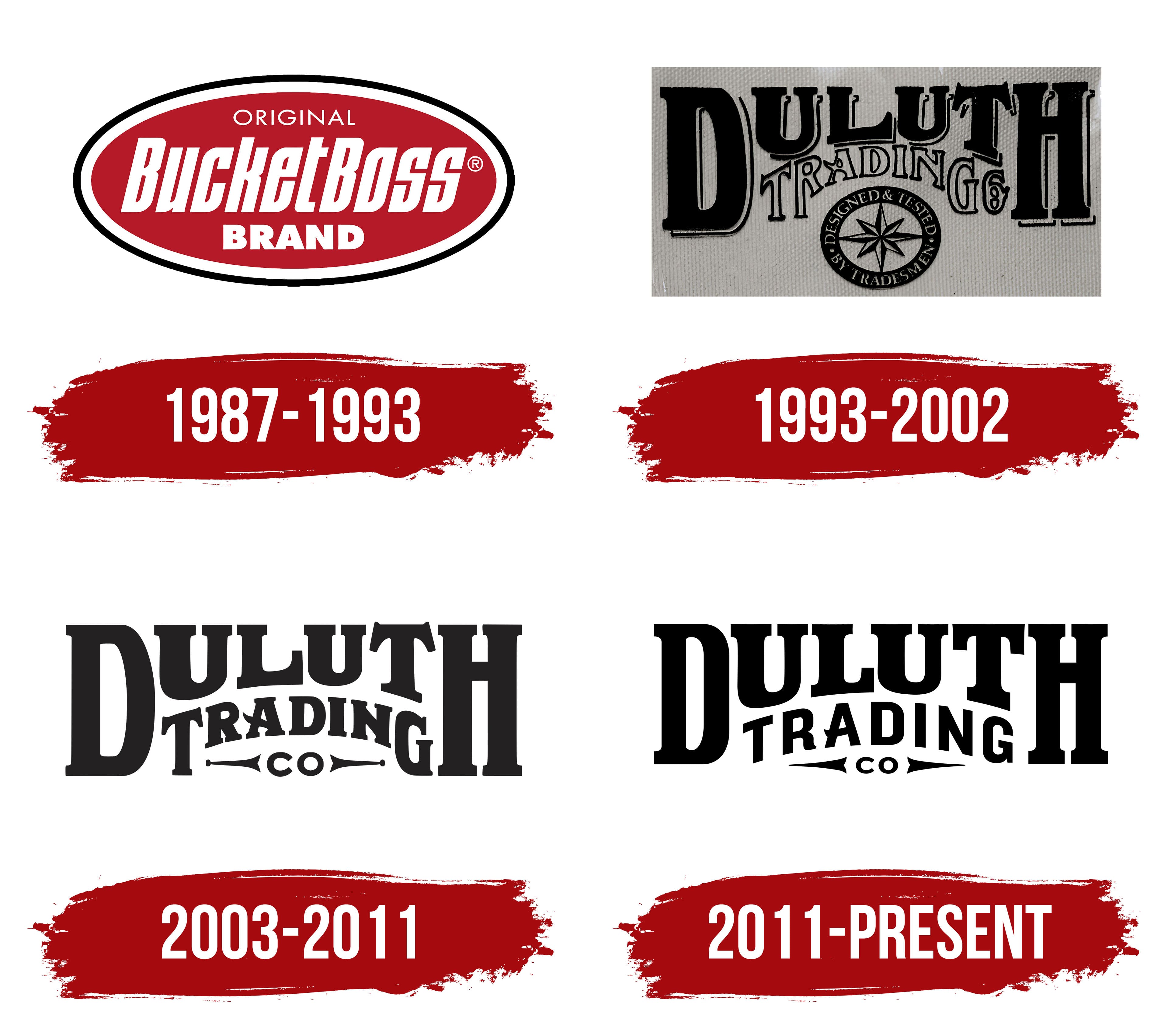
Throughout its history, the company has repeatedly changed owners and, at different times, become part of various organizations. This is why the first logo was closely tied to the specific time and circumstances in which the company existed. The identity from this period reflected important elements and included text blocks that, for understandable reasons, disappeared in later periods. The first logo is still considered striking, impressive, and information-rich despite changes.
White text fragments were placed on a red background, filling the inner surface of a semicircle. The geometric shape was surrounded by several contrasting outlines, making it bold and attractive. The alternation of black and white outlines served a decorative function, helping to focus attention on the main informational block.
In the center of the emblem, words in different fonts were arranged across three levels. The word “original” was placed at the top of the circle on the first line. Its letters, rendered in an elegant sans-serif font, were uniform in shape, slightly elongated, and in uppercase, adding a unique charm to the text and emphasizing the importance of a word closely associated with the brand and its original products.
The phrase “Bucket Boss” occupied the central position. Its significance was highlighted by bold, large, italic letters, which gave the name expression and elegance. Upon seeing the visual mark and brand name, the customer understood that the products presented were high-quality, whether workwear or various accessories. These are items known for durability, practicality, and a service life that exceeds expectations.
The word “brand” was set in a unique font on the third line from the bottom. The white letters, bold and slightly smaller than the brand name, maintained their significance. Each of the three informational blocks of the logo was perceived as a new chapter in the company’s story, creating an informative and inspiring image, much like scenes from a favorite movie.
1993 – 2002
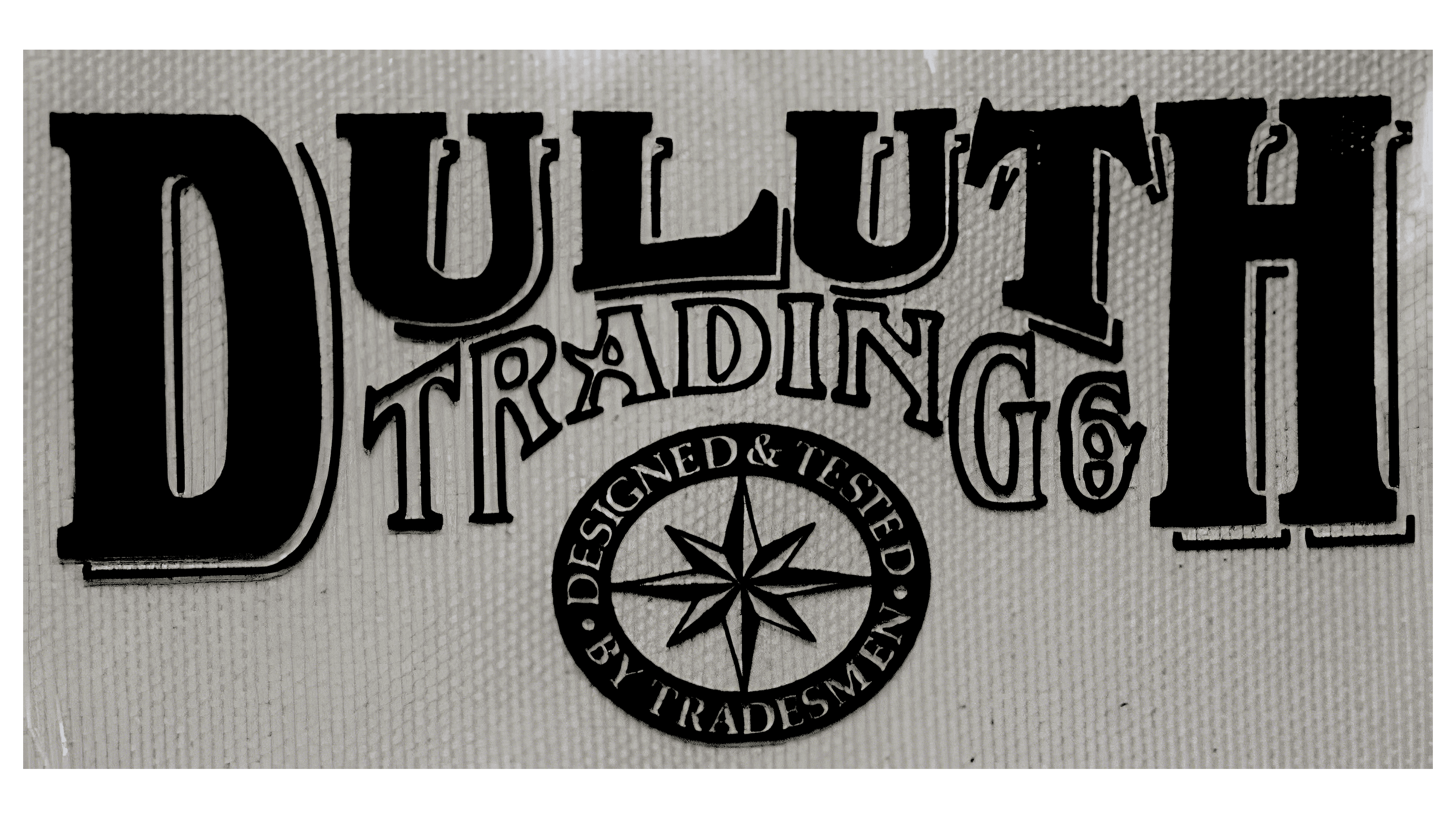
Over time, the brand’s identity underwent drastic changes. It took on an entirely different appearance, as the information delivery style and color palette were updated beyond recognition. The logo now features numerous informational blocks, meaning accents, motifs, and fine details. The transformations within the company itself are reflected in its altered identity.
The brand name is now displayed as “Duluth Trading.” To emphasize this, a unique font and a well-thought-out layout were chosen for each word, drawing attention to the text. In its composition, the emblem resembles a newspaper clipping featuring important news, a symbolic technique that highlights the significance of the changes.
The gray background added an air of mystery, and its uneven texture created a striking visual effect. Placing the brand name in two rows was a deliberate decision, as each word played a vital role. The lettering seemed to rest on two parallel lines, complementing each other. The key focus was the word “Duluth,” which was nearly twice the size of “Trading.”
At the bottom of the logo is a unique symbol, a circle with a compass rose at its center. Within the wide double contour of the circle, three words form a single text block rendered in white on a black background. The inner surface of the circle is filled with gray, harmonizing with the overall background in color palette and texture, completing the image with impressive cohesiveness.
2003 – 2011
The identity of the new period took on a simple, strict, and precise appearance, reflecting the manufacturer’s conservative approach to its products. The logo also conveyed the brand’s strong sense of care for its customers. It was created in a classic color palette in two styles, emphasizing minimalism more strongly. Contemporary trends appeared in the fonts, underscoring the design’s relevance.
Large black letters seemed arranged along a semicircular line, though, upon closer examination, the geometry of straight lines became more apparent. The first and last letters of the word “Duluth,” “D” and “H,” were taller and larger than the others, emphasized by bold typeface and the width of horizontal and vertical elements. These letters appeared equal and similar, while the four central letters were smaller and disproportional. They were slightly tilted at the top of the logo, surrounding the second word, “Trading,” which formed part of the brand name. This arrangement created a sense of the letters embracing the second word in a strong, masculine hold. Through various graphic techniques, the effect of unity and cohesion was conveyed.
A new inscription, “Co,” also appeared, bearing a unique symbolic significance. Two symmetrical lines resembling elongated arrows drew the viewer’s attention to this addition, introduced with an obvious purpose that was understandable to everyone.
2011 – today
The modern Duluth Trading logo possesses all the advantages of a contemporary brand identity. Its color palette adheres to classic standards, while its originality is evident in each letter’s unique form, giving the visual emblem a memorable look.
The brand identity communicates the company’s confidence in its future and success, signaling the strength and quality of its products. The logo implies that the brand’s workwear and accessories are reliable goods designed for long-lasting use.
Massive letters convey strength, power, and a sense of freedom, while the elegant font adds an effect of reliability and stability. The resilience and immovability of the text elements resemble an ancient structure, fearless and omnipotent. Combining serifs and rounded edges evokes associations with high-quality craftsmanship and a distinctive style, emphasizing the brand’s unique character.