


![]() Duolingo Logo PNG
Duolingo Logo PNG
The Duolingo logo shows that the site is a path to wisdom and development. The portal’s pages contain so much useful information that the emblem calls on users to awaken their inner child, strive for knowledge, and take away what they learn.
Luis von Ahn grew up in Guatemala, where English lessons were expensive for many families. He later studied mathematics at Duke, earned a PhD at Carnegie Mellon, and invented CAPTCHA in 2000. In 2007, he founded reCAPTCHA, using distorted-word tests to help digitize books and newspapers. Google bought the company in 2009.
Back at Carnegie Mellon, von Ahn began working with Swiss programmer Severin Hacker on a free language-learning service. The first idea was that users would learn languages while translating real documents for media companies. In late 2011, Duolingo raised $3.3 million from Union Square Ventures and Ashton Kutcher’s A-Grade Investments. The name combined “duo” and “lingo,” reflecting both the two founders and the dual learning model.
Closed beta began in November 2011, with about 300,000 people on the waiting list. On June 19, 2012, Duolingo launched to the public with courses in English, Spanish, French, German, and Portuguese. Its main break from Rosetta Stone and older study sites was its use of gamification: short lessons, points, streaks, lives, and progress levels.
The iPhone app launched in November 2012, followed by Android in May 2013. Apple named Duolingo its iPhone App of the Year in 2013. By 2014, the translation model gave way to freemium learning, with ads and paid access available. That year, Duolingo launched the Duolingo English Test as a cheaper alternative to TOEFL and IELTS. Duolingo Plus launched in 2017, and the number of registered users surpassed 300 million in 2018. On June 28, 2021, Duolingo went public on the NASDAQ under the symbol DUOL. In 2023, it added GPT-4 through Duolingo Max.
Meaning and History
![]()
A professor and his students created this service at Carnegie Mellon University in 2009. Then, a group joined the project, subsequently supporting and developing it. Among them were specialists from various fields, so the language courses were equally well adapted to the Internet and mobile devices. This thoughtfulness contributed to the quick recognition of the company’s logo and demand for its products.
Luis von Ahn is from Guatemala. It was difficult for him to adapt to the new linguistic environment, so he found himself in situations similar to those of many others. His reflections led to a unique project on foreign languages. A student, Severin Hacker, from Zug (Switzerland), joined the work. Like his leader, Severin Hacker believes free education will change the world. Hacker is now the company’s CTO.
The project’s pilot launch occurred in 2010, and a test version was made available to users in November 2011. In the early years, a temporary emblem consisting only of the name was used to identify the product. Later, other options appeared, with the original talisman, an owl symbolizing intelligence, wisdom, and knowledge.
What is Duolingo?
It is a popular platform for learning foreign languages and a resource for translation. It allows you to learn other languages and assess the quality of knowledge assimilation through testing. The service launched in 2010 through the efforts of Luis von Ahn and Severin Hacker. For 2021, it contained 106 language courses. Its head office is located in Pittsburgh, Pennsylvania.
2010
![]()
When launching the closed beta, the authors used the project’s name and emphasized it with several visual tricks. First, the compound word’s semantic parts are divided by color into two fragments: “duo” black, “lingo” gray. Secondly, under the first three letters, there is an arc in the form of a welcoming smile because “d” and “o” look like eyes, and “u” is like a nose. The result is a good-natured emoticon. At the same time, a prototype of the talisman appeared.
2011 – 2012
![]()
After testing, the language service received an official distribution and a corrected logo. The designers changed their palette, choosing the same lowercase lettering with rounded letters. They also unified the color palette to green. In this form, the inscription was used until 2019.
The mascot has also changed: the owl has turned green. The logo designers also lowered the right wing, depicted in an invitation gesture. Therefore, the bird just froze in anticipation.
2012 – 2013
![]()
A year later, the designers modernized the icon, depicting the owl more naturally. They removed the letters “d,” “u,” and “o” that replaced the bird’s beak and eyes, drew a tail for it, lengthened its wings, and added over-eye plumage. The logo’s authors’ colors were created using a gradient transition from light green (center) to dark green (edges).
2013 – 2019
![]()
The Duolingo administration decided to redesign the logo to look friendlier. To achieve this, the developers used an animation style that made the owl a pleasant character. She has depicted her wings spread wide, as if she is ready to welcome anyone who wants to study foreign languages. Emotions and dynamics are expressed in the sparkle in the eyes, raised “ears,” and widely spaced legs, as if a bird were moving forward. By the way, the classic four-toed paws have been replaced with pointed ones, formed by two yellow spots of different sizes, based on the location of the first and second toes. The central zone of the logo is light green, and the edges are dark green.
2019 – today
![]()
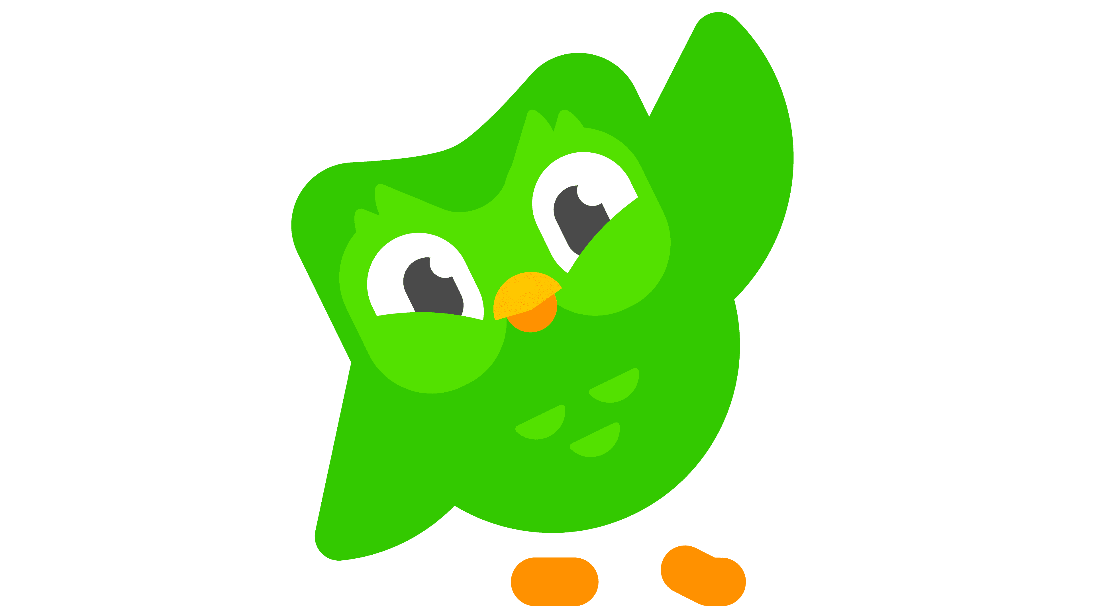
In 2019, the brand transitioned to a new logo that was radically different from previous versions. The site’s name, course, and application are rendered in streamlined symbols with no perfectly straight lines or sharp corners; even the wide “i” and “l” sides are not as straight as they could be. The protruding elements of the word “Duolingo” have oblique cuts, and the “g” is shaped like an owl with a single feather sticking upon its head. The designers returned the side legs to the letters “u” and “n.”
The bird’s image also changed, conveying emotions such as bewilderment, glee, and joy. The bird is depicted with either lowered or raised wings with an open or closed beak. Moreover, the developers simplified the icon: the fluff around the eyes increased, and three miniature, light-colored semicircles appeared on the stomach. The gradient transition has disappeared.
Font and Colors

The designers emphasized a light shade of green, using it both for the inscription and the owl. This bird personifies wisdom, making her image central.
The logo is dominated by a grotesque, rounded typeface in two styles. Earlier versions used a typeface reminiscent of Torus Bold or Auro Bold, while the current version uses a similar typeface. This is a custom development for Duolingo; it is patented and not licensed by other brands. Bright green was chosen for its deep symbolism of growth and development. Moreover, different shades are used in the emblems of different years.
![]()