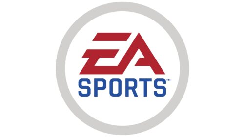
The EA Sports logo is professional, as it contains the most essential element – the abbreviated name. Despite its minimalism, it is filled with dynamism, reflecting the nature of the company’s activities. The emotions users get from electronic games are embodied in small strokes – stylish, bright, and dynamic.
EA Sports: Brand overview
| Founded: | 1991 |
| Founder: | Electronic Arts |
| Headquarters: | Redwood City, California, U.S. |
| Website: | ea.com |
Meaning and History
The key feature of this video game producer is the lack of attachment to a limited number of platforms. EA Sports does not focus on one but instead expands the platforms, providing sports series for various popular resources. The brand name itself speaks to the content theme: it stands for Electronic Arts Sports.
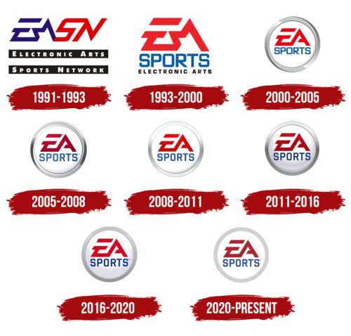
The logo is based on the abbreviated form of the name so that gamers do not confuse the subsidiary with the parent company, which has an almost identical name. In a short period of time, the trademark has changed several emblems, each being a modernized version of the existing symbol. No steps have been taken toward a radical redesign. This is due to the broad recognition of the brand so that consumers can visually become accustomed to one type of design and recognize the sports video game provider at a glance.
What is EA Sports?
EA Sports is an American sports-themed video game producer. It releases series such as FIFA, NBA Live, and NHL and belongs to the Electronic Arts Sports Network, which opened in 1991.
1991 – 1993
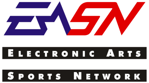
The key element of the logo is the abbreviation derived from the phrase “Electronic Arts Sports Network.” It is made large, bold, and dynamic. Its inner energy is generated by:
- jerky lines;
- rightward tilt;
- color contrast;
- speedline;
- half-star.
The wide stripes add expressiveness to the symbol, making it visible on any background. Underneath the two-tone short name is the full version of the name. It occupies two lines in the form of black horizontal stripes. The inscription, on the other hand, is painted in white.
1993 – 2000
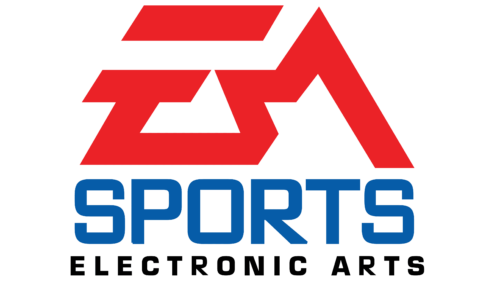
Rebranding influenced the redesign. After separating the subsidiary from the parent company, the management chose a new visual identity symbol for it while preserving the similarity with the familiar sign. The primary focus was on the abbreviation “EA,” while the combination “SN” disappeared forever. The hint of a star in the letter “A” and the speedline at the top of the “E” were preserved. They add dynamics to the emblem and indicate its sports orientation.
Both glyphs are painted in red and connected by a common line. The second part of the name is spelled out and placed at the bottom. In the first line, the word “Sports” is set in a bold geometric font in uppercase. The second row contains the phrase “Electronic Arts.” It is executed in a small black typeface of the same style.
2000 – 2005
After a series of transformations, the EA Sports logo gained a wide silver ring with a grooved surface. The texture is conveyed by thin vertical stripes. In some segments, they are thicker, while in others, they are thinner, adding dynamics to the logo since such a pattern on a chrome rim appears as a play of light. Overall, the symbol began to resemble car company emblems. However, this did not bother the sports video game producer, as its activities are also related to endurance, reliability, and power. The sharp protrusion in the “A,” reminiscent of a star fragment, disappeared and was replaced with a half-crossbar.
2005 – 2008
Designers stretched the letters in the lower row and softened them. Instead of red, they used burgundy, making the abbreviation much more expressive. The dark color also made it somewhat more rigid, which the developers sought. The linear texture on the ring disappeared – only the silver gradient and chrome effect remained.
2008 – 2011
The central element of the emblem is the “EA” monogram. It is large, expressive, stylish, and drawn with a single line. The separate upper element of the letter “E” has the form of a short stripe and serves as a speedline. The frame of the white circle became light gray, with individual reflections. The designers slightly lightened the red color.
2011 – 2016
A dark gradient of burgundy and shade transitions of silver color gave expressiveness to the circular EA Sports logo. This combination added expressiveness to the emblem and made it more distinct, as the gray now captures part of the central circle.
2016 – 2020
The frame of the logo became uniformly gray. Reflections and gradients disappeared, leaving only the three-dimensional ring surrounding the “EA” abbreviation. The upper inscription received a consistently red color, while the lower one became dark blue.
2020 – today
Designers turned the voluminous EA Sports emblem into a flat one, as demanded by the times. In this form, it is easier to display on any digital media, which is extremely important for a video game producer. The gradient was completely removed: colors became cleaner, though still retaining the dark palette.
Font and Colors
The inscription in the upper row is custom-drawn. It is executed in the EA Sans Bold typeface. The word in the lower row is set in a sans-serif typeface with rounded corners, reminiscent of Monda and Hind Siliguri. The color scheme includes two shades of red (scarlet, burgundy), blue, and a rich palette of gray tones – from ash to silver.
EA Sports color codes
| Red Brown | Hex color: | #af232e |
|---|---|---|
| RGB: | 175 35 46 | |
| CMYK: | 0 80 74 31 | |
| Pantone: | PMS 711 C |
| US Air Force Academy Blue | Hex color: | #27509f |
|---|---|---|
| RGB: | 39 80 159 | |
| CMYK: | 75 50 0 38 | |
| Pantone: | PMS 7455 C |
| light Gray | Hex color: | #d2d0ce |
|---|---|---|
| RGB: | 210 208 206 | |
| CMYK: | 0 1 2 18 | |
| Pantone: | PMS Cool Gray 2 C |
