Earth Rated, an innovative firm on a mission to make pet waste cleanup a breeze, has recently rolled out a total brand makeover that aligns with its extraordinary growth trajectory. Today, Earth Rated’s products have made their way into more than 20,000 stores worldwide, helping over 4.5 million people in over 40 countries carry out their pet waste disposal duties in a more manageable manner. Esteemed branding agency LAYER spearheaded the creation of a delightful new identity, laying out a strategic blueprint for brand consistency across existing and future product ranges.
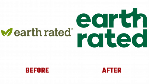
The company’s old logo bore a generic eco-conscious look, which, while cleverly incorporating a checkmark symbol to represent a “rating” in a plant image, failed to convey Earth Rated’s primary audience – pet owners expressly. The Earth Rated logo was too ambiguous, potentially representing an array of green goods, from an earth-friendly detergent brand to a sustainable consumer goods company.
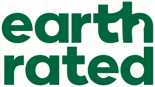
The redesigned logo boldly veers away from the old aesthetic, opting for a more welcoming sans serif typeface and ingeniously weaving in the silhouette of a plump dog into the negative space formed by the letters “t” and “h.” The ligature linking these letters may seem somewhat artificial, but the witty incorporation of the dog largely overshadows this minor flaw. Adding an amusing twist, the dog’s rear end is in full view, subtly echoing the company’s flagship product – dog poop bags. Although the typographic execution could benefit from refinement, particularly in typeface choice and the lowercase approach, the creative use of the dog motif makes up for these minor oversights.
The rebranding triumphs with its overhauled packaging system. A calming forest green is the foundation color, livened by dashes of subdued yellow, lavender, and mint, resulting in pleasing color amalgamations. The simple box designs acquire a distinctive personality through the playful logo, while the selected typeface, Filson Pro, stands strong across varied boxes.
LAYER’s contribution extends to designing engaging pet toys, making a compelling offer for pet parents looking for sturdy and entertaining play options.
The new branding represents a substantial leap forward compared to the previous cutesy illustrations and quote-inspired typography. It positions Earth Rated as a playful yet serious market leader, balancing light-hearted charm and professionalism. The rebranding resonates perfectly with a company that has succeeded in making a routine task more enjoyable.


