The logo of Eastern Air Lines, once America’s largest airline until its dissolution in 1991, embodied the company’s pioneering spirit and significant historical impact on U.S. aviation. It represented the company’s role as a trailblazer in air transportation, especially along the East Coast, and illustrated its foundational contributions to making air travel more accessible and frequent for the American public. The emblem became a symbol of trust and reliability, reflecting decades of operation that helped connect various regions of the U.S., facilitating business and tourist travel.
Eastern Air Lines: Brand overview
The history of Eastern Air Lines began in 1926 when pilot and entrepreneur Harold Pitcairn founded Pitcairn Aviation to transport mail between New York and Atlanta. Initially, the airline operated single-engine Pitcairn PA-5 Mailwing biplanes.
In 1929, Pitcairn Aviation was acquired by Curtiss-Keys, an investment company, and renamed Eastern Air Transport. Over the years, the airline expanded its route network along the East Coast, the Midwest, and Florida.
In 1934, aviation magnate Eddie Rickenbacker bought Eastern Air Transport and renamed it Eastern Air Lines. Under Rickenbacker’s leadership, the airline saw rapid growth and innovation.
In the 1930s, the company introduced new technologies and services like onboard radios, flight attendants, and cabin air conditioning. The fleet was upgraded with modern Douglas DC-2 and DC-3 aircraft, improving flight speed and comfort. During World War II, the company was crucial in military transport, transporting troops and cargo to Europe and the Pacific. After the war, the airline enjoyed a “golden age” in commercial aviation, expanding its presence in the U.S. market.
In the 1950s, the airline expanded to Canada, Mexico, and the Caribbean and introduced jet aircraft like the Boeing 727 and Douglas DC-8, revolutionizing air travel.
In the 1960s, the company peaked under President Floyd Hall, expanding its route network and fleet.
However, the 1970s brought challenges like economic downturns, fuel crises, and increased competition. Frequent leadership changes and conflicts with unions impacted stability. Despite these challenges, the company continued to invest in its fleet, becoming the first U.S. operator of the European Airbus A300. The 1980s marked a period of crisis and decline under President Frank Borman. The airline faced conflicts with unions, strikes, and financial difficulties.
In 1986, Texas Air, led by Frank Lorenzo, took control and implemented restructuring measures that worsened relations with unions and affected service quality. A major strike in 1989 led to the airline’s eventual closure on January 18, 1991, after 65 years of operation.
The airline’s bankruptcy and dissolution marked a significant chapter in American aviation history. Once a dominant force in the industry, the company was known for its extensive Douglas DC-9 and Lockheed L-1011 aircraft fleet. However, the airline struggled to adapt to changing market dynamics and eventually ceased operations.
Despite its unfortunate demise, the company left a lasting impact on air travel in the United States and worldwide. Many innovations and service standards pioneered by the company have since become standard practices in modern civil aviation. The brand continues to evoke nostalgia among Americans, with its liveries and logos becoming sought-after collector’s items.
In 2009, a group of investors unsuccessfully attempted to resurrect the brand by launching a new airline under the same name. Sadly, this venture folded in 2017 after just a few years in operation.
Meaning and History
What is Eastern Air Lines?
It was a major American airline based in Miami, Florida. It was one of the “Big Four” airlines in the United States and played a significant role in the development of the American aviation industry. It operates domestic and international flights connecting major U.S. cities to destinations in the Caribbean, Central America, and South America. Known for pioneering efforts in air transportation, it has been a leader in introducing new aircraft and technology. Despite its historical significance, it ran into financial difficulties and ceased operations. The brand was later briefly revived but ceased operations again.
1926 – 1930
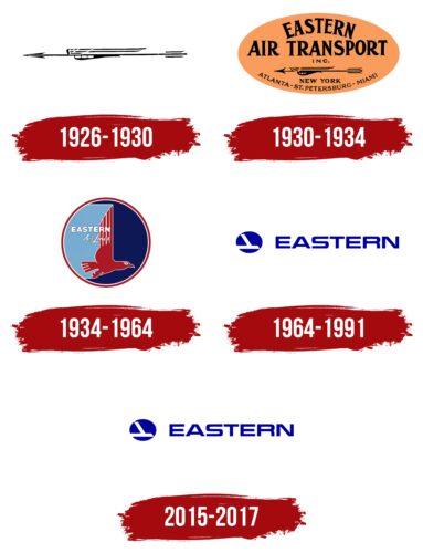
Between 1926 and 1930, Eastern Air Lines adopted its first official logo, the “Winged Arrow.” This symbol conveyed key brand attributes: speed, purposefulness, and the ambition to be among the top ten airlines for passenger service quality. The lower part of the design, resembling an airplane fuselage with windows, effectively linked the logo to aviation themes, highlighting the company’s focus on air transport. The company deliberately avoided additional text on the logo, prioritizing recognizability and clarity in its visual message. The central theme of the logo was speed: by choosing an airplane with a symbolic arrow, passengers could feel confident about reaching their destinations quickly and comfortably.
1930 – 1934
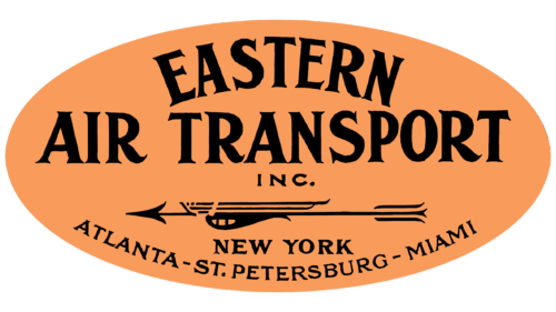
In the 1930s, Eastern Air Lines focused on developing its brand and enhancing market recognition. During this period, the airline was part of the so-called “Big Four,” a significant achievement that motivated further efforts to improve its image. New elements were added to the corporate style as part of these efforts. For instance, the arrow symbol was complemented with an oval orange background, which served an aesthetic function, emphasizing harmony and comfort in flights and carrying a specific meaning.
The choice of orange for the logo’s background was deliberate. Orange symbolizes a sunny and welcoming atmosphere and is directly associated with the flag of New York. This was significant as Eastern operated monopoly flights from New York to Florida, allowing passengers to travel to the warm state for vacation.
In the logo’s center, the company name—Eastern Air Transport—was prominently displayed, underscoring its primary activity of transporting passengers along the East Coast of the USA. Before being renamed to Eastern Air Lines, the company was known as Pitcairn Aviation, and this name change reflected the expansion and strengthening of the brand. Under the company name in the logo were the names of cities served by Eastern, further informing customers about the airline’s flight geography.
1934 – 1964
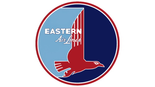
1934, a significant event occurred in the airline’s history: it officially changed its name to Eastern Air Lines. This change was accompanied by revision of the corporate logo, which was updated to reflect the company’s ambitions and values. The new logo included modified shades to emphasize the company’s patriotic spirit. The round background, symbolizing a seal of quality and a medal of leadership, along with the sun, highlighted the harmony and excellence of the services provided.
The logo’s color composition—light blue and dark blue—recalled the transition from day to night, as well as water and sky, symbolically representing the ability to fly at any time and navigate air routes over the blue ocean. This design element aimed to showcase the flexibility and extensive reach of the company’s route network.
At the center of the logo was a red bird, associated with Eastern as the American eagle—the nation’s primary symbol. This bird, depicted as soaring above all and ruling the skies, resembles a seagull inhabiting the Florida coast, adding local flair to the company’s image. The wings raised upward reminded me of the swiftness embedded in the brand’s concept, similar to the previous symbol—the arrow.
The white lettering of the company name added lightness and airiness to the image. In contrast, a white border around all emblem elements enhanced the sense of integrity and high quality. The updated Eastern Air Lines logo represented the image of a pioneering and leading company in aviation transport, proud of its role in providing fast and reliable flights for America.
1964 – 1991
2015 – 2017
Eastern Air Lines’ logo features a blue circle with two white stripes. The circle represents the sky, and the stripes form a stylized bird or airplane with an upward wing. To the right is the word “EASTERN” in bright blue, bold serif letters. The elongated shape of the letters gives a sense of movement, symbolizing growth and fast service.
The circle’s blue color and the name suggest reliability and trust. The white stripes indicate cleanliness and high standards. The bold serif font shows modernity and professionalism, emphasizing the airline’s quality service. The elongated letters create an illusion of movement, showing the airline’s efficiency and commitment to customer satisfaction.
The white stripes also symbolize streamlined operations and safety. The blue color evokes openness, freedom, stability, and trust. The stylized bird or airplane suggests agility and forward-thinking, key aspects of Eastern Air Lines. This design shows the airline’s dedication to progress and its ability to adapt.
The bold letters in “EASTERN” are impactful and elegant, reflecting confidence and heritage. The serifs add a touch of tradition, linking the modern company to its roots. The extended form of the letters creates a dynamic effect, indicating continuous advancement and improvement.


