Eastern Airways’ logo reflects the airline’s commitment to serving the United Kingdom, focusing on reliability and customer satisfaction. It symbolizes the company’s role as a critical link between regional and international routes, facilitating connections for people who rely on air travel for business, leisure, and essential services. Rooted in the traditions of British aviation, the logo offers a modern take on classic values such as punctuality, safety, and courteous service.
Eastern Airways: Brand overview
In 1997, aviation entrepreneur Brian Huxford embarked on an unusual journey, laying the foundation for Eastern Airways, a renowned British regional airline offering a wide range of domestic, international, and private charter flights. Departing on January 27, 1999, Eastern Airways embarked on its maiden flight from Humberside to Aberdeen, beginning a remarkable chapter in the company’s history. Since then, the airline has steadily climbed to new heights, prioritizing reliability and passenger satisfaction.
In 2002, Eastern Airways acquired Air Kilroe and rebranded the airline with a new name. This strategic decision proved fruitful as the company expanded its presence in 2003, establishing a crew base in Newcastle and opening flights to the Scandinavian region, Stavanger.
In 2010, Eastern Airways embarked on an ambitious expansion plan, entering into a strategic partnership with Aer Arann and acquiring Air Southwest’s route network and operating assets.
In 2014, Eastern Airways entered into an important partnership with the renowned Bristow Group, a leading provider of helicopter services to the offshore energy industry. This strategic alliance opened up new opportunities for Eastern Airways in the charter business, especially in the lucrative oil and gas sector.
Meaning and History
What is Eastern Airways?
It is a British regional airline based in Humberside, England. It operates scheduled and charter flights to the UK and some European destinations. The airline provides reliable and efficient air travel, catering to business and leisure travelers. It is known for its services, including corporate transfers, special charters, and scheduled routes. The airline’s fleet comprises various aircraft types suitable for short—and medium-distance flights.
1997 – 1999
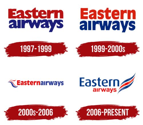
From 1997 to 1999, Eastern Airways actively worked on enhancing its image through the design of its logo, which conveyed power and strength as well as the cultural heritage of England. The logo featured red and blue hues, symbolizing the country’s national colors. The red in the logo referred to elements of the British flag and symbolized the speed and dynamic movement of the airline through the air. Blue was associated with the sky, providing a visual representation of the company’s safety and professionalism.
The logo design included two levels that metaphorically depicted the two shores—the country and the island—highlighting the airline’s initial route between Humberside and the Isle of Man. This design element emphasized the geographical aspect of Eastern Airways’ operations and their focus on a specific route.
The bold, large letters in the logo demonstrated the carrier’s technology’s reliability, self-confidence, and durability. These letters made the brand easy to recognize and reminded people of its solid structure and strength, essential qualities for the aviation industry.
1999 – 2000s
At the turn of the millennium, Eastern Airways updated its corporate style, including the logo, to better reflect the company’s evolution and adaptation to new times. The font became lighter and stretched upward as if reaching for the skies. This visual change gave the logo a sense of lightness and ambition, emphasizing the company’s pursuit of new heights in the aviation industry.
The logo design now included two words intertwined with each other, creating a dynamic yet harmonious image. This stylistic choice symbolized the energy and tranquility that are key to an airline striving to ensure comfort and safety for its passengers. The interweaving of the words reflected the connection between innovation and tradition that the company aimed to balance in its development.
This emblem symbolizes the reliability and professionalism that Eastern Airways is known for as a British regional airline.
2000s – 2006
In the latest logo design, Eastern Airways used blue and red waves that create the impression of fluttering in the wind. This technique gave the logo a sense of lightness and dynamism, which is important for an airline that aims to highlight its modernity and adaptability to changes. Each of the three elements in the logo symbolized one of the company’s flight routes—between England, Scotland, and Ireland, emphasizing the expansion of the carrier’s geographical reach and service.
A thin element at the top of the logo had special significance, symbolizing the company’s attention to young passengers. Eastern Airways was the first company to offer free flights for children under two years old, highlighting its focus on family values and comfort for passengers of all ages.
The company name was written in a single continuous line, symbolically conveying the extended flight distances and the continuity of service. Using different colors to separate the words added a visual accent and enhanced brand recognition. The red and blue color scheme continued to emphasize that Eastern Airways operates exclusively within the United Kingdom, maintaining national colors in its corporate symbolism and strengthening its position as a reliable domestic carrier.
2006 – today
Eastern Airways’ logo features bold red and blue colors. Red represents the company’s purpose, while blue symbolizes flight and the sky. These colors make the logo stand out. The top line of the logo has semicircular letters with sharp ends, giving a modern look. The bottom line has smaller letters in a different font. Three alternating stripes are on the right side.
The vibrant red and blue colors draw attention and convey energy, determination, trust, and professionalism. This color choice highlights the airline’s commitment to excellence and reliability. The semicircular letters with sharp ends add a dynamic feel, and the lack of serifs keeps the design clean and contemporary. The font variation between the top and bottom lines adds visual interest and shows the company’s versatility.
The three alternating stripes suggest movement and progress, representing different routes or services. These stripes align with the airline’s mission to connect people and places.
