“You can buy anything here,” says the eBay logo. A wide range of goods is promised by a bright and colorful emblem of the trading platform. And in addition to the best lots, a chic mood that appears after successful purchases.
eBay: Brand overview
| Founded: | September 3, 1995 |
| Founder: | Pierre Omidyar |
| Headquarters: | San Jose, California, U.S. |
| Website: | ebay.com |
Meaning and History
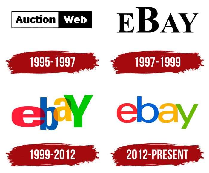
EBay’s logos reflect its evolution from a quirky startup to a successful online marketplace. It all started in 1995 when AuctionWeb appeared – an add-on to Pierre Morad Omidyar’s site. The auction with the original business model grew rapidly until it evolved from a flea market to a direct selling platform. Its visual identity changed after each rebranding, but the last two emblems became the most memorable.
What is eBay?
This is both an American corporation and its trading floor. EBay’s core business is online auctions.
1995 – 1997
AuctionWeb was born at the dawn of online trading just four years after creating the World Wide Web. It is clear that her first logo by today’s standards was primitive: it looked like one large horizontal rectangle divided into two small ones. On the left side (white) was the black word “Auction,” and on the right side (black) was the white “Web.” Pixel graphics were used for the inscription: the individual points that made up the letters were visible.
1997 – 1999
In 1997, the AuctionWeb marketplace changed its name to eBay, so it was forced to update the logo. Designers have come up with nothing better than writing the black word “EBAY” on a white background. To do this, they used the most common font, Times New Roman. All letters were in capital letters, but the “B” stood out noticeably.
1999 – 2012
At the turn of the millennium, the company turned to Californian advertising agency CKS Partners to increase visitor traffic. The main marketing tool was a change of image, which involved updating the logo. The redesign was entrusted to a newly hired Elissa Davis employee. This was her first job at CKS Partners.
Elissa later admitted that she was inspired by two unrelated things: the Twister game and the Apple logo. From the first, she took mobility, and from the second – an ardent palette. The result was a bouncing eBay lettering with each letter in a different color. The red “e,” blue “b,” yellow “a” and green “y” were alternately superimposed on each other to symbolize a sense of community.
2012 – today
The iconic eBay mark lasted 17 years until a new design was created by the branding company Lippincott. They kept the lettering and color scheme but completely redesigned the font to balance eBay history and modernity. The logo as a whole has become more orderly, which is what the developers wanted. It has been in use since mid-October 2012.
eBay: Interesting Facts
eBay, started by Pierre Omidyar in 1995, has evolved from a site for trading collectibles to a major global online marketplace.
- First Sale: The first item sold was a broken laser pointer for $14.83, highlighting eBay’s role in connecting niche markets.
- Original Name: Initially called AuctionWeb, eBay was renamed in 1997 and became a well-known brand for online auctions and shopping.
- Feedback System: eBay introduced a feedback system allowing users to rate each transaction, fostering trust and accountability within its community.
- Billion Listings: By 2015, eBay had listed its billionth item, showcasing its extensive offerings.
- Worldwide Operations: eBay runs local versions of its site in various regions and languages, supporting global transactions.
- PayPal Acquisition: eBay bought PayPal in 2002, making it a primary payment method. Though eBay and PayPal separated in 2015, PayPal remains a popular choice for eBay payments.
- Charitable Auctions: Through eBay for Charity, sellers can donate part of their proceeds to nonprofits, raising significant funds for various causes.
- Wide Range of Items: eBay is known for its diverse inventory, including everyday goods, rare collectibles, and high-value items like yachts and jets.
- eBay Motors: This specialized section for vehicles and automotive parts, launched in 2000, has become a leading marketplace for automotive sales.
eBay has transformed the online shopping and selling landscape, offering a platform where almost anything can be bought or sold, fostering a community bound by shared interests and transactions.
Font and Colors
The company’s logo reflects its name, which was adopted in 1997. When Pierre Morad Omidyar wanted to create the EchoBay website, the domain name was taken, and the abbreviated version of eBay was free. The designers played with this word, presenting it in the form of a multi-colored inscription. Now the letters are not as randomly arranged as they used to be, but they still touch. Their bond symbolizes the indivisible eBay community.
Designer Dianna McDougall has shed some light on some facts about the logo. She said that the global online marketplace had chosen the traditional Univers Extended font – the same font that Microsoft used for its new text mark. This makes the inscription seem simple and solid.
After the redesign, the color scheme remained the same. For the first letter, I used Deep Carmine Pink (# E53238), a dark red shade. For the second – True Blue (# 0064D3), for the third – American Yellow (# F5AF02), and for the fourth – Dark Lemon Lime (# 86B817).
FAQ
What does the eBay logo mean?
The logo represents the diverse and vibrant community of buyers and sellers on the platform. It features the brand name in colorful, overlapping letters, symbolizing variety and interconnectedness.
The primary colors in the logo—red, blue, yellow, and green—are similar to the Google logo. These colors highlight eBay’s wide range of items and information, emphasizing its vast marketplace.
The overlapping letters show the connection and unity within the eBay community. This design choice conveys that the platform is where people come together to buy, sell, and connect over shared interests.
What is the eBay logo type?
The logo is based on the Univers typeface, except for the first version, which was not officially recognized as the logo. Univers is a clean and modern typeface that gives the logo a distinctive and professional look. This typeface aligns with the brand’s image, emphasizing clarity and simplicity while maintaining a vibrant and approachable feel.
The logo’s colorful and overlapping letters symbolize the diverse and interconnected community of buyers and sellers on the platform, making it easily recognizable.
What is the eBay logo?
The logo features the company name in lowercase letters, colored in red, blue, yellow, and green. This vibrant design reflects the dynamic and diverse marketplace that the brand represents.
The lowercase letters make the logo friendly and approachable, inviting users to explore the platform. The bright colors symbolize the variety of products available on eBay, emphasizing its wide range of items. The clean and modern design aligns with the brand’s commitment to a user-friendly and accessible platform.
Can you use the eBay logo?
Since the logo is copyrighted, you can only use it with written permission from the company’s executives. This ensures the logo is used correctly and protects the brand’s identity.
Unauthorized logo use can lead to legal issues, so following company rules and getting the necessary permissions is important. This helps maintain the brand’s integrity and ensures it is represented accurately and respectfully.
Has eBay changed its logo?
Yes, the brand has changed its logo several times since it started, with the most recent change in 2012. The 2012 redesign updated the logo from playful, overlapping letters to a more streamlined and modern look.
The new logo kept the colorful letters but aligned them neatly and reduced the overlaps. This change reflected the company’s evolution and commitment to a cleaner, more contemporary style. The colors—red, blue, yellow, and green—were retained to maintain brand recognition.
This redesign aligns with the brand’s mission to provide a user-friendly and trustworthy platform for buyers and sellers worldwide.
When did eBay change its logo?
The brand has changed its logo several times, with the most recent change in 2012. This redesign moved from the playful, overlapping letters to a more streamlined and modern look.
The new logo kept the colorful letters but aligned them neatly and reduced the overlaps. This update reflected the company’s growth and commitment to a cleaner, more contemporary style. The colors—red, blue, yellow, and green—were retained to ensure continuity and maintain brand recognition.
Since the update, the logo has stayed the same, representing eBay’s identity as a vibrant and reliable online marketplace.
