Looking at the Edeka logo, you can see how individual merchants form an impressive conglomerate in terms of volume. The emblem shows a wide assortment, a single-price policy, and large audience coverage. Stores purchase the brand’s products throughout Germany.
Edeka: Brand overview
| Founded: | 1907 |
| Headquarters: | Hamburg, Germany |
| Website: | edeka.de |
Meaning and History
The name Edeka began to be used in 1911. The fact is that the abbreviation E. d. The K., from which it is derived, seemed too short to the company’s owners, and the full version (Einkaufsgenossenschaft der Kolonialwarenhändler im Halleschen Torbezirk zu Berlin) was too long. However, November 25, 1907, is still considered the official date of the group’s creation. It was then that several trading cooperatives united into an association, which later turned into Edeka Zentrale Stiftung & Co. kg.
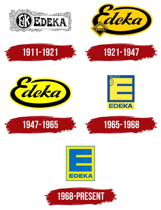
Now the organization owns several thousand stores throughout Germany. Many of them are run by independent traders who have volunteered to join Edeka. They use a common logo called Block-E: a large blue “E” in a yellow square. But this was not always the case because the brand’s visual identity changed several times. Its history can be divided into five periods.
What is Edeka?
Edeka Group is an association of German cooperatives. This organization operates numerous discounters and full-range supermarkets. It is the undisputed leader in the ranking of food retailers in Germany: it owns more than a quarter of the market in the food retail sector.
1911 – 1921
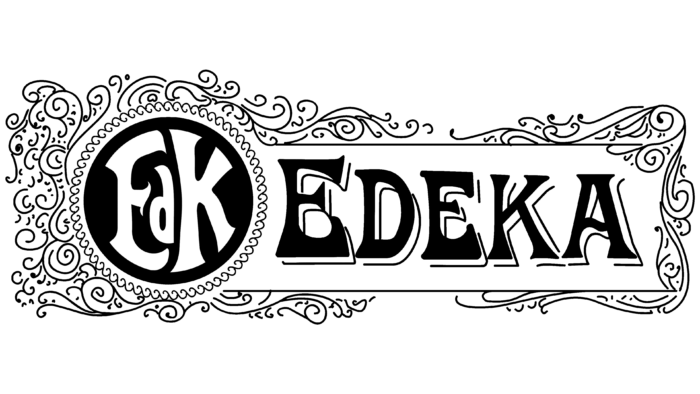
The Edeka trademark was officially registered in 1911. Its name served as the basis for the emblem: it was depicted in an old serif typeface and placed inside a white rectangle. The letters were all capital and black, and the thin outlines made them appear three-dimensional. And on the left, in a black circle, was the abbreviation “EdK.” The designers had to deform it so that it reached the borders of the circle. The inscriptions were placed in a figure frame consisting of numerous scrolls.
1921 – 1947
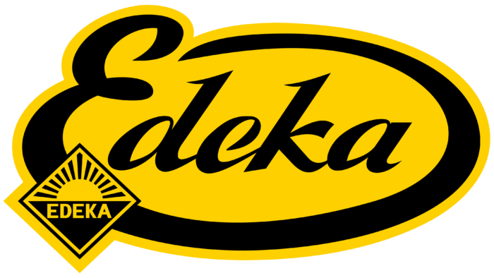
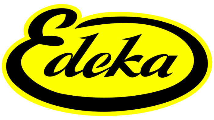
In 1921, Edeka had a new CEO, Fritz Borrmann, and a similar new logo. The graphic sign was called “Schleife” (“Loop”) because of its characteristic shape: the lower line of the capital letter “E” formed an oval, in which lowercase “d,” “e,” “k” and “a” were enclosed. Moreover, except for the first one, all characters were connected to each other. A handwritten font with sharp serifs at the tops was used for the inscription. The word was black and was on a yellow background. And in the lower-left corner was a diamond, divided into two parts: an inverted black triangle with the brand name (below) and a rising sun with 13 rays (above).
1947 – 1965
In 1947, the cooperative EDEKA Importe GmbH was founded for the import business. In the meantime, the company’s emblem has changed a little: the diamond has disappeared, and the yellow base has acquired a cold lemon hue.
1965 – 1968
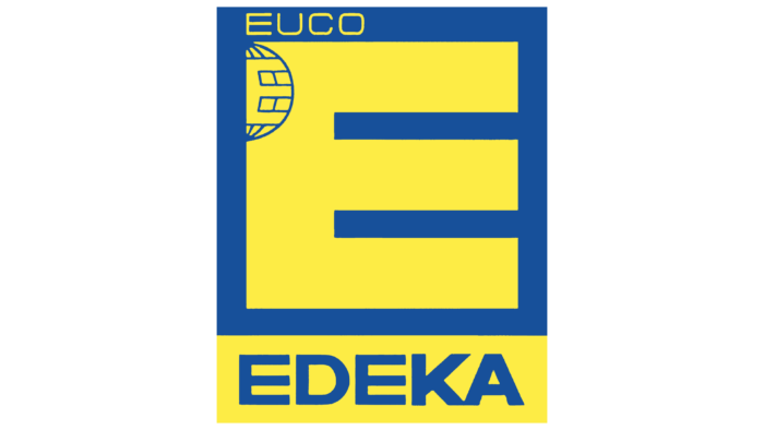
When the new labeling rules came into effect, a group of German cooperatives abandoned handwriting. The result was the famous Block-E, which at first looked like a yellow “E” in a dark blue quad. In the upper left corner of the letter was a small “E”: it was stylized as parallels on the Earth’s grid. A little higher was the word “EUCO.” The bottom contained a yellow horizontal rectangle with the blue inscription “EDEKA.” The brand name used a straight, bold sans-serif font.
1968 – today
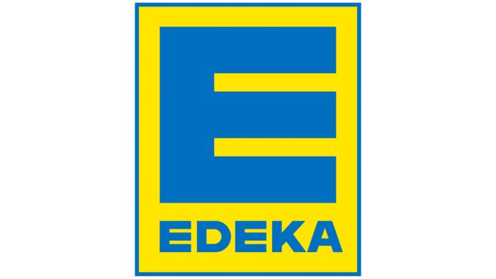
Shortly before the band’s reorganization, its logo was changed again. This happened in 1968, the same period when the subsidiary MK-Werbe GmbH, responsible for the conceptual design of advertising, became part of Edeka. The Block-E format was preserved, but the developers removed many elements, leaving only the “E” and the word “Edeka” inside a single vertical rectangle. Moreover, the inscriptions have become light blue, and the base is now bright yellow and has a border in the form of a thin blue line.
Font and Colors
The letter “E” symbolizes the abbreviation E. d. K., which underlies the brand name. That is, this is a tribute to the historical heritage of the company – simple but not too obvious to modern consumers. Geometrically defined shapes create a balance that makes Block-E attractive.
If earlier the word “Edeka” was written in an elegant cursive type, now its complete opposite is used: a visually heavy sans serif with bold letters. It is roughly similar to Bicyclette Black by Kostic Type Foundry or Favela Semi Bold by BORUTTA.
The combination of light blue (#006cb8) and bright yellow (#ffe700) became a staple in the late 1960s. It builds on the previous color scheme that appeared in 1965 with the first version of Block-E. Since then, Edeka stores have been recognizable by this eye-catching palette.
Edeka color codes
| Light Blue | Hex color: | #006cb8 |
|---|---|---|
| RGB: | 0 108 184 | |
| CMYK: | 100 41 0 28 | |
| Pantone: | PMS 285 C |
| Bright Yellow | Hex color: | #ffe700 |
|---|---|---|
| RGB: | 255 231 0 | |
| CMYK: | 0 9 100 0 | |
| Pantone: | PMS 803 C |
