![]() Edmodo Logo PNG
Edmodo Logo PNG
The Edmodo logo looks like a good friend to the user. A caring mentor helps transfer the necessary knowledge to students and serves as a reliable conduit for the Internet. In the emblem’s symbols, messages, and videos, the information is encrypted, which helps with training.
Edmodo grew out of school technology work in Illinois. Nick Borg spent seven years as a webmaster in the Kaneland Community Unit School District. At the same time, Jeff O’Hara worked as a network administrator and web developer. Both saw the same problem: teachers needed a safer online space for class communication. Crystal Hutter later joined the team with experience from Oracle and Omidyar Network.
The platform launched in September 2008. In two weeks, it had more than 1,700 users, mainly through teachers sharing it on professional networks and Twitter. Edmodo used familiar Facebook-style tools, including a feed, posts, and notifications. Still, access to class groups was closed through unique codes. The service was free from the start.
In 2010, Edmodo raised $7.5 million from Index Ventures, Greylock Partners, Union Square Ventures, and other investors. By its second birthday, it had passed 500,000 users. In 2012, it won a Webby Award, raised another $25 million, and reached more than 7 million users. In 2013, it bought Root-1, and in 2014, it launched Snapshot for student assessment.
By 2015, Edmodo had about 60 million registered users, but Google Classroom and Canvas had already reshaped the market. In 2017, a data breach affected 77 million accounts. NetDragon Websoft bought Edmodo in 2018 for $137.5 million. The platform surpassed 100 million users in 2019 and closed on September 22, 2022. In 2023, the FTC case over children’s privacy led to a $6 million penalty and a permanent order limiting Edmodo in the U.S.
Meaning and History
![]()
Throughout the educational platform’s existence, the logo used for visual brand recognition has changed only once. Moreover, we are talking about a radical update, because the main element of the first version was the system’s name, and subsequent edits were directly tied to adding an image.
Throughout the project’s development, brand recognition remained high. The use of bright and friendly colors facilitated this. Thus, the logo looks modern and fresh, clearly conveying the project’s goals and ambitions. The hospitable character is also conveyed through lowercase letters, effectively depicted in dark blue.
The “Edmodo” emblem used as the platform’s icon is a lowercase “e” with three vertical stripes. Each of them symbolizes one element of the educational process: progress, ideas, and education.
What is Edmodo?
First of all, it is a global information system functioning in school education. With such a platform, teachers have the opportunity to continue their education under quarantine restrictions and other circumstances that negatively affect the educational process.
2008 – 2013
![]()
The first version of the logo existed for the first five years after the platform’s launch. The main element is the project’s name, which is located inside the dialog symbol. The classic dialog element, which points to the user sending the message, is on the left. The verbal inscription is set in italics, with lowercase, rounded letters. The brand name is written in blue on a white background. The outlines in the dialog symbol are shown in blue.
Thus, this logo variation directly indicates the interaction and the dialogue between the participants in the educational process.
2013 – today
![]()
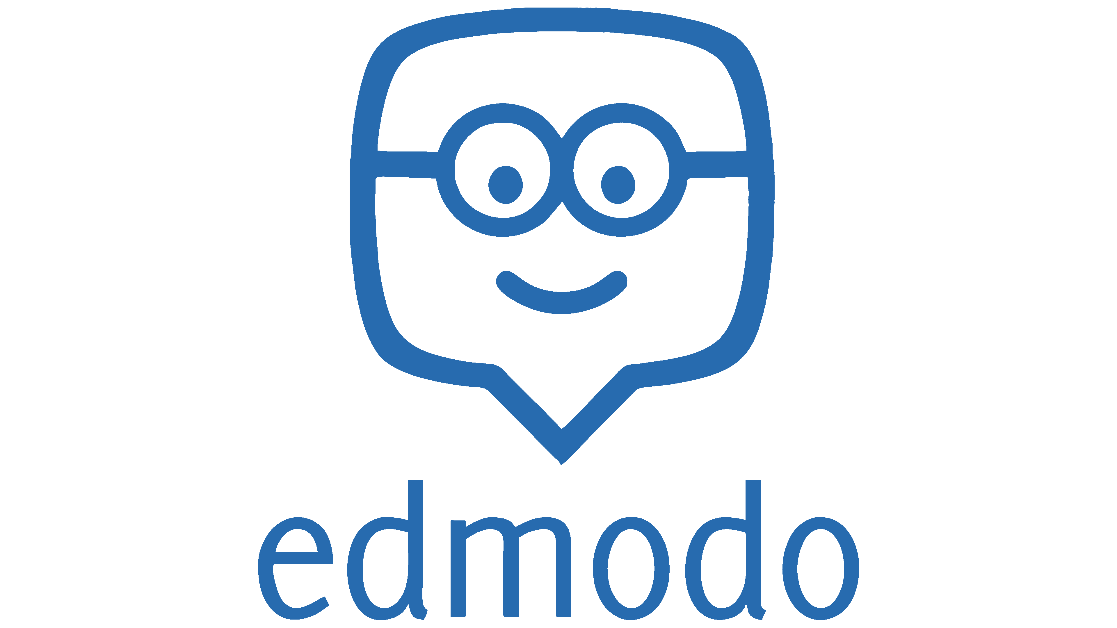
After the educational platform Edmodo became one of the most popular globally, its management decided to change the logo. The color palette remained unchanged, consisting of blue and white. However, the verbal inscription is now depicted separately from the “dialogue” element. Moreover, this image has become more friendly to potential resource customers. After the changes were made, it resembled a human face. Glasses and a smile have been added. The brand name used a classic font, but now starts with a capital “E.” In addition, the italic font has been removed.
Font and Colors

A bold sans-serif font was used to create a word inscription on the logo, as close as possible to the classic Times New Roman.
The blue-and-white color palette has become a classic for the platform logo. In conjunction with its logo, icons, and other visual elements, Edmodo is perceived positively by users worldwide. In turn, yellow was used for the emblem, and the letter “e” itself was depicted in dark blue.