


 Eibach Logo PNG
Eibach was founded in 1951 by Heinrich Eibach in Rönkhausen, Germany. The company began as a manufacturer of springs for industrial use, before its work gradually moved toward the automotive sector. Over more than seven decades, Eibach has developed its product range around springs, suspension components, and automotive accessories.
A turning point came in 1975, when the company created its Chassis Technology division. This shifted Eibach toward automotive suspension development and broadened its role beyond industrial spring production. The brand later became known among motorsport teams and car enthusiasts, with products used in vehicles where handling, suspension setup, and road behavior mattered.
International growth followed in the late 20th century. In 1988, Eibach opened its first US branch, marking a new stage outside Germany. In 1994, the company opened its first Chinese branch, expanding its presence in Asia alongside European and American operations. Its global structure later included manufacturing facilities in Germany, the United States, and China.
In 2000, Eibach AG became the holding company, and the organization was restructured for its next stage of activity. In 2013/14, Eibach opened a new 10,000-square-meter production facility in Finnentrop, Germany. The expansion added capacity to its work in springs, suspension parts, automotive components, and accessories for road cars, motorsport, and enthusiast use across several markets.
Meaning and History
What is Eibach?
This company manufactures suspension components and technical springs for automobiles and industrial equipment. The product range includes chassis, suspension systems, and specialized springs. The main production facilities are in Germany, and the company is part of an international industrial group.
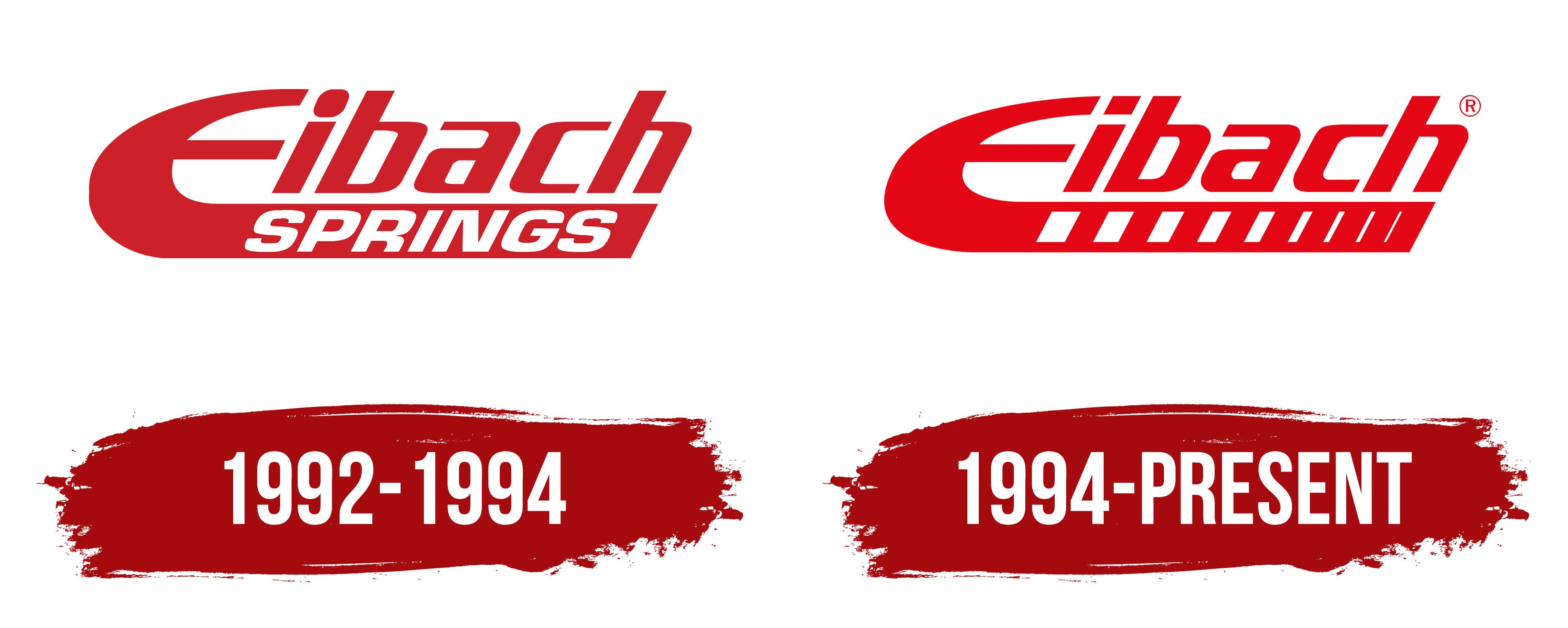
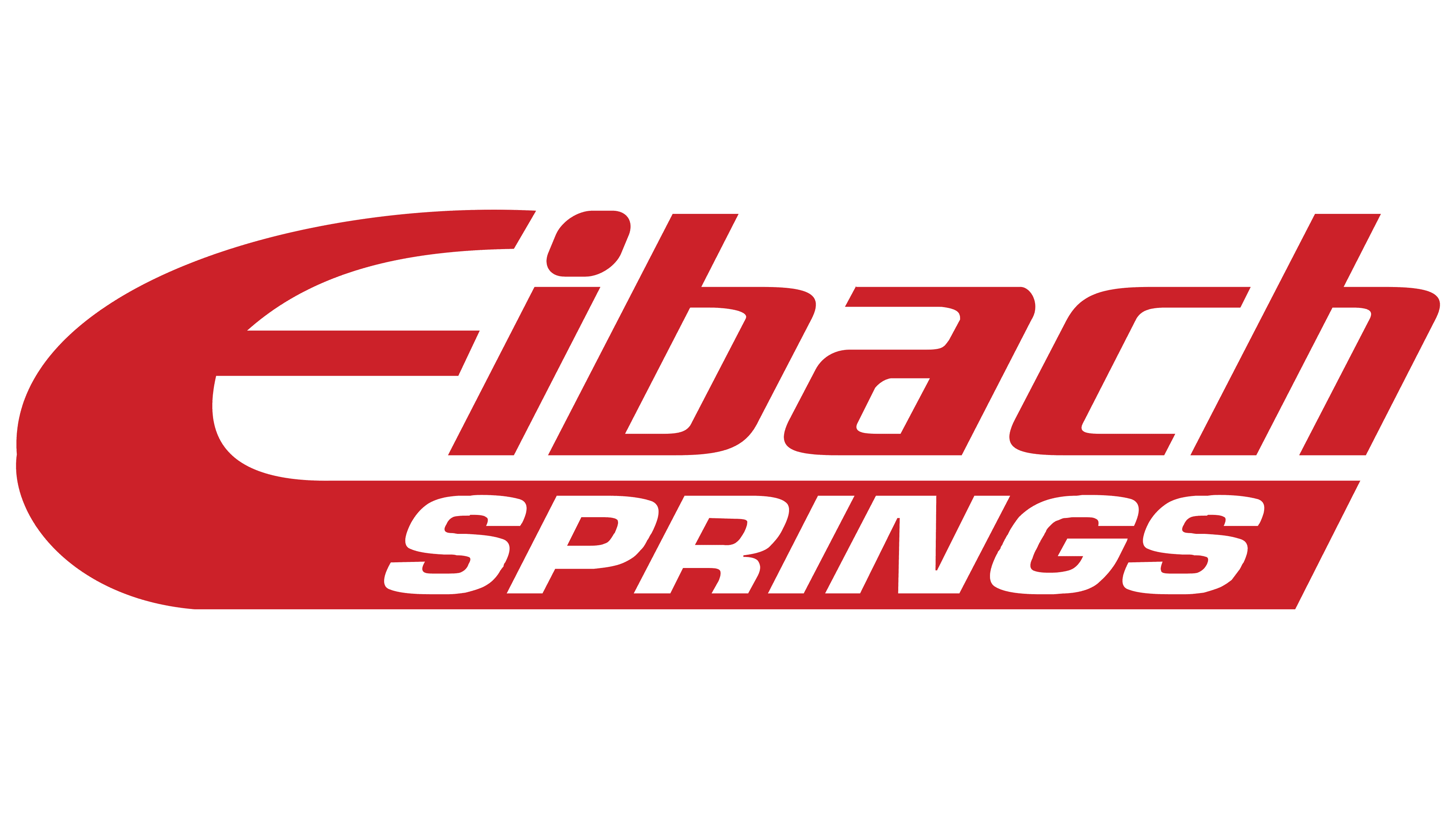
1992 – 1994
1994 – today
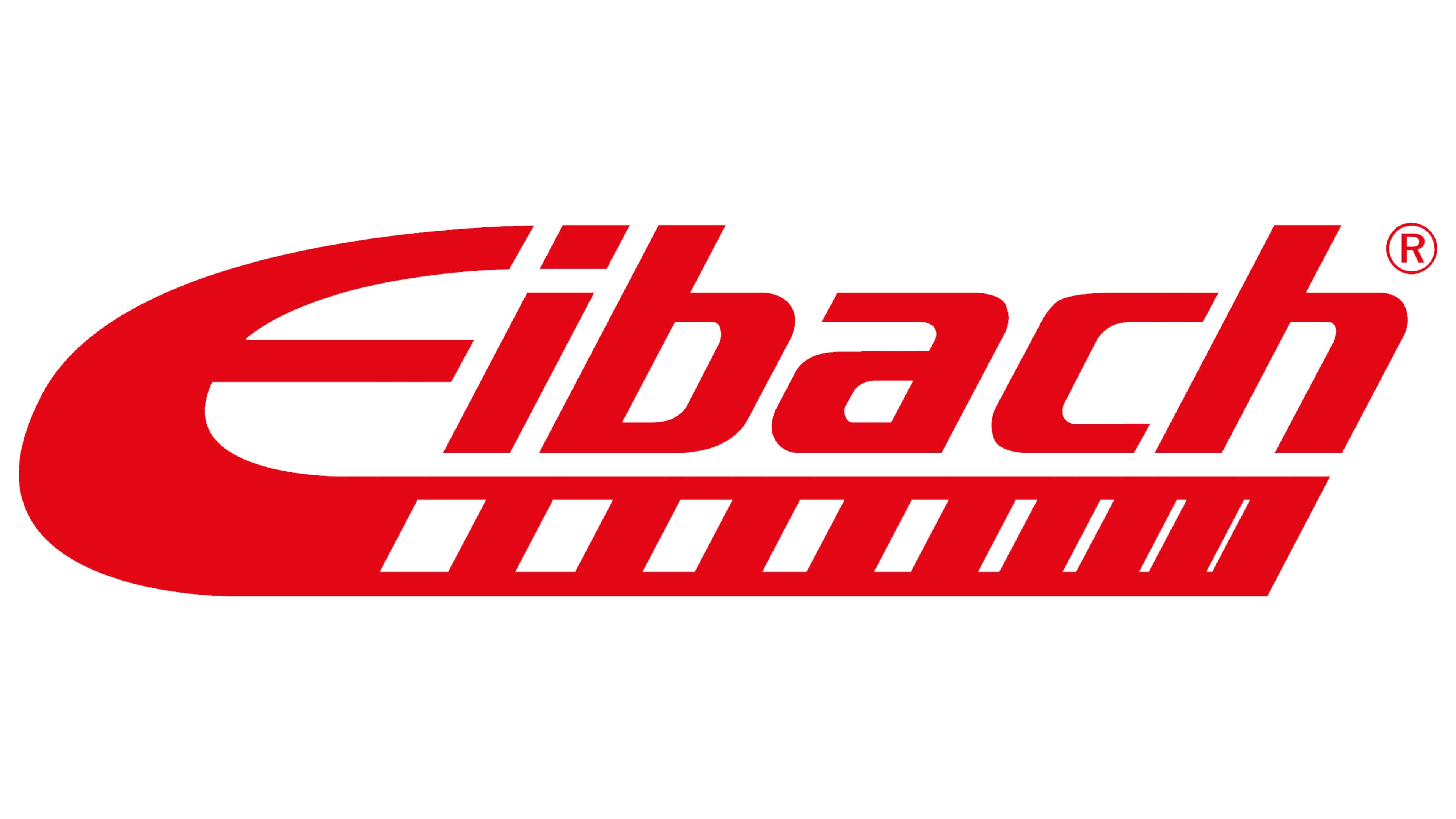
The Eibach logo features a dynamic, expressive design that reflects the company’s focus on performance and engineering precision. At the core is the stylized letter “E,” distinguished by its extended lower stroke, which flows into a horizontal underline running beneath the rest of the company name. This underline features nine rectangular cutouts, decreasing in size from left to right, illustrating mechanical components and emphasizing the brand’s technical expertise.
These cutouts resemble elements of complex machinery and suggest adaptability across various vehicle configurations. Though reminiscent of film perforations, the intent emphasizes technical refinement and mechanical accuracy, key attributes of Eibach’s suspension systems and springs.
The bright red color of the logo conveys strength, speed, and energy. Its intensity evokes the atmosphere of motorsports, where Eibach products are widely used. The forward-leaning italic font enhances the impression of motion and innovation, reinforcing the brand’s orientation toward high-performance engineering.
The typeface is clean and modern, free from decorative elements, which supports readability and strengthens the logo’s technological character. The letterforms are well-proportioned with smooth curves, projecting professionalism and a meticulous approach to product development.
The brand name reflects the company’s German origin and its strong reputation in the global market. Known for its advanced engineering capabilities, Eibach successfully communicates these qualities through a logo that blends boldness, motion, and precise detail, establishing a lasting image of reliability and innovation.