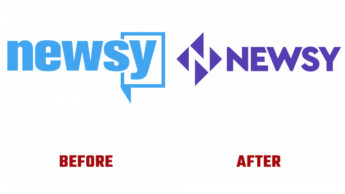
EW Scripps division – Newsy streaming news service was relaunched on 01 October 2021. She changed her style and visuals while creating broadcast coverage across the country. Following the change of direction, the channel changed the situation to change its appearance and create a new studio in Atlanta. The new image was developed and implemented by the Elevation design studio. Among the tasks that the agency set for itself was the need to reflect the new features of the news channel, which became free around the clock, effectively becoming a new broadcast brand.
The studio has completed a large amount of work, which covered creating a unique logo, aesthetic component, dynamic “live” graphics, the development of unique tools, and analysis and monitoring of future content, elements of a new identity in social networks. The latter included the development of the appearance depending on the time of day, the distribution of the volume of the show, which will be held in prime time. Considering such a large amount of work, it was required to perform several tasks at once simultaneously.
The logo was sent to development first. A creative approach allowed us to find an original solution for the emblem in control arrows on consoles. The arrows have been graphically designed so that negative space shapes the visual perception of the letter “N” – the first letter of the channel’s name. The arrows have become a symbol of balance, the desire to maintain everything at the same level, without any deviations to the left or right. The sign itself consists of 4 arrows, two each pointing in the same direction. Thus, the symbol demonstrates its neutral attitude to any political news, leaving the choice of priorities for the viewers.
It was also important to consider the depth of the color palette, which will demonstrate the depth of news and information, making the depth more important than superficial coverage of events and various debates. The geometry of the triangles also contributed to this. It was especially important to correctly identify the potential consumer, his interests, embracing both the old guard and modern youth. A brilliant purple-blue hue dominated by a gradient from red to blue, in which the arrows and the brand name are made, helped to reflect this. The name is executed in a lowercase font like Cera PRO Black by TypeMates; the letters create a single even composition, demonstrating friendliness and openness. The letters “N,” “W,” and “Y” acquired some peculiarities in the form of changes in the height of the lid, which made the perception of the text very easy to remember and well-read at any scale.
All together – color, font, textures, and three-dimensional elements – created a single unique composition that made the visualization of the brand unique.
