


![]() England Logo PNG
England Logo PNG
The Football Association uses an emblem that signifies its connection to the home country. The England logo features important national symbols that reflect the organization’s incredible patriotism. Even the colors here are chosen deliberately; each one carries a deep meaning.
The England national football team began in 1872 with a 0:0 draw against Scotland, the first official international match. In the early 20th century, the team dominated the British Home Championship but did not participate in global tournaments.
England entered FIFA competitions in 1950 and lost its first FIFA World Cup match to the United States. The peak came in 1966, when the team won the FIFA World Cup at home, defeating West Germany 4:2 after extra time. Geoff Hurst scored a hat-trick, and Bobby Moore captained the side.
After 1966, results declined. England failed to qualify for the 1974 and 1978 World Cups. In 1990, the team reached the semi-finals but lost to West Germany on penalties. Euro 1996 followed a similar path with another shootout loss to Germany.
Between 1996 and 2006, the squad included David Beckham, Steven Gerrard, Frank Lampard, and Michael Owen. Despite strong line-ups, results remained unstable, including failure to qualify for Euro 2008 and early exits in 2010 and 2014. Euro 2016 ended with a loss to Iceland.
In 2016, Gareth Southgate became head coach. England reached the 2018 World Cup semi-finals and the Euro 2020 final, losing to Italy on penalties.
The “Three Lions” emblem derives from medieval heraldry associated with the Plantagenet dynasty and features three lions linked to Richard the Lionheart.
Meaning and History
![]()
In 1872, during the first international match against Scotland, the English needed a logo to symbolize national pride. Therefore, they chose the “Three Lions”. Gold and red were replaced by blue and white. White formed the foundation of the English flag and the flag of Saint George. The three lions are depicted on the Royal Coat of Arms of England, so the Football Association asked the royal family for permission to use them.
The 10 Tudor roses are the white and red flowers on the English emblem, symbolizing reconciliation between the Yorks and Lancasters after the War of the Roses in 1485. It’s unclear why there are exactly ten roses. Perhaps it signifies the number of players. But where is the goalkeeper?
The England national football team, which defends the country’s honor in international competitions, has had several versions of the same emblem since the 1950s. All seven versions are the same rectangular heraldic shields with a sharp base. Inside them are depicted three guardian lions and ten Tudor roses.
The heraldic animals are taken from King Richard I’s seal, symbolizing the team’s patriotism. The roses represent the ten divisions of the Football Association, one for each. However, traditional colors did not appear immediately: from 1879 to 1949, the shield with lions was adorned only with a crown, which subsequently disappeared.
Since 2003, the England national football team has periodically used an emblem featuring a five-pointed star, positioned where the crown used to be. It symbolizes the victory in the 1966 World Cup.
What is England?
England is the national team representing England in international football competitions. It is managed by the Football Association. It is one of the oldest and most successful teams, having won many major tournaments. The team played its first match in 1870.
1879 – 1950
![]()
Three identical, schematically drawn lions in crowns, each raising a paw, are depicted one above the other. The lions look exactly alike and have an identical pose. Behind them is a pentagonal coat of arms, the two lower corners of which are rounded. Above it is a large imperial crown, skillfully trimmed with red velvet and blue sides. The repetition of lions and the use of a crown lend the image a regal, authoritative character, while the geometric shapes create a sense of stability and structure.
1950 – 1993
![]()
There was a time when lions were depicted surrounded by roses, with three flowers depicted above each animal. These elements harmoniously combined when roses separated the lions, outlining the boundaries of their individual space. This time, all three representatives of the animal kingdom are depicted in the ornate baroque style, abounding in rounded details, swirls, and spikes.
The lions’ manes and faces resemble artificial masks, and their poses are relaxed: the front paws are stretched out, and the back paws are drawn back. Such an arrangement suggests that the kings of the beasts have comfortably stretched out, content with their possessions.
The emblem’s color palette is dominated by dark blue and red, creating a rich, bold visual effect. The background of this design forms a triangular shield, adding a sense of tradition and formality to the overall composition. The union of lions with roses embodies elegance, while the pronounced baroque elements lend sophistication. The emblem resonates with power and grace, balancing between authority and calm.
1993 – 1998
![]()
In the refined design, special attention was given to the flower sizes: the roses gradually decreased in size from top to bottom. The upper roses are depicted prominently, while the lower ones are significantly smaller. Such a change in scale lends depth to the visual representation and creates an appealing effect that draws the gaze.
The images of heraldic lions express a sense of superiority. The beasts demonstrate their dominance and power to those they encounter. To emphasize their importance, the animals’ tongues and claws are painted red, creating a bright contrast against the blue background. These details lend to the composition’s liveliness and vividly highlight the animals’ features.
Under the shield, which now has a rounded bottom end, is the word “England.” All letters are uppercase, and the font is adorned with tiny serifs. The textual element lends a formal and dignified aspect to the overall design, linking the emblem to its national identity.
The combination of visual elements in this design, including the gradient of the roses, color contrast, the lions’ assertive pose, and the inclusion of the country’s name, all contribute to creating a symbol that embodies pride, elegance, and a sense of historical continuity.
1999 – 2003
![]()
In the updated design, the artists made several noticeable changes to achieve a more cohesive, vivid visual experience. They brought all parts of the lions closer to their torsos, which had previously been spaced apart (e.g., one paw and the head). This adjustment gives the lions a more unified and powerful look.
The claws and tongues were enlarged, adding boldness to the animals’ expressions. Additional attention to detail was paid by adding spikes to the roses, enhancing their realism and texture. These changes enhance the emblem’s impression of regality and authority.
The knightly shield was narrowed, giving the overall design a sleeker, more modern look. Perhaps the most significant change was the dark blue rectangle above the coat of arms. It is now adorned with the white word “England,” set in a font that mimics a simplified Old English style, a clear nod to the country’s heritage.
The new placement of the country’s name above the heraldic elements lends the design a particular significance and pride. The dark blue background creates a dignified contrast, highlighting the inscription, and the font’s stylistic choice links the logo to traditions and history.
These design changes resulted in a more sophisticated and cohesive emblem, combining historical and contemporary aspects of symbolism and embodying a sense of national identity and strength.
2003 – 2009
![]()
The logo transformed, reflecting a more modern design approach and moving somewhat away from the baroque style. The abundant swirls and spikes disappeared, and the bodies of the lions ceased to be as elongated as before. The animals themselves look less menacing, permeated with a sense of calm elegance.
The lions now have shorter manes and soft facial features, lending their appearance a gentleness. Interestingly, the third lion differs from the first two: it is smaller and raises one front paw. This subtle variation is a response to the knightly shield’s specific design, which tapers towards the bottom.
The flowers on the emblem have been changed: classic red petals, a yellow center, and green accents. Such a color scheme lends the emblem a sense of freshness and naturalness, contrasting with the more stylized depiction of the lions.
The inscription above the shield is done in a smooth sans-serif font, a departure from the previous Old English style. Such a choice gives the logo a more modern, accessible look, enhancing readability while maintaining a dignified appearance.
The revised logo represents a balanced combination of tradition and modernity. While retaining key elements of historical symbolism, the new design introduces a more subtle and streamlined aesthetic. As a result, the logo resonated with a broad audience, paying homage to the cultural heritage it represents and creating a harmonious chord between the past and present.
2009 – 2012
![]()
The football organization decided to simplify the logo, removing the inscription above the shield. Designers implemented this change without altering other design elements. However, a subtle adjustment was made to the color palette: the dark blue shade that previously dominated the emblem was lightened.
This seemingly minor change noticeably affected the logo’s overall appearance. By lightening the blue, designers gave the emblem a fresher, more accessible look. The absence of the inscription gives the emblem a cleaner and more focused look, allowing the other elements to stand out more prominently.
2012 – 2013
![]()
Maintaining the same style and outlines of the lions and roses, the creators of the new logo decided to make everything in bold red.
This is not a hue change; it represents a significant shift in the logo’s visual appeal. The red color conveys passion, energy, and strength, closely aligning with the values typically associated with sports and competition.
The red uniform creates a cohesive and striking image, making the logo recognizable and distinctive. It allows a new emphasis on the details of the lions and roses, highlighting their shapes and designs without the distraction of numerous colors.
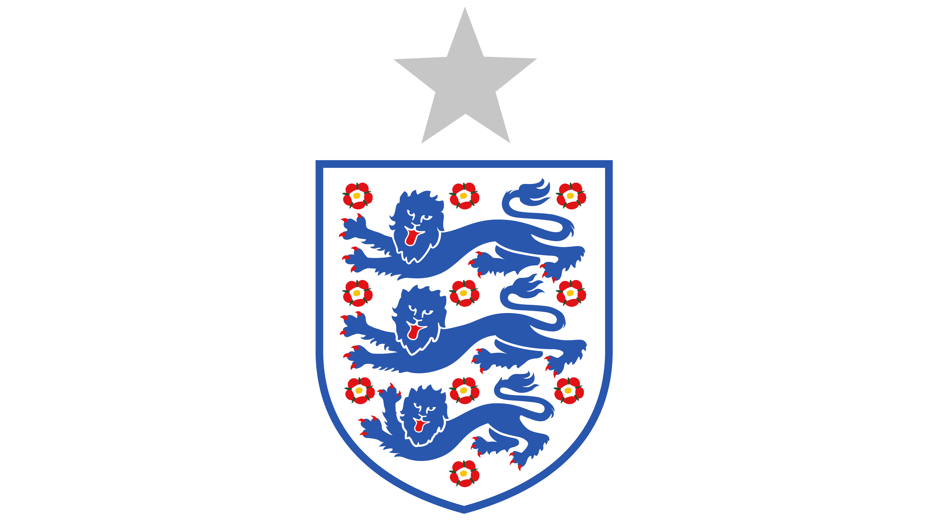
2013 – today
![]()
The England national football team returned to its 2009 logo, a symbol that meets modern requirements while retaining traditional heraldic images. In this version, the three lions are depicted without excessive decoration, bends, or elongated spikes often found in older styles.
Each lion looks strong and noble yet streamlined and modern, reflecting a contemporary aesthetic that matches the team’s progressive identity. The focus on simplifying the form highlights the lions’ primary characteristics, conveying an image of strength, unity, and pride.
The flowers are carefully crafted between the lions, with yellow centers and bright red petals. The green sepals peeking through them lend the design realism and sophistication. Such a combination of colors creates a harmonious, vibrant contrast in the overall appearance.
The logo’s predominant color is blue, which adds depth and evokes determination and excellence. This shade is linked to the team’s and country’s history and embodies calm confidence.
By returning to the 2009 design, the England national football team chose a logo that symbolizes its idea and mission. Combining a modern style with elements of tradition forms a visual identity rooted in history and looking toward the future. This visual statement unites the past and present, embodying the team’s commitment to excellence, heritage, and innovation.
Font and Colors
From 1993 to 2009, the word “England” was added to the shield. Initially, it was set in a serif font, but in 2003, designers changed the letter design to a simple sans-serif. Modern logos do not have inscriptions.
The team’s graphic symbols are remarkably similar, except for a small difference in details and palette. The lions have always been blue or dark blue, except from 2012-2013. The contour of the shield usually matched the color of the heraldic animals. The flowers have traditionally been red, and designers decided not to change the original appearance of the Tudor roses.