


![]() Entertainment One Logo PNG
Entertainment One Logo PNG
The Entertainment One logo symbolizes creativity, style, and uniqueness. It embodies the brand’s identity in the entertainment industry, reflecting its commitment to producing high-quality content. The design draws attention through its originality.
Entertainment One began in 1970 as Records on Wheels Limited, a Canadian distributor of music records. In 1991, the company created ROW Entertainment Inc. to handle wholesale distribution of CDs and video products. Its first major expansion came in 2003, when ROW bought Koch Entertainment, a large independent music and video distributor in North America.
In 2005, the company changed its name to Entertainment One Income Fund and listed on the Toronto Stock Exchange. It then moved from distribution into film and television through a series of acquisitions. Contender Entertainment Group was bought in 2007, Barna-Alper Productions in 2008, and Hopscotch Films in 2009. That year, eOne also secured Canadian distribution rights for DreamWorks films.
Growth continued in the 2010s. The company bought Shock Entertainment in 2011 and Alliance Films in 2012 for about C$225 million, expanding its film business in North America and Europe. In 2013, eOne acquired a 51% stake in The Mark Gordon Company, known for Criminal Minds and Grey’s Anatomy, and took full ownership in 2018. In 2015, it bought a 70% stake in Astley Baker Davies, the studio behind Peppa Pig, strengthening its children’s content business.
In 2019, Hasbro agreed to acquire Entertainment One for $4 billion, and the deal closed in December. eOne later worked with brands such as Transformers and My Little Pony. In 2023, Hasbro sold much of eOne’s film and television business to Lionsgate for $500 million. On June 7, 2024, Playback reported that eOne had been renamed Lionsgate Canada.
Meaning and History
![]()
Entertainment One had two major predecessors: CD Plus and Records on Wheels. After their merger, ROW Entertainment was born. It received its current name in 2010; before that, it was known as E1 Entertainment. Naturally, the frequent renaming was accompanied by a complete change in visual identity, including the creation of logos that matched the new branding.
What is Entertainment One?
It is a Canadian company better known as eOne. It produces its films and series and buys other people’s TV content to distribute it abroad. Since 2019, it has been owned by the multinational conglomerate Hasbro, Inc.
1970 – 1980
![]()
In 1970, Records on Wheels was founded and later became Entertainment One. The designers played on its name in the logo, depicting two black wheels in wide rings and a frame connecting them. This design simultaneously resembled both a skateboard and the underside of a car. Above it was the word “RECORDS,” curved like a rainbow. His letters were in wide lines, painted black at the top and white at the bottom.
The rest of the brand name was placed under the arch. The designers made it completely black and divided it into two lines. Notably, the space inside the “O” in “ON” was stylized as a five-pointed star.
1980 – 2005
![]()
After Records on Wheels merged with CD Plus, the company became ROW Entertainment. Its name served as the basis for the logo, with the word “ROW” rendered in large red letters with a three-dimensional effect. The designers didn’t make only the “O” voluminous – instead, they depicted it as a shiny CD. At the bottom was the phrase “MUSIC AND VIDEO,” consisting of capital glyphs in white.
2005 – 2009
![]()
In 2005, ROW Entertainment made a major acquisition by purchasing the record label Koch Entertainment. After that, it was reorganized and became the Entertainment One Income Fund. Its new logo contained a monogram of the letter “e” and the number 1. In the center was a red unit formed from two rectangles. A gray line was drawn perpendicular to its vertical part, which served as the beginning of an open ring of the same color.
This part of the logo was significantly larger than the “Entertainment One” lettering. The wordmark was positioned to the right of the emblem and divided into two lines, left-aligned. The designers made both words black and used the same sans-serif font.
2009 – 2010
![]()
Over the past two years, some series and films have featured the logo with the text “E1 Entertainment.” Above was the first half of the inscription. The designers depicted it as the letter “E” with the number 1 slightly turned to the right side. The word “ENTERTAINMENT,” consisting entirely of capital glyphs, was at the bottom.
The basis for the inscription was the top of a sphere that denoted the planet. It was painted in a blue gradient. In the background, you can see the same blue rays of different shades. All this was placed in a square.
2010 – 2015
![]()
In 2010, the company began using a logo that could be roughly divided into two parts. The first fragment is a light-blue square with rounded corners at the top-right and bottom-left. Inside it were the letter “e” and the word “one” in white, aligned on the right.
The second part was a blue inscription, “entertainment one,” consisting of lowercase characters. Due to the lack of space, the two words were separated only by typography: the last three letters were bolder than the rest.
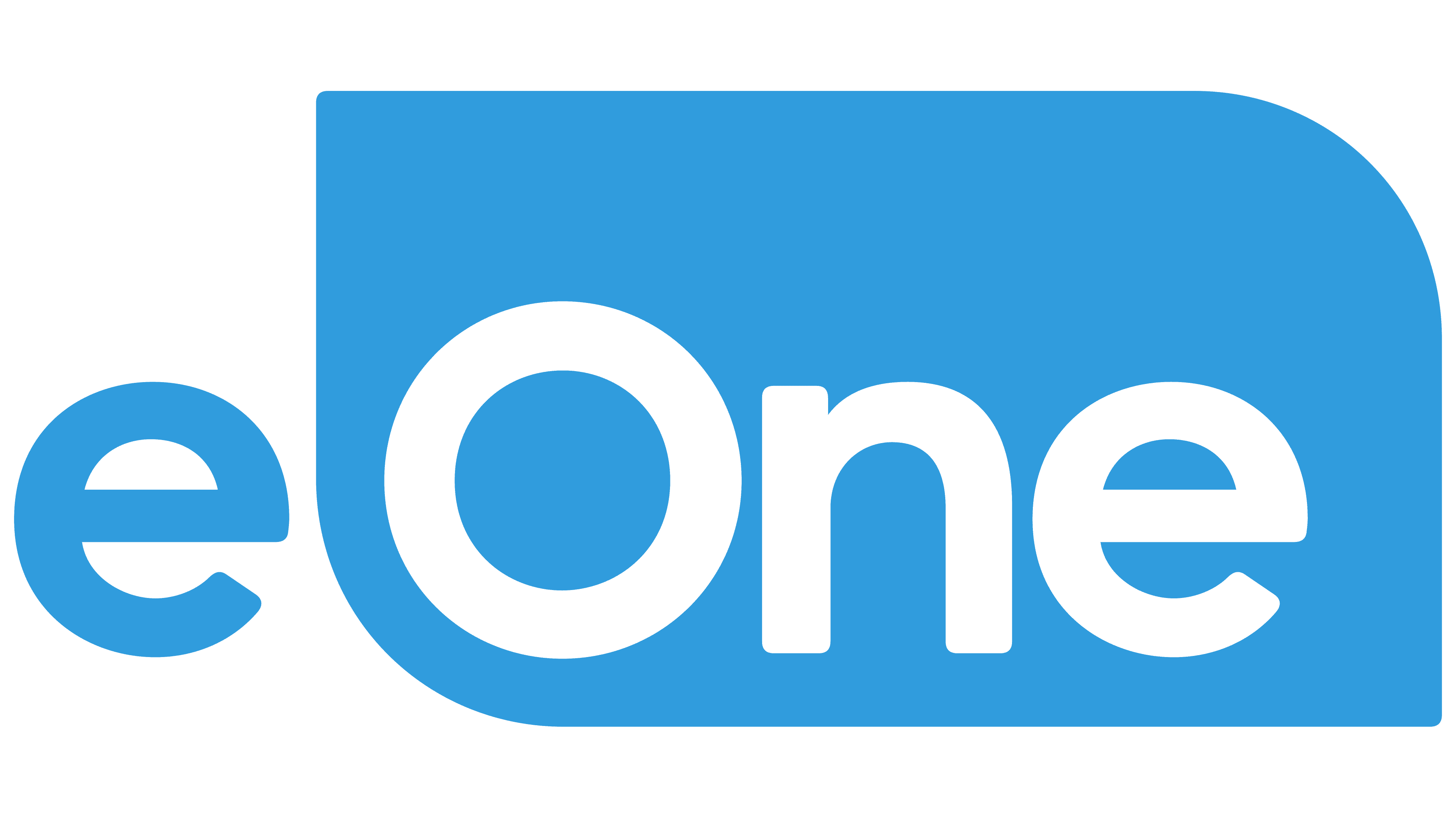
2015 – 2024
![]()
The “Entertainment One” logo was updated in 2015 as part of efforts to modernize and strengthen the brand’s visual identity. A team of designers led the project under the direction of Steven Preisman. Their task was to create a modern, easily recognizable visual mark that reflected the company’s essence and its position in the entertainment industry.
The main element of the emblem is the “Entertainment One” text, set in a simple, modern font. The logo is light blue, symbolizing trust, stability, and professionalism. The sans-serif font was chosen to give the emblem a clean, contemporary look.
The word “One” is distinctively highlighted and styled differently from the rest of the emblem. The letter “O” in “One” is the only uppercase letter in the logo, emphasizing its importance and uniqueness. The word is placed inside a blue rectangle with rounded corners, adding a sense of completeness to the visual mark. This rectangle symbolizes a screen, a central element in the entertainment world, whether film, television, or digital content.
The logo’s balanced, memorable design combines text and graphic symbols. The company is portrayed as bringing together diverse content and formats on a single platform. The visual identity reflects the brand’s ambitions and readiness to remain relevant in the ever-changing entertainment world.
Font and Colors
The main distinguishing mark of the Canadian company is its name. The designers tried to make its graphical representation simple and memorable, using negative space: the word “One” is formed by empty spaces inside a blue geometric shape.
The font chosen by the logo’s creators resembles Circe Bold by ParaType and Averta Standard Bold by Kostas Bartsokas. It is a bold, grotesque font with rounded glyphs of an unusual shape. There are only two colors: white and light blue (shade # 009CDB).