“Follow the sign and you will enter a special gaming world,” the Epic Games logo invites. There is a mystery and a share of fantasy in the emblem. The player never knows what lies behind the plot twist and what direction the game will take him.
Epic Games: Brand overview
| Founded: | 1991 |
| Founder: | Tim Sweeney |
| Headquarters: | Cary, North Carolina, U.S. |
| Website: | epicgames.com |
Fans and computer game enthusiasts are well aware of the products of Tim Sweeney’s company, Epic Games, Inc, which was originally called Potomac Computer Systems. The company is a developer and publisher of video games and related software. Its founder created and released the first commercial video game, ZZT, in 1991 at his parents’ home in Potomac, Maryland, which was a hit with gamers at the time. Within a year, the first success had already contributed to the expansion of the company and a change of name to a more resonant one – Epic MegaGames, Inc. At the same time, the staff expanded – Mark Raine – from id Software was invited to the position of Vice President of the company. After moving to Cary in 1999, the company shortened its name somewhat and became Epic Games.
In 2014, the Guinness Book of World Records publishers called the Unreal Engine developed by the studio “the best engine at the moment.”
Meaning and History
Having started his business as a computer consultancy in his parents’ home in 1991, Sweeney, faced with the need for quite a lot of investment and labor to develop it, gave up that option. But the successful realization of the first game from an unknown company, without self-promotion, gave him a new direction to develop his ideas – the reformatting of the business to the creation of video games.
The beginning of 1992 became for Sweeney the realization that the game world was already rather densely populated with big and world-known studios, such as Apogee Software and id Software. To somehow enter this market, and even more to make a loud statement right away, was not enough to make 1-2 popular games. It requires in-depth marketing, a well-thought-out image, an attractive name, and an original company logo. The renaming to Epic MegaGames seemed to him impressive and original. It sounded like the name of a large and solid organization, even though its founder, manager, and employee were in one person.
Mark Raine, who became Sweeney’s partner in the same year, was a tremendous help in organizing the company’s promotion. His experience at id Software came in handy for business development. Having connections, dealing with marketing, sales, and publishing issues made a huge contribution to the successful growth of the new company. During one season, the studio’s development required the services of a wide range of specialists – programmers, designers, composers, and artists. Twenty employees were invited to work and formed the main core of the studio’s team.
The company has become widely known among developers of electronic video games because of its Unreal Engine. Developing it, the studio simultaneously launches its video games, including Fortnite and Gears of War, and Infinity Blade, which Unreal Engine was tested. Its application demonstrated excellent results. Subsequent refinements have allowed its successful use in video games of other developers. But this was preceded by years of hard work and struggle for a place in this type of business. The next year allowed us to expand to 30 employees.
In 1996, the company was approached by the Polish studio Chaos Works to help with the release of its shooter, Fire Fight. 1997 increased the staff to 50 people working for the company worldwide. The following year, its new Unreal Engine opened up a wide range of possibilities for further unique developments. That same year saw the launch of the Unreal series of games with Digital Extremes, a three-dimensional implementation of the first-person shooter that immediately became popular with the world of gamers. This fame made the engine in demand by other developers, which allowed the studio to open a new direction – implementing a unique but already licensed engine.
Significant changes in the company took place in 1999. An increase in the number of employees and the volume of tasks to be solved required a revision of the approach to collaborative work. Previously, many of them worked in their own country, at home. But the development of Unreal required all its creators to work together under one roof. The company moved to Cary, North Carolina, occupying an impressive facility that met current needs. At the same time, the word Mega was removed from the name, as it was no longer necessary to give the appearance of a large organization. Since then, Epic Games has become a “big” company, known far beyond the United States.
In 2019, the studio won the British Academy of Film and Television, was also awarded the Engineering Excellence Award from the Hollywood Professional Association. Organizing contests, cybersport events, and investing have increased the scale of projects but also dramatically raised the company’s profitability.
A great role in the company’s development has also played the right marketing approach, which responded quickly and effectively to the changes taking place, timely changing the image of the studio, adjusting to the spirit and time. Its emblem has undergone several changes during its existence, each time demonstrating the success of the new logo in fulfilling its purpose.
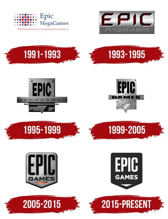
1991 – 1993
The first logo was designed under the first name change when Sweeney made his first risky move, hoping to raise his company’s profile. The composition reflected the state-of-the-art of computer technology at the time, perfectly suited to the task of establishing himself as a major player in the development and distribution of video games.
1993 – 1995
The company’s rapid development and its computer technology, its primary focus as a developer of new game technologies and game systems, led to the necessity of rethinking its logo and image. The new logo became three-dimensional in the form of a metalized plate, a label, with the effect of the pressed text of the first word of the name and convex – the second. The color solution created the required perception of the plate’s steel material, and the letters of the first word were made in gradient blood-red.
1995 – 1999
The version of this period will last until 2005, carrying forward only technical changes.
1999 – 2005
In 1999, the logo gained clarity and sharpness of image due to computer technology and graphics. It would no longer contain the word “Mega .”It would become the company’s demo logo for the first time at the release of Unreal Tournament (1999)
2005 – 2015
In May 2005, the company will unveil a new emblem that will retain the general idea of the previous version but will be simplified. It is a vertically pointing down pointer in the traditional steel design with text all over its free space and a small isosceles triangle pointing down the apex. The text is black, and the triangle, made visually voluminous, is filled in red with a gradient transition from lightest to darkest.
2015 – today
The desire for concreteness and brevity, which are today’s trends, led to revising its emblem. As a result, the modern company logo, preserving the general contours of the previous one, has become a simple label. It is believed that the company’s fame has become so high that it requires no difficulty in visualizing its brand. Today’s simple version is quite enough for the company. Since November 2015, it has been the official emblem of Epic Games.
Epic Games: Interesting Facts
Epic Games has made a big splash in gaming and beyond.
- How It All Began: Tim Sweeney kicked things off in 1991, right out of his parents’ garage in Maryland. The first game they sold was called ZZT.
- Unreal Engine: Epic is famous for creating the Unreal Engine, a beast in game development used worldwide. It started with Unreal in 1998 and has since powered countless other games.
- Fortnite Takes Over: In 2017, Epic released Fortnite, which quickly became a massive hit, drawing in millions of players and making a lot of money from in-game purchases.
- Epic Games Store Launch: In December 2018, Epic Games opened the Epic Games Store to challenge Steam. It stands out for giving developers better deals and snagging exclusive games.
- Leading in Cross-Platform Play: Epic was ahead in letting Fortnite players on different devices play together, pushing the whole industry towards cross-platform gaming.
- Beyond Gaming: The Unreal Engine, because of its real-time graphics, is used in movies and TV, like “The Mandalorian.”
- Epic MegaGrants: Epic has invested $100 million in Epic MegaGrants to help people and organizations improve 3D graphics using the Unreal Engine.
- Fighting for Fairness: Epic has sued big companies like Apple and Google over app store rules, arguing for a fairer digital market for developers and customers.
- Strategic Acquisitions: Epic has bought several companies, like the social video app Houseparty and the anti-cheat company Kamu, to boost its tech and expand its offerings.
- Eco-friendly Goals: They’re part of the “Playing for the Planet” group, which focuses on reducing carbon emissions and promoting sustainability in its games and operations.
Epic Games has been a trailblazer, constantly innovating in game development and digital distribution and making gaming more inclusive, all while addressing wider industry and environmental concerns.
Font and Colors
In the development of the new sign participated the main part of gamers and fans of game consoles of the company, responding to the request of Epic Games. By the majority of votes, they chose the logo that can be seen on all company products, as well as on the portal and social networks. Its color scheme is simple, laconic, and contrasting – only white and black. No gradients, full colors, rainbow colors, or shades. The black field of the pointer and the white triangular arrow at the bottom with the white font – the company name in its field.
The text is in capital letters. The first word occupies “EPIC” almost 3/4 of the area of the pointer. Under it is “GAMES,” in a smaller typeface and coinciding in its width with the borders of the first word. The small arrow-triangle under the second word of the company’s name is symmetrically repeated at the tip of the pointer. This is ensured by the parallelism of its sides to the sides of the pointer, forming a downward pointing wedge.
Epic Games color codes
| Eerie Black | Hex color: | #242424 |
|---|---|---|
| RGB: | 36 36 36 | |
| CMYK: | 0 0 0 86 | |
| Pantone: | PMS Neutral Black C |

