The Escape from Tarkov logo is like a piece of the world seen through binoculars. The emblem evokes a sense of participation in an exciting secret mission. The participant lies in ambush or slowly creeping with a group, hiding among the buildings.
Escape from Tarkov: Brand overview
| Founded: | 27 July 2017 |
| Founder: | Battlestate Games |
| Website: | escapefromtarkov.com |
Meaning and History
The game’s logo has remained unchanged since its announcement in 2015, but future changes are possible. The shooter has been developing and constantly updated for the last six years. Players use a trial beta version. The emblem stands out for its amazing realism. The reception attempts to convey the maximum correspondence of the surrounding situation in the game to the real war conditions on city streets. That’s why the shooter is only allowed for persons over 18.
What is Escape from Tarkov?
A military game, the action of which unfolds in 2028 based on a fictional Russian city that is isolated by the Russian Federation and NATO troops. Inside the zone is lawlessness and confrontation of private groups, one of which the player is a member. The task of the character is to survive, find the necessary equipment and food and arrive at the evacuation point to leave the dangerous place. The game is distinguished by extraordinary realism, which gives the feeling of real participation.
2017 – today
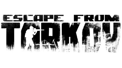
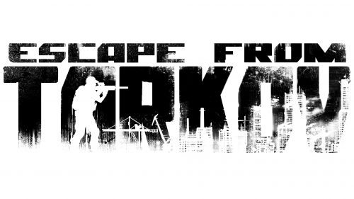
The game’s logo impresses with its detail and clear contrast. The large, massive name inscription is placed on two levels. Tarkov is a fictional city in the Norvinsk region. According to the game legend, this is a place of former cooperation between Russia and the EU, where a scandal breaks out around the large organization Terra Group.
The escape, which the inscription on the logo refers to, is the game’s main goal. Participants are given an evacuation point in a distant part of the map. You need to get there during the missions.
The letters are covered with an image of a night city with white elements of houses and silhouettes of people in military uniform. The picture is supplemented by falling snow and clouds of smoke, thanks to which the edges of the letters blend with the background. It is difficult to determine where the image ends and reality begins.
The view is similar to the image in a night vision device. The main difference is in the color gamut of the backlight, which in the real device is green. The area resembles an industrial one, which indicates the game’s main locations. Participants have access to 11 game zones, most of which are in abandoned parts of the industrial zone – Interchange, Factory, Terminal, and Laboratory.
In the background, a lone soldier with a gun in his hands is visible. This is likely the player. He represents a private military company: USEC or BEAR. With weapons, the character and his team participate in raids, obtaining trophies, medicines, and food.
Font and Colors
The contrast of black and white represents the theme of confrontation and attempts to survive in the dark, cold, and scary reality of a besieged city. The color indicates the need to hide, to act secretly.
The font of the inscription is bulky, with angular cubic glyphs. Cut-off elements convey the theme of shelters and barriers. The silhouettes of the letters F, C, and E at the top of the inscription remind players of weapons in their hands.
Escape from Tarkov color codes
| Black | Hex color: | #000000 |
|---|---|---|
| RGB: | 0 0 0 | |
| CMYK: | 0 0 0 100 | |
| Pantone: | PMS Process Black C |
