Esso: Brand overview
Esso, a trading name for ExxonMobil, traces its history back to the dissolution of the original Standard Oil company in 1911. The chosen brand name “Esso” originated from the phonetic pronunciation of Standard Oil’s initials, “S” and “O”. However, this decision did not resonate with other Standard Oil subsidiaries. Despite these obstacles, Esso has become a globally recognized and trusted brand.
The Esso branding was introduced by Standard Oil of New Jersey in 1926 to promote its products. In 1972, after Standard Oil of New Jersey acquired Humble Oil, the Exxon brand name appeared on the American market. However, the Esso name remains popular in many other countries.
A dominant player in the international arena, Esso operates in more than 100 countries, offering a wide range of products from gasoline and diesel to lubricants and petrochemicals. Esso’s ubiquitous global presence has cemented its status as one of the most recognized and respected names in the industry.
The unprecedented Supreme Court decision in 1911 to break up Standard Oil’s formidable monopoly into 34 separate entities inevitably changed the American corporate scenario.
The introduction of the Esso brand name by Standard Oil of New Jersey in 1926 brought about a significant change in the industry.
The introduction of the Exxon brand in the American market in 1972 replaced Esso and led to a significant restructuring of the industry.
The merger of Exxon and Mobil in 1999 led to the formation of a new energy titan, ExxonMobil.
Esso’s historic opening of the first solar-powered gas station in the U.S. in 2009 was a significant leap toward sustainability.
In 2017, Esso’s ambitious “Make the Future” initiative was launched to promote clean energy solutions and move towards a greener future.
Meaning and History
What is Esso?
Essol, a business name for ExxonMobil, is an innovator in the energy sector with more than a century of history. Founded in 1911 as Standard Oil of New Jersey, it has grown into a huge American multinational company specializing in oil and gas production.
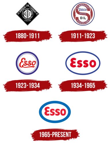
1880 – 1911
1911 – 1923
1923 – 1934
1934 – 1965
1965 – today
Esso uses the logo along with its name and places it on gas station signs so that customers can easily identify the brand. The main feature of the lettering is the bright red color chosen to attract attention. The word is arranged in a vertical white oval that is outlined with a wide blue stripe. The capital letter “E” looks like a turned number “3”. The rest of the letters look standard and somewhat reminiscent of DTP Types’ Delargo DT Condensed Black font.
The red, white, and blue colors look very patriotic, like a flag waving in the wind. The rotating “E” that looks like a “3” looks whimsical and thought-provoking. The oval shape around the name is reminiscent of a road, and the blue stripe is the sky above it.
Esso color codes
| Imperial Red | Hex color: | #ee1c2e |
|---|---|---|
| RGB: | 238 28 46 | |
| CMYK: | 0 88 81 7 | |
| Pantone: | PMS Bright Red C |
| Medium Persian Blue | Hex color: | #006bb6 |
|---|---|---|
| RGB: | 0 107 182 | |
| CMYK: | 100 41 0 29 | |
| Pantone: | PMS 285 C |
