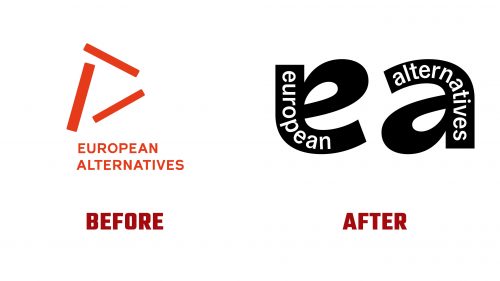
European Alternatives (EA), a non-profit organization advocating for democracy, equality, and culture beyond national boundaries, has introduced a new brand identity designed by London-based TEMPLO. Established in 2007, EA fosters transnational dialogue and action through various initiatives and events. The new branding aims to reflect EA’s mission and enhance its visual presence.
The new logo creatively combines the letters’ e’ and ‘a’ into a single form. Using Type Family’s Bossa, the ‘e’ is rotated to form an ‘a’, symbolizing different perspectives and the organization’s commitment to diverse discussions. This design choice highlights EA’s core principle of viewing issues from various angles to create comprehensive solutions.
The typographic choice, Bossa, is known for its clean lines and modern look. The font emphasizes EA’s contemporary approach while maintaining clarity and legibility across different platforms. The interaction between the ‘e’ and ‘a’ in the logo symbolizes conversation and interaction, key elements in EA’s mission. This ensures that the logo stands out and communicates the organization’s values.
The vibrant and dynamic color palette reflects EA’s energetic approach to fostering dialogue and action. The colors highlight different aspects of EA’s work, ensuring visibility and impact across various mediums. The bold and contrasting colors help the logo and other visual elements maintain prominence in diverse contexts, from digital platforms to printed materials.
The visual language extends beyond the logo, incorporating a unique treatment where the ‘ea’ monogram acts like a brush or eraser, revealing imagery beneath blocks of color. This technique works well in motion graphics, adding a dynamic quality to videos and digital presentations. The effect adds texture and depth to static applications, making posters, reports, and other materials visually engaging.
The logo’s typography enhances its unique character. The unconventional placement of the letters reflects the idea that change can be challenging. This typographic arrangement reflects EA’s commitment to pushing boundaries and challenging the status quo. The logo animation shows the letters merging and interacting, visually representing the fluidity and adaptability required to address complex global issues.
The branding includes clever messaging strategies. Pairs of words starting with ‘e’ and ‘a’ that have opposite connotations are joined using a single glyph, creating a thought-provoking visual pun. This approach ties back to the organization’s emphasis on dialogue and alternative perspectives.
One of the most striking aspects of the new identity is the use of jagged, constantly moving edges in motion graphics. This design element keeps the visual presentation lively and engaging, maintaining viewer interest and reinforcing the idea of constant movement and change. This effect is particularly powerful in video formats, enhancing storytelling and drawing viewers into the narrative.
The new identity by TEMPLO for European Alternatives captures the essence of EA’s mission through thoughtful design choices that emphasize dialogue, alternative perspectives, and dynamic interaction. By integrating modern typography, vibrant colors, and unique visual effects, the rebranding communicates EA’s values and vision for a more inclusive and democratic world.


