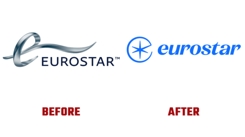
In January 2023, the Channel Tunnel railway company Eurostar announced a merger with Thalys (the Franco-Belgian operator) and introduced a new logo. Strange, but users did not like it, causing a flurry of discontent. What is the reason? Probably, in conservatism or fear of the new.
Customers are accustomed to the old “tongue-out” logo at the lowercase “e” and the yellow title in thin slashed letters. And they took the updated version with hostility, arguing that it was “to 90s of the last century” or that it was more suitable for a manufacturer of household appliances than a railway operator. However, the modernized Eurostar logo has a clever design that takes you back to the brand’s history.
The British company deliberately removed the strange “e” with the “tentacle” protruding forward. She regained her iconic star, reminiscent of compass markings indicating all cardinal directions. This is an element of her debut sign. Designers combined it with the first letter of the name, which has many meanings.
- The star has previously shone on the Étoile du Nord trains, which were the first to link the UK with Paris, Brussels, and the Netherlands under the English Channel.
- Designers have now used it for the new Eurostar logo as a tribute to Europe’s railway heritage.
- In addition, this is an allusion to the stars in the symbols of the EU. Thus, a simple emblem reflects the spirit of freedom and unity.
The logo was designed by London-based DesignStudio, deliberately choosing a star. It will be included in a large-scale system where “star” themes are widely used on trains. So the new emblem will harmoniously fit into this format. The reviewers also liked the color palette, which is reminiscent of a star shining in the sky, and the modern lettering style with wide cursive glyphs.


