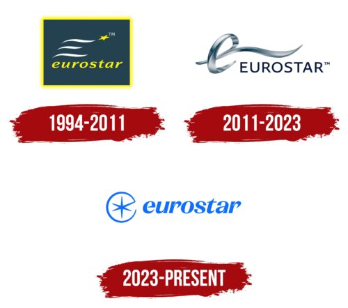
The Eurostar logo symbolizes speed, fluidity, and seamless, convenient travel between the United Kingdom and continental Europe. It is a visual representation of modern transportation, removing barriers and making journeys effortless and accessible.
Eurostar: Brand overview
The history of Eurostar dates back to 1986 when Britain and France signed the Treaty of Canterbury to build a tunnel under the English Channel. This engineering project aimed to physically connect the island and the continent, creating new transport opportunities. Construction of the tunnel began in 1987, eventually becoming one of the most remarkable engineering feats of the 20th century.
Alongside tunnel development, plans for a rail service were underway. In 1990 the UK established European Passenger Services (EPS) to manage passenger transport through the tunnel. In France, this role was fulfilled by SNCF, while in Belgium, it was handled by SNCB. Trains also had to meet different technical standards, a challenge addressed by the French company GEC-Alsthom (now Alstom), which developed the TGV TMST (TransManche Super Train) series.
The official opening of the Channel Tunnel took place on May 6, 1994, attended by Queen Elizabeth II and French President François Mitterrand. On November 14 of the same year, the high-speed rail service launched commercial passenger operations between London, Paris, and Brussels. The first journey from London to Paris took approximately three hours, marking a breakthrough in transportation.
Initially, departures were from London’s Waterloo station, but trains had to travel on conventional British rail lines before reaching the tunnel, limiting their speed. In 1996, EPS was privatized and rebranded, enhancing operational flexibility. The UK government approved the High Speed 1 (formerly Channel Tunnel Rail Link) project 1997 to increase train speeds.
The first section of High Speed 1 opened in 2003, cutting travel time by 20 minutes. The full line was completed in 2007, and the London terminal moved to St Pancras station. This reduced travel time between London and Paris to 2 hours 15 minutes and London to Brussels to 1 hour 51 minutes.
In 2010, the British, French, and Belgian divisions merged into a single entity, simplifying management. In 2015, the operator introduced the new e320 trains from Siemens, capable of reaching 320 km/h and equipped with modern amenities, including onboard Wi-Fi. That same year, the UK government sold its 40% stake to the CDPQ and Hermes Infrastructure consortium.
By 2018, the company had carried 200 million passengers, solidifying its popularity. In May that year, services began between London and Amsterdam, with direct return journeys introduced in 2020. In 2021, amid financial difficulties, the rail operator secured a £250 million support package.
In 2022, a merger with Thalys formed a new unified brand. A refreshed logo featuring an eight-pointed star representing key routes was introduced the following year. The Thalys brand was gradually phased out, with all trains now operating under a single identity.
By early 2024, the network spanned five countries and over 80 cities. Plans were announced to expand and upgrade the fleet, focusing on passenger comfort and service reliability. Today, the high-speed rail service plays a crucial role in European travel, connecting the UK with continental Europe.
Meaning and History
What is Eurostar?
It is a high-speed passenger train that connects the United Kingdom with France, Belgium, and the Netherlands, traveling through the Eurotunnel beneath the English Channel. It provides fast and comfortable service between cities such as London, Paris, Brussels, and Amsterdam, offering an alternative to air travel. The trains have comfortable seating, various service classes, and modern amenities, including Wi-Fi and onboard restaurants.
1994 – 2011
The Eurostar logo combines dynamism and European symbolism. The base is a dark green rectangle with a bright yellow outline.
At the center, three smooth white lines resemble the movement of trains and a railway composition. They are positioned horizontally, with the middle line shorter than the others. This symbol represents speed and conveys the rapid motion of Eurostar trains.
A yellow five-pointed star is slightly above the right of the lines. It reflects the symbolism of the European Union and alludes to the brand name (Euro + Star), emphasizing Eurostar’s European identity and its role as the leading operator of international rail transport in the region.
Below the graphic elements, the name “eurostar” is displayed in an elegant italic font. The letters are smooth, rounded, and slightly slanted to the right.
The logo’s color palette has a dark green background, white lines, and yellow accents. Green symbolizes nature and stability, white adds a sense of purity, and yellow highlights the dynamism and progressiveness of the company. Together, these elements create a harmonious image that conveys the brand’s core values: speed, reliability, and an international presence.
2011 – 2023
The logo, updated in 2011, features a modern, three-dimensional design, conveying a sense of speed, technology, and high-level service.
The central symbol is a dynamic, curved ribbon forming the letter “e.” Its smooth curves create the effect of swift motion, emphasizing the high-speed nature of Eurostar trains. The sleek lines and metallic gradients symbolize innovation in rail transport.
The EUROSTAR name is written in a bold, sans-serif typeface. The clean, uppercase letters with uniform thickness give it a contemporary look.
The color palette is based on a silver-metallic gradient and a dark blue shade. The main symbol features a 3D effect, adding a high-tech and premium feel. The dark blue lettering enhances the elegance and stability of the design.
The logo update reflects a new chapter in Eurostar’s history—transitioning to more comfortable and faster trains focused on passenger convenience.
2023 – today
The new emblem, introduced in 2023, became part of a major rebranding of the company. The design was created by DesignStudio, making it more modern and dynamic.
The key symbol is a stylized mark inside the letter “E”—a six-pointed star enclosed in a circle, resembling a compass rose. It reflects the company’s international nature and connects different countries and destinations. The geometric shape is associated with navigation, movement, and travel.
The name’s font is designed in a smooth, italicized style. The slight tilt of the letters creates an effect of speed, highlighting the high-speed nature of the trains. The characters appear elegant while maintaining a strict geometric structure. The font resembles La Pontaise, which features pointed ends and narrow shapes, giving the logo a modern look.
The primary color is a rich blue, a shade associated with reliability, technology, and European identity. Additionally, the blue color references the crossing of the English Channel, which separates the UK from mainland Europe, symbolizing the carrier’s core route.