


![]()
The company Everbloom, formerly known as Bloom Labs, has unveiled an updated visual style developed by the studio How&How. The rebrand reflects a shift from a technology startup image to a premium positioning, closer to the world of fashion and high-end materials.
The previous look appeared clean and logical for a company with a scientific background. At its core was a light logo featuring a spiral-shaped letter B, reminiscent of spirograph patterns and referencing the brand’s core product: fiber interweaving.
![]()
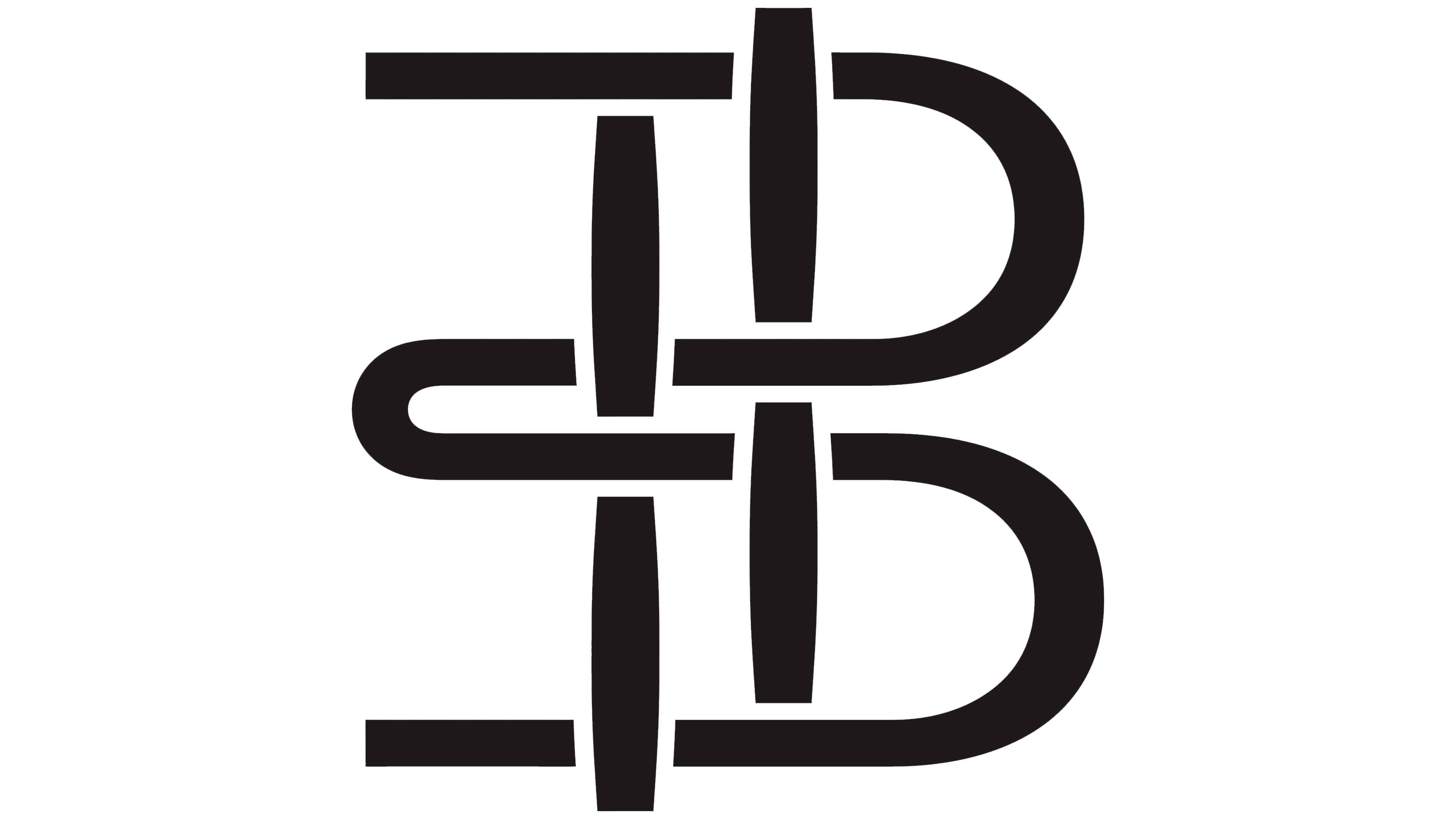
The new Everbloom identity changed the positioning across all areas, from the name to the brand’s key symbol. A monogram now sits at the center of the system, constructed as a graphic weave. It refers to sustainable fibers and textiles and, on closer inspection, breaks down into the letters E and B, with the E rotated and integrated into the overall form. The treatment is abstract, so the mark is perceived primarily as an image of material rather than a letter puzzle.
The wordmark is set in Season Mix by Displaay Type, customized for the brand’s needs. Some of the serifs were removed, making the lettering more restrained and refined.
Smooth tonal transitions enhance the sense of high quality and underscore the brand’s ambition to secure a lasting place among premium material producers. The image feels substantial and expensive, signaling Everbloom’s readiness to collaborate with fashion houses such as Gucci, Louis Vuitton, and Dior.
The entire system is built with flexibility in mind. The monogram and the wordmark can coexist or appear separately. The designers found a subtle balance between the brand’s technological foundation and its luxury aesthetics, leaving room for further growth. Everbloom shows that advanced biomaterials can naturally enter the world of high fashion and premium products.
![]()