At least once in his life, the average American or European has come across a crispy Pringles product. The powerful advertising campaign, strong imagery, beautiful colors are mesmerizing. And these tubes, in which slices of fried chips are packed one after the other? The elegance of forms, beauty, and convenience, ergonomics, and mastery of taste. It seems that the buyer will only think about this box and will already feel the taste of seasoned thin slices of potatoes.
Pringles has taken snacks to the next level. It became some nationwide magic. It is already unthinkable to imagine a football fan or movie lover without these products. Chips are the bestsellers and one of the most frequently bought products in the US, probably in Europe. Marketers have a clever idea: popular appetizer ads appear during live sporting events. And brands of chips and various delicious drinks, alcoholic and non-alcoholic, become noticeable markers in advertisements in stadiums and places filled with fans.
The Pringles company has been known in popular circles since the mid-60s when it just entered the market to take the palm and a confident leadership position. It was new, unusual, innovative. People quickly understood the idea, picked it up, and the brand’s creators began their evolution of the trademark.
In the beginning, their logo was a cute mustachioed man with an apostrophe inscription. And what is interesting to note is that the color of his hair was rusty; the contours of his face are black and rather dense, which made him very tightly delineated. As if the edging layer was especially duplicated so that it was noticeable from afar. But it was the design of 1967-1980; then they drew as best they could. It was necessary to attract the buyer with the brightness of the wrapper.
This was followed by modifications of the cheerful little man with a mustache. The hair color darkened and turned brown, the contours became smoother and more delicate, and the very name of the chips shifted, leaning slightly to the right side, creating the image of a butterfly on the neck.
By the beginning of the 2000s, the company introduced the character in a new way. They abandoned the bold contours, making light hints on the line of the face, mustache, hair. And they did well because the idea of a constant snack with fat potato slices does not lead to health and a slim figure, and the bright contours seemed to emphasize this on purpose. The man with the mustache became airy, easy to perceive. It doesn’t matter that one part of his mustache was larger, and the curl on the right was smaller. And that the inscription itself has changed, shrinking, and the letters seem to be pressed into the box of chips. It looked attractive, unexpected, and intricate. Even an element of enthusiasm – the image of these shining tiny black eyes – said that eating such a delicious snack while sitting on the couch with dear people and reviewing your favorite comedy is a great pastime that does not bode well for the loss of health and self-esteem. There is such a comic assumption that the lines began to look better on the logo to evoke a sense of slenderness and dynamics in the buyer.
And then, in 2009, another logo appeared for the USA, Asian countries, Great Britain, and several other sales countries. It was simplified, the hairstyle was “disheveled,” the inscription was slightly increased in size and evened out, although the arc of letters remained. The character Mr. Pringles has gone through many changes but has remained a staunch product mascot.
And now, transformations again. It’s 2020, a pandemic, restrictions, remote operation. Do not go out and calmly meet with friends in a pub, do not have a drink, do not talk about the vanity and frailty of life.
But there is a cool alternative – to sit at home, not let anyone in, only the very best, and then with a can of the updated Pringles!
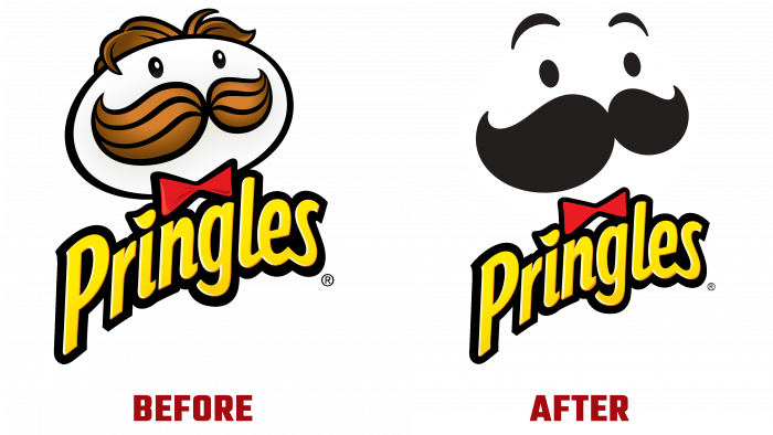
The most advanced brands are moving towards the current design trend – the simplification, the minimalism of the flat design. The chips company decided to follow in the same footsteps, and now the cute Mr. Funny Mustache Pringles is flatter, less colored, but more contrasting.
Again we returned to the tradition of writing the name in the form of a butterfly. These are just white capital letters in the form of two triangles, below the postscript that is “original” (probably because many were not ready to change the brand image). Well, the face, in principle, has retained its features, but it has become less “versatile.”
A multi-sized mustache, raised eyebrows that do not “sit” on the face, button eyes, and a white oval face is all that remains of Mr. Pringles.
This was a decisive move by the brand. But that army of fans, who for years with pleasure gathers with a can of chips for some show, match, or broadcast, will never give up their favorite delicacy, whether it has changed its image or not. The reliability of the brand, proven over the years, the quality of products, and the attitude to the target audience, are much more expensive than just design.


