Pressing computer keys allows you to perform calculations, and all data is stored in cells and added to virtual books. The Excel logo conveys the principle of the program. Using the system, as the logo shows, is a step towards developing accounting methods.
Excel: Brand overview
| Founded: | 1987 |
| Founder: | Microsoft |
| Headquarters: | United States |
| Website: | products.office.com |
Meaning and History
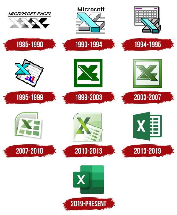
The distant predecessor of Excel is considered to be Microsoft Multiplan, released in 1982. The developers hoped that it would compete with Lotus 1-2-3 and Visicalc, popular at that time, but users were not so enthusiastic about Multiplan. So three years later, Microsoft had to introduce another program of similar purpose – Excel. It was given a name that made its superiority over Lotus 1-2-3 obvious because the word “Excel” reads “XL,” an abbreviation for Extra Large. This little pun is played out in numerous logos for the application. There were no less than ten of them because an icon redesign accompanied the release of new software versions.
1985 – 1990
The very first program was designed for the Macintosh. It had a multi-component symbol containing the inscription “MICROSOFT EXCEL,” underlined by two horizontal lines, a wide and a narrow one. Bold italics without serifs were chosen for the text.
In the lower half was a set of geometric shapes which folded into the letters “X” and “L,” with the “L” looking like the structural parts of the “X.” The designers combined the three pairs of symbols, placing them one on top of the other. The image in the background consisted of widely spaced dots. The picture in the middle was clearer, as the indentation between the dots was reduced. The top element was painted completely black.
The same logo was used for the next version of Excel, created in 1987 for the Windows system.
1990 – 1994
In 1990, Microsoft Excel 3.0 was released. The splash screen displayed a new visual sign in the form of the inscription “XL,” which consisted of two three-dimensional blocks. The gray corner represented both the letter “L” and half of the “X.” It was crossed by a second diagonal “X” – a blue parallelepiped. All visible edges were black. The base was crisscrossed with gray horizontal lines. At the top was the word “Microsoft,” written in pixel font without serifs.
1994 – 1995
The Excel 5.0 logo had no lettering because it was used as an icon on the Windows desktop. The designers kept the “XL” pattern but presented it as a simplified pixel graphic. The side edges of the blocks became darker. In the background, there was a schematic representation of a table, which symbolized the program’s interface. It was a white sheet with a black frame and a dark gray shadow. Inside it was a grid of cells in rows and columns. In the upper corners were purple bars, which replaced the headings.
1995 – 1999
With the release of Excel 95, the icon was redesigned. Artists made the “XL” symbol two-dimensional and repainted it blue, keeping the black outline. The letter element was reduced and moved to the upper left corner. A diamond-shaped schematic table took up most of the space. It was crossed out into lines and contained an image of a three-color graph of three columns: dark pink, blue, and red. The same icon was used for Excel 97.
1999 – 2003
Excel 2000 set new standards for design. Its interface received a modern design, and the logo was redesigned by fashionable minimalism. The corporate symbol contained the already familiar “XL” monogram, but it became completely green. The individual outlines of the blocks disappeared. The two parts of the design could be distinguished only by a white line stretching along the diagonal and by the projecting lower edge of the corner. A white square in a bold dark green frame was used as the base.
2003 – 2007
In 2003, a version of the application with a 3D logo appeared. The designers added many new contours and combined different shades of green to make the image appear three-dimensional. The shape of the monogram has changed slightly. The white base became light gray, and small triangles appeared in the corners of the outer frame. The gradient enhanced the three-dimensionality of the emblem.
2007 – 2010
The Excel 2007 icon differed from previous versions, with a more complex structure. In the foreground was a white sheet raised above the surface and casting a gray shadow. It showed the monogram “XL” with a dark green diagonal and a light green corner. The rest of the space (the bottom and right side) was occupied by five rectangles. They, too, were green, with a clear gradient used in them.
Behind the leaf was some geometric figure – probably a square with one rounded corner. Most of it was hidden, but you could see the double white-green frame and gray top.
2010 – 2013
After the revision, the diagonal parts of the monogram became narrow and elongated. The lower stripe, on the contrary, was shortened. A radial gradient was used for both elements, each with its gradient. The white sheet was placed inside an asymmetrical square, which had previously been in the background. The background was divided into two color blocks with different shades of light green.
2013 – 2019
A common logo was created for the next versions of Excel (starting in 2013). It featured a two-dimensional design, which was achieved by the absence of a gradient. It looked like an open book with a dark green cover and a sheet divided into cells. The monogram was replaced by a single white “X.” It was on a makeshift “cover” in the form of a trapeze.
2019 – today
As part of the global rebranding of Office 365, Excel has a new icon that follows common design standards. Its main elements are two quadrangles with rounded edges. In the background is a large vertical rectangle. It is divided into six color blocks, representing different shades of green. It is partially overlapped by a second geometric figure – a square with a white letter “X” in the middle.
Excel: Interesting Facts
Microsoft Excel, part of the Microsoft Office suite, is a key tool used in business, education, and personal projects for managing and analyzing data.
- Starting: Excel first appeared for the Macintosh in 1985, two years before it came to Windows. Its early success was due to its user-friendly design, which was a big deal for Macintosh’s graphical interface.
- A Game-Changer for Windows: Excel played a huge role in the success of the Windows operating system. Thanks to its easy-to-use interface and features like undoing actions, it quickly surpassed Lotus 1-2-3, the leading spreadsheet software.
- Ribbon Interface: In 2007, Excel got a new look with the Ribbon interface, replacing old toolbars to make features easier to find and use.
- Bigger Workbooks: Originally, Excel could handle only 65,536 rows and 256 columns. However, since 2007, it has managed 1,048,576 rows and 16,384 columns, allowing for much larger datasets.
- Pivot Tables: Since 1993, they have let users easily organize and summarize large data sets, helping them make fast decisions.
- Excel as a Developer Tool: Excel supports Visual Basic for Applications (VBA), letting users automate tasks, create custom functions, and build complex data analysis tools.
- Excel World Championship: Microsoft holds competitions where people show their Excel skills in functions, formulas, and data visualization.
- Collaboration Features: Microsoft 365 allows Excel users to collaborate on documents in real-time, improving teamwork on data projects.
- Use in Space: Astronauts have used Excel on the International Space Station for various tasks, like tracking diet and exercise, showing its wide range of uses.
- Beyond Business: Excel has been creatively used for making art, music, and more, showing its versatility and users’ creativity.
- Easter Eggs: Earlier versions of Excel contained hidden features, like the “Hall of Tortured Souls” in Excel 95, a mini-game with the developers’ names.
- Skills and Careers: Excel knowledge can help in many careers, such as finance and data analysis. There are certifications for Excel that prove your skills.
Excel has evolved significantly, showing Microsoft’s dedication to meeting the needs of a wide range of users. Excel’s impact on professional and personal life is huge, from basic data management to complex analysis.
Font and Colors
Previously, Excel’s main symbol was a monogram of the combined letters “X” and “L.” This abbreviation referred to Microsoft’s spreadsheets were superior to similar competitor programs. The hint of the “L” disappeared when the application became popular enough not to prove its superiority with visual branding. The table image was also removed and replaced by an abstract combination of quadrilaterals. It is assumed that users are already familiar with Excel and know what it is for, so there is no need to place traditional columns with cells on the emblem.
The letter “X” is written in bold, sans serif font. It is most likely Segoe, which Microsoft has been using since 2012. The primary color chosen was green in various shades. The latest Excel logo is closer to the turquoise color scheme.
Excel color codes
| La Salle Green | Hex color: | #10793f |
|---|---|---|
| RGB: | 16 121 63 | |
| CMYK: | 87 0 48 53 | |
| Pantone: | PMS 340 C |
| Hunter Green | Hex color: | #185c37 |
|---|---|---|
| RGB: | 24 92 55 | |
| CMYK: | 74 0 40 64 | |
| Pantone: | PMS 7727 C |
| Green | Hex color: | #21a366 |
|---|---|---|
| RGB: | 33 163 102 | |
| CMYK: | 80 0 37 36 | |
| Pantone: | PMS 3405 C |
| Emerald | Hex color: | #33c481 |
|---|---|---|
| RGB: | 51 196 129 | |
| CMYK: | 74 0 34 23 | |
| Pantone: | PMS 3405 C |

