The company assessed the attitude of consumers towards tourism services and implemented some updates.
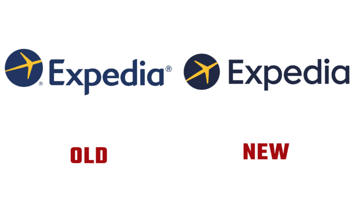
One of the first changes was received by the company logo. Expedia decided not to drastically change the images, making the font clearer and simpler. The business emblem – this plane inside the blue circle remains the same; only the color palette has become dark. Additionally, the designers changed the direction of the plane, pointing it slightly upward.
Expedia has been in the market for 25 years and provides a wide range of services, including accommodation, transportation, events, and an unforgettable experience. The COVID-19 pandemic has significantly “hit” the tourism business, which had to survive in difficult conditions.
Expedia has shared a new slogan – “It matters who you travel with.” Another announcement was the collaboration with famous personalities: American writer, actor, and director Rashida Jones and British actor Naomie Harris for the European segment of consumers.
Expedia’s team of experts analyzed customer expectations and identified key issues. Modern travelers want the company to become an advisor and guarantor, as reliability and personal safety come to the fore.
New expectations and goals have become the reason for rebranding and attracting attention to themselves. In addition to the updated Expedia logo, the company introduced several functions and capabilities for customers, for example, tracking all the details of the trip through a mobile application or a web browser. Expedia also announced improvements to insurance and simplification of the Expedia Rewards program for earning points.


