


![]() Expedia Logo PNG
Expedia Logo PNG
“Fly with us,” the Expedia logo calls. The emblem promises travel to distant lands, allowing the user to watch them through the portal without getting up from the couch. Comprehensive information and exciting stories will create the basis for real travel.
Richard Barton worked in Microsoft’s CD-ROM division on interactive travel guides. As the CD-ROM market weakened in the mid-1990s, he proposed moving travel booking online and cutting out traditional agents. He presented the idea to Microsoft co-founder and CEO Bill Gates, who approved the project. On October 22, 1996, Microsoft launched Microsoft Expedia Travel Services. Expedia lets users search and book flights, hotel rooms, and cars without an agent. Airline pricing systems, once available mainly through closed professional terminals, became accessible to ordinary customers.
By March 1997, Expedia reported $1 million in bookings in a single week. Its first ad, launched in November 1996, promoted travel on the user’s own terms. Competition arrived quickly from Travelocity, created by SABRE, and Priceline, which used an auction-style pricing model.
Expedia held its IPO on November 10, 1999. Shares were priced at $14 and closed the first trading day at $37, valuing the company at over $2 billion. Microsoft kept 86.4% after the IPO but did not plan to run a travel portal long-term. In 2001, Barry Diller’s USA Networks agreed to buy a 75% stake for about $1.5 billion. The deal closed in February 2002, and IAC later took full control. Diller built Expedia through acquisitions, including Hotels.com, Hotwire, and TripAdvisor.
On August 9, 2005, IAC spun Expedia into a public company on NASDAQ. By the 2010s, it ranked among the largest online travel players alongside Booking Holdings and Ctrip. In 2011, TripAdvisor was spun off. In 2015, Expedia bought Orbitz Worldwide and HomeAway, later Vrbo. In 2018, the parent company became Expedia Group.
Meaning and History
![]()
The logos of the online travel firm and its flagship website were initially identical. They had a common symbol, an airplane circling the globe. That changed in 2018 when Pentagram designed Expedia Group, Inc.’s new visual identity. So, the parent company began using a blue-and-white emblem with a lowercase “e,” while its Internet brand retained the old 2012 icon. This distinction drew a line between the group and the web resource, showing that they are not the same.
What is Expedia?
Expedia is an international travel agency based in the United States, and its sites are used to find hotels and travel itineraries and to book rooms, tickets, and lodging. Since 2003, the service has been wholly owned by the Internet Corporation IAC.
1996 – 2007
![]()
Expedia was founded in 1996. At the same time, it had a website with the same name and the “.com” domain, where everyone could book air tickets, cruises, hotels, or car rentals. The logo of that time looked funny and cartoonish: the artists depicted the globe as a blue air bubble around which an airplane flew. The circular movement was indicated by long lines extending from the tail and enveloping it on the left side. On the right was a black inscription “Expedia.com.”
2007 – 2010
![]()
In 2007, the “.com” domain was removed, so it is no longer bound to a web resource. This was because the company’s owners wanted to demonstrate their global reach by acquiring localized sites across a dozen countries. The logo colors have become more vivid, and the lines that replaced the plane’s tail have disappeared.
2010
![]()
When Expedia redesigned its logo, the air bubble and cartoon airplane were gone. The Martin Agency’s attempt to modernize the classic identity without abandoning the old concept was part of a major rebranding effort.
The new logo includes a globe, an airplane, and an inscription. However, the designers removed the sparkle that made the globe look like a bubble and added a radial gradient to convey its volume. The plane is no longer yellow and cartoonish; it’s white and looks minimalistic. The word “Expedia” is not black but blue and written in an unusual font.
2010 – 2012
![]()
A few months after the emblem’s global transformation, the company returned the yellow plane and repainted the turquoise balloon. The lettering became a little darker, but this did not affect the style.
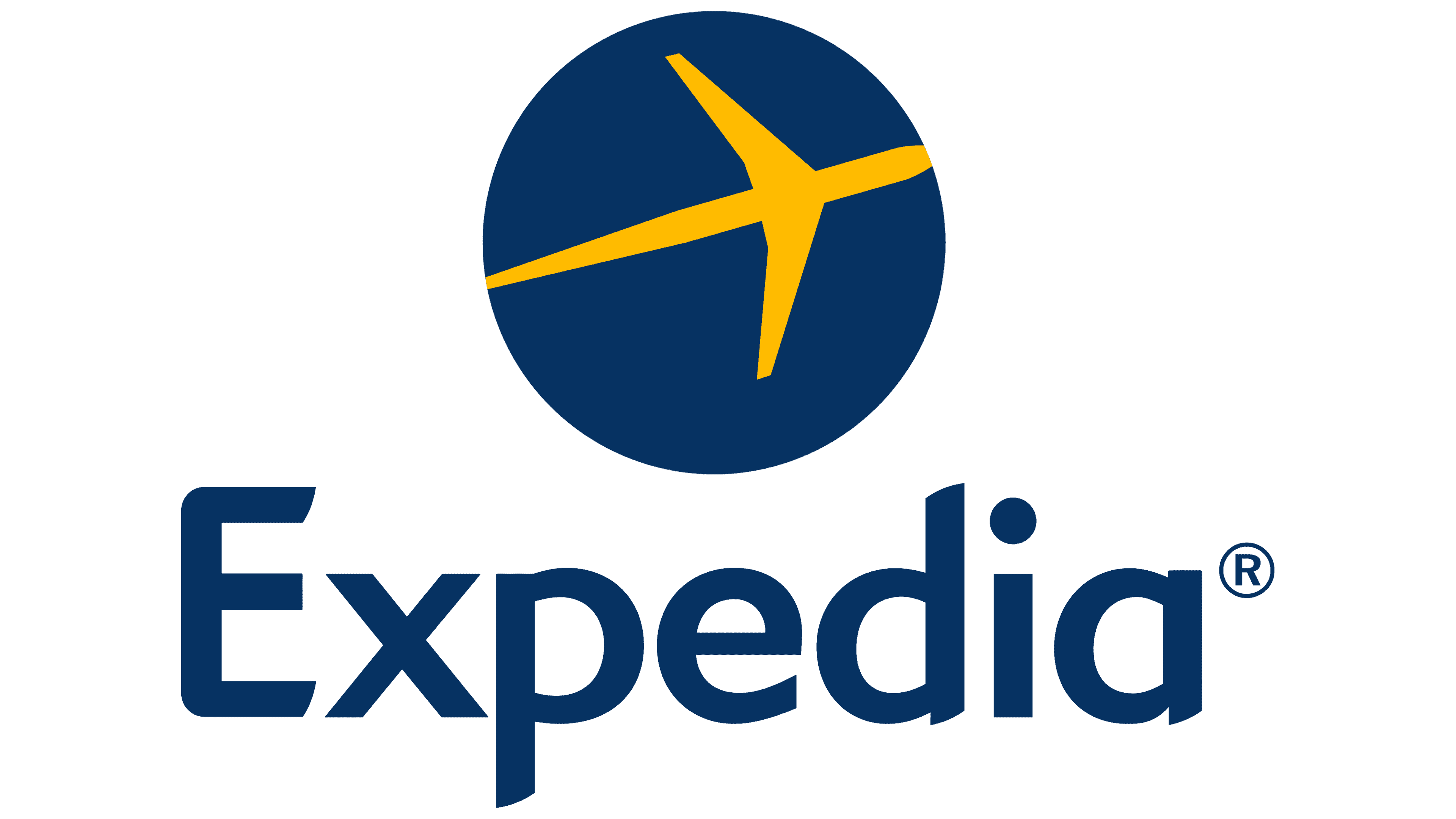
2012 – 2021
![]()
In 2012, the designers removed the gradient, so the globe lost its three-dimensionality. They also updated the color scheme once again. Now, the balloon and the company name are painted in the same shade of blue, and the plane is dark yellow. Another detail that the most attentive Expedia users may notice is the replacement of the TM badge with ®.
The emblem represents the brand’s main aspect. The plane flying around the globe is directly related to the project’s tourism focus. Realizing that this mark makes Expedia’s website recognizable, the parent company never changed it. She only decided on a small redesign to remove the cartoon style and update the color scheme.

The elegant lettering consists of letters that vaguely resemble Geometric 415 Std Medium. Some lines are cut diagonally, making them appear to have serifs at the ends. Rounded shapes combined with sharp corners create a contrast.
A logo palette is much simpler than a font. It contains only two colors: Deep Lemon (#EEC218) for the aircraft and Dark Midnight Blue (#00355F) for the company name and the globe.
2021 – 2023
![]()
The company presented the updated logo in the spring of 2021. First, the designers corrected the font. They replaced Expedia Sans with a crisper typeface that visually echoes the Gilroy Semi Bold. In addition, the darker color makes it much richer, and the light yellow elements stand out more. The third revision concerned the graphic part: the developers moved and rotated the plane, making it perfectly proportional to the round background and placing it in the center.
2023 – today
![]()
The thoughtful reworking of the Expedia logo has brought a noticeable update to its design through refined but powerful visual metaphors. And this was done with one simple stroke. The central element of the logo, the plane, was ingeniously transformed into a pointer, underscoring the company’s active direction and forward movement.
This arrow, vaguely reminiscent of an airplane with unusually long wings, points upwards, embodying the aspiration for growth and development. The sharpness of the elements’ ends, except for the front, underscores determination and effectiveness. In contrast, the presence of a miniature square in place of the tail part draws attention to the variety of directions in which the company operates.
The company’s dynamic nature is indicated by the blue pointer within a bright yellow square with softly rounded corners. This conveys movement and energy and reflects the brand’s safety and reliability.
The accompanying text, executed in lowercase with a font similar to Gilroy Semi Bold, enhances the brand’s modern, accessible, and friendly character. The updated Expedia logo seamlessly integrates symbols of movement, growth, and diversity while preserving its unique visual legacy.
Font and Colors
As a result of the emblem’s modernization, a different inscription style was adopted: the name of the tourist service is set in a font that most closely resembles Gilroy Semi Bold. It is thin, graceful, light, and grotesque. The yellow color has taken on a lighter shade, while the blue, by contrast, has become darker.

![]()

FAQ
Did Expedia change its logo?
On April 15, 2021, the travel brand unveiled a new logo with key changes. The lettering has become increasingly clear, giving it a modern look. The famous airplane symbol received an update. The colors are more vibrant, and the aircraft’s position has been adjusted for better balance. These changes aimed to modernize the brand’s image and increase its appeal to today’s audience. The new logo reflects the brand’s commitment to offering innovative, convenient travel solutions.
What is the new Expedia logo?
In March 2023, the travel brand updated its logo to better reflect its diverse range of travel services. The airplane logo has been replaced with an upward arrow, signifying progress and innovation in travel. The typography has been updated to a sleek, modern font to match the new brand image. These updates aim to create a modern, versatile look that will appeal to a wide audience and demonstrate the brand’s growth and its commitment to providing comprehensive travel solutions and impeccable customer service.
What is the meaning of the Expedia logo?
The logo reflects the brand’s personality, demonstrating its global reach and comprehensive services. The globe symbolizes the company’s global presence, connecting travelers to worldwide destinations. The plane represents the brand’s tourism services. This combination conveys adventure and exploration, reinforcing the brand’s commitment to providing seamless and innovative travel solutions. The updated design aims to attract a broad audience, reflecting the brand’s ambition to become a leader in the tourism industry.
Can I book on Expedia?
Yes, you can make a reservation. The brand offers a metasearch feature to search and book rooms and tickets. You can use their specialized website to book hotels, flights, and car rentals. The platform is user-friendly, making the booking process simple and efficient. With many options and competitive prices, you can easily plan and book your entire trip through this travel agency.
Is Expedia an Indian company?
The brand is not an Indian company. It is an American company founded as a Microsoft specialized service. It began providing a platform for booking travel services, including flights, hotels, and car rentals. Over the years, it has grown into one of the world’s leading travel companies, offering a wide range of travel services to clients worldwide. Despite its international reach, the company is still headquartered in the United States.
Is Expedia and Trivago the same?
No, these are different services. In 2012, Expedia bought Trivago for $630 million and now owns a majority stake. Expedia is a travel booking platform that offers flights, hotels, car rentals, and vacation packages. Trivago is a hotel search engine that compares prices across multiple booking sites to help users find the best deals on accommodations. Although they operate separately, the acquisition allows them to collaborate and leverage their strengths in the travel industry.