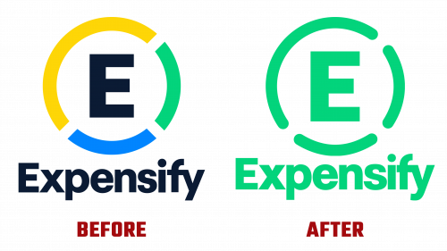
Expensify, one of the largest developers of financial technology, has unveiled a refreshed corporate identity, signifying a new era in its visual identity. Since its founding in 2008, Expensify has been instrumental in optimizing financial challenges for a wide range of businesses. The recent rebranding by Expensify’s internal team and New York-based design agency The Collected Works is designed to strengthen the company’s position in the fintech sector.
Central to Expensify’s updated identity is a redesign of the word mark and monogram. The new wordmark features a tighter letter layout and improved letter proportions, such as a more compact “p” and an elongated “s.” More subtle improvements are the smoothing of diagonal joints in the letters “p” and “n” and a new curl in the descending part of the letter “y.” These changes give the Expensify brand a refined and approachable feel.
The monogram, though less significantly altered, now features rounded caps replacing the previous flat endings. This transition gives the monogram a softer feel, though it creates a slight visual contrast to the previous style, which was more in line with the updated wordmark. The use of a unified color scheme reinforces the visual unity of the brand, supported by elegant animations that seamlessly merge the monogram and word mark.
The typography features New Kansas by Newlyn, a typeface modified for a more professional feel, and a custom version of RM Mono by CoType Foundry. The combination of monospaced and regular serif fonts allows for a simple yet adaptable typographic system.
Expensify’s logo redesign extends to a variety of applications, from product interfaces to advertising, providing a consistent and appealing look. The New Kansas font, despite its sometimes overly friendly appearance, especially when combined with swash alternates, forms a striking contrast to the bold sans serif typeface. The choice of a dark green color palette noticeably differentiates Expensify from other tech brands, giving the design elegance and unity. The brand’s apps demonstrate versatility by seamlessly transitioning from one visual format to another: illustrations, photos, and icons.
This comprehensive rebranding rejuvenated Expensify’s visual appeal and brought the brand in line with current design trends. The new identity is well thought out and resonates with both existing and potential customers, demonstrating Expensify’s commitment to innovation and excellence in the fintech industry. Expensify’s new logo and brand identity are important steps in the company’s journey to remain a leading player in financial technology.


