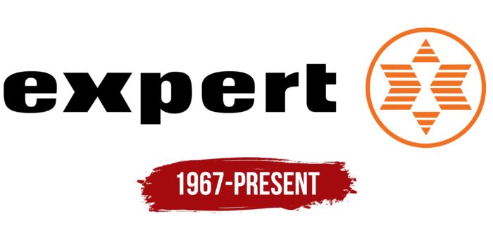
The Expert logo shows that the company specializes in customer service and assistance. The unification of disparate stores can be seen in the emblem. Each presents goods under different brands but is equally useful to customers.
Expert: Brand overview
| Founded: | 1967 |
| Headquarters: | Zug, Switzerland |
| Website: | expert.org |
Meaning and History
The emergence of the Expert brand was preceded by the creation of Intercop GmbH in 1967. It was founded by the entrepreneur Gunnar Nygren, acting in the interests of the Samex association, which included television and radio service providers. Later, other organizations began to join the group. And in 1971, it was renamed, which was the reason for changing its logo.
As a result of the rebranding, a new Expert symbol appeared, containing the brand name and an icon in the form of a striped six-pointed star depicting a white hourglass in negative space. The black wordmark seems as simple as possible: it consists of unremarkable bold sans-serif letters at first glance. But if you look closely, it becomes noticeable that some glyphs have an unusual shape. First of all, this concerns the lowercase “x,” which looks like a combination of two angle brackets pointing in different directions. They look like a modified fast forward icon, usually used when playing video or audio.
What is Expert?
The Expert retail chain sells electronic equipment for everyday use. It is headquartered in Switzerland and has stores all over the world. It received its current name in 1971. Before that, the company was known as Intercop GmbH.
To the right of the inscription is a white-orange emblem: a striped six-pointed star in a white circle with an orange outline. This is not just an abstract symbol but a stylized “x.” Parts of the letter can be seen in two elements, shaped like angle brackets. They are distant but connected by two small triangles (one at the top and one at the bottom). The empty white space formed by geometric shapes looks like an hourglass.
The combination of all the fragments looks exactly like a six-pointed star, which is no coincidence. The hexagram has many meanings in cultural, religious, and historical contexts. It is considered a sign of the harmony of the spiritual and material, the connection of two principles. And it is also an ancient symbol to which mystical properties were attributed in all eras.
Font and Colors
The brand name is written in bold sans-serif type. The lines are uneven in thickness: the main strokes are much wider than the secondary ones. Moreover, the word is completely translated into lower case. This is a subtle psychological trick used to gain consumer confidence.
Most likely, the designers developed a set of individual glyphs for the Expert International logo, giving them the necessary shape. This can be judged by the unusual appearance of the letter “x,” which was adapted to the brand concept. There are, however, approximately similar typefaces, such as Balboa Extra Black by Parkinson Type Design or Ultimate Serial Heavy by SoftMaker. Almost one hundred percent analog of the lowercase “e” is in Quilon Bold from the Indian Type Foundry.
The black inscription is contrasted with an orange icon. So that it is not too bright and does not attract all the attention, the designers diluted the orange color with white accents.
Expert color codes
| Pumpkin | Hex color: | #f37021 |
|---|---|---|
| RGB: | 243 112 33 | |
| CMYK: | 0 54 86 5 | |
| Pantone: | PMS 1585 C |
| Black | Hex color: | #000000 |
|---|---|---|
| RGB: | 0 0 0 | |
| CMYK: | 0 0 0 100 | |
| Pantone: | PMS Process Black C |


