 Exxon Mobil Corporation Logo PNG
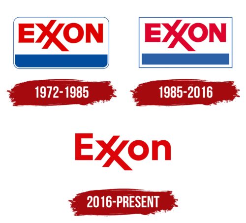
It is immediately striking that the Exxon Mobil Corporation logo from different years is almost identical, despite the difference in periods. It is red and austere, with the originally placed “X,” of which there are two in the name. And the designers used both glyphs to get a high dynamic emblem.
Exxon Mobil Corporation: Brand overview
| Founded: | 1882 |
| Founder: | John D. Rockefeller |
| Headquarters: | Texas, United States |
| Website: | exxon.com |
Meaning and History
The history of Exxon is long and rich because it goes back to the 19th century and is associated with one of the richest men on the planet – Rockefeller. The beginning of an influential corporation was the firm Standard Oil Trust. At one time, it was reorganized and split into two companies, which became the forerunners of Exxon and Mobil, which later merged.
After the name “Exxon” was officially adopted, the brand received a new visual identity. This happened in 1972. Raymond Loewy, a well-known industrial designer, worked on it. He proposed a double “X,” playing it off in dozens of variations, of which only one was adopted. According to Designboom magazine, 76 pencil sketches of the future logo were created. And each specifically highlighted a double glyph.
Users see it as similar to many real and even iconic elements. Some, for example, considered the Lorraine Cross, the symbol of the Templars, in the interlocking sign. In their opinion, the designer and the trademark owners were Freemasons. Others speculate that the duplicated “X” represents the scale of the car’s gas meter and that the emblem sends a subliminal signal to drivers that they have run out of fuel (XX is empty). In any case, nearly six years they are passed between the first sketch and the final approved version offered to the public.
What is Exxon Mobil Corporation?
Exxon is an American oil and gas corporation based on Standard Oil, which the Rockefeller family started. It is headquartered in Irving, but in 2023 it will be moved to Spring, Texas. The company’s current name is ExxonMobil: it got it in 1999 after it merged with the Mobil company.
1972 – 1985
The Exxon logo was immediately textual, with the letters acting as graphic elements. The designer took the double symbol as the basis and played with it interestingly by connecting the two glyphs with one leg. The result is the element “XX,” reminiscent of the modern grid “#,” positioned with a slight slope and with an elongated right side. The rest of the letters are usual: plain and smooth, with sharp extensions at the ends, replacing the serifs. Below the name is a blue stripe. The thick line and the inscription are taken in thin rectangular frames with rounded corners. This makes the emblem look like a business card.
1985 – 2016
After the redesign, the color of the inscription in the logo has changed: if previously it had a bright scarlet shade, now it is closer to crimson red. Another modernization touched the frame, where the developer straightened the corners so it got a perfectly rectangular shape. The wide blue stripe at the bottom was aligned accordingly.
2016 – today
The current emblem is a complete replica of the 2014 sign. The oil and gas company adopted it to match ExxonMobil’s overall logo for professional equipment (pumps and canopies). The main elements on the badge are the red name and blue stripe. The border is gone. In addition, the designers changed the font, making it simple, businesslike, and flat. The letters are converted to lowercase, except for the first one.
Font and Colors
The modern visual identity of this brand is based on the logo of Esso, the original fuel brand of Standard Oil, which was Exxon’s predecessor. Its name also has a double consonant, which is used in its personal symbolism. The color palette and emblem structure are identical, but only in the first case; the inscription is in a circle, and the second is in a rectangle.
The lettering used in the Exxon identity is custom-made because it is a key element of the logo. The closest font it resembles is the ITC Avant Garde Gothic Std Bold. The corporate palette of the oil and gas company is very bright, expressive, and dynamic. It consists of two colors: red and blue, arranged on a neutral white background.
Exxon Mobil Corporation color codes
| Racing Red | Hex color: | #dc0409 |
|---|---|---|
| RGB: | 220 4 9 | |
| CMYK: | 0 98 96 14 | |
| Pantone: | PMS Bright Red C |


