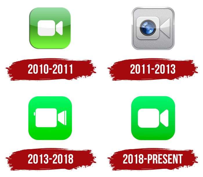
The FaceTime logo is built on association symbols, and promises live communication. Easy and simple communication system based on calls and video. “Place a call and maintain eye contact with selected callers,” the emblem’s symbols invite.
FaceTime: Brand overview
| Founded: | June 24, 2010 |
| Founder: | Apple |
| Headquarters: | United States |
| Website: | apple.com |
FaceTime is a video telephony program developed by Apple Inc. for multiple platforms. In 2010, it was launched for iOS and Mac OS products.
Initially, the product belonged to the private multinational company FaceTime Communications. This explains its unusual name. Then the application was bought by Apple Corporation, which, after a little refinement, introduced the new product to its Mac App Store.
The app is compatible with any iOS device with a front-facing camera and Mac hardware with a FaceTime camera. In addition, the utility can be used in the audio content transfer mode. It is supplied free of charge in a modern format – as preinstalled software (starting from the Mac OS X Lion version).
Meaning and History
Apple acquired FaceTime from FaceTime Communications, which became Actiance in 2011. Steve Jobs announced the program at the Apple Worldwide Developers Conference in the summer of 2010, in conjunction with the iPhone 4. Support for the iPod Touch (the first camera prototype) was launched in September of that year. A month later, a version for Mac OS X appeared.
In March 2011, the launch of a version adapted for iPad 2 was announced. A little later (in May), it turned out that the application can work over 3G networks on any iPhone, iPad, and iPod Touch model that support it. Now, this software also accepts calls on 4G LTE. The utility is more advanced in a modern format – it allows you to make video calls in conference mode to 32 users simultaneously (since 2018). In parallel with the technical improvement of the software, its graphic designation also changed. There are four of them in total.
The software for video communication FaceTime can replace Skype, Viber, and similar services for Apple mobile devices. Therefore, its logo is well known to millions of users who have appreciated the benefits of technology for communicating with friends and family. The modern application icon reflects its essence, as it depicts a video camera. Moreover, the style corresponds to the identity of other products: it is the same terse and has a simple geometry. FaceTime emblems have changed quite often, but only once (in 2011) has the update been global.
What is FaceTime?
FaceTime is an application that connects Apple mobile device users. It allows making video calls with high-quality sound and images. It offers two modes: communication with one person or with multiple people simultaneously. To use FaceTime, you need an iPod Touch, Mac, iPad, or iPhone with a compatible OS version and an Apple ID account.
2010 – 2011
This logo has been used on several versions of iOS (from 4.0 to 4.2). Products that worked on iPads and iPhones did not have a similar icon. It later became a complement to the 4th generation iPod Touch. The icon depicts a classic white movie camera with a rectangle, and a trapezoid turned on its side. Both elements are housed in a large green square with rounded corners. A large horizontal flare has been superimposed on the logo; therefore, according to color proportions, the image is divided into two parts – a lighter and a darker one.
2011 – 2013
The new version of the logo accompanied the application running on iOS versions 4.3-6. Moreover, the program was first adapted for devices on the iPad (starting with the second series).
But this time, the developers approached the logo more originally. They removed glare and green color by adding a metallic embossed texture and a realistic lens. The icon began to look different because the developers combined the old image of the TV camera and the built-in smartphone lens, which has a characteristic bluish sheen. At the same time, the square turned silver and received an embossed pattern, which is why the logo acquired a metalized design. In addition, he had a thin frame that shimmered in the light.
2013 – 2018
This version of the logo was launched in the fall of 2013, simultaneously with iOS 7. A little later, another one appeared – for the iPhone 4.
In 2013, the creators of the logo reverted to the old concept, again depicting a white TV camera on a green background. This time, they tried to detail the picture by folding the camcorder from a large rectangle with rounded sides (body), a small short strip (regulator), a trapezoid turned on the side (lens), and a long narrow rectangle (lens edge). The gradient has practically disappeared: the green color has become more uniform and has acquired a pastel shade.
2018 – today
When the iOS 12 beta one was released, the style of the FaceTime icon was closer to the original version, although in general, it retained the 2013 palette. Thus, some details were removed from the camera: only the large quadrilateral and trapezoid remained in their places.
The creators removed the miniature vertical rectangle and rounded the corners of the lens. They also slightly tweaked the rectangle to make the edges more streamlined and replaced the neon palette with a calm one. At the same time, the green took on a darker shade, and the gradient was slightly enhanced – not as noticeably as in the 2010 logo, but enough to talk about changes.
FaceTime: Interesting Facts
FaceTime, created by Apple Inc. in 2010, quickly became a key way for people, especially those with Apple devices, to video chat. Originally made for iPhone 4 users to make video calls over Wi-Fi, it’s grown significantly with new features and updates.
- Launch: Steve Jobs introduced FaceTime at the Worldwide Developers Conference in 2010, starting with the iPhone 4. It has since become available on iPads, iPod Touches, and Macs but not on non-Apple devices.
- From Wi-Fi to Cellular: Initially, FaceTime only worked over Wi-Fi. In 2012, iOS 6 also allowed it to work over cellular networks so that users could make calls without Wi-Fi.
- Secure Calls: FaceTime calls are protected with end-to-end encryption, meaning they’re private and secure from eavesdropping, even by Apple.
- Group Calls: Since iOS 12.1 in 2018, FaceTime has allowed up to 32 people to join a single call, with a smart interface highlighting whoever is speaking.
- Animoji and Memoji: Users can make calls using animated emojis that mimic their facial expressions, thanks to the TrueDepth camera on newer iPhones and iPads.
- Audio Calls: In addition to video, FaceTime offers high-quality audio calls over Wi-Fi or cellular data, a clear alternative to traditional calls.
- Eye Contact Feature: iOS 14 introduced a feature that makes it look like you’re making eye contact with the camera, even if you’re looking at the screen, for a more personal conversation feel.
- FaceTime Links: With iOS 15, Apple added FaceTime links for scheduling calls, making it possible for non-Apple devices to join calls via web browsers, expanding its accessibility.
- Spatial Audio: This feature makes it sound like the person you’re talking to is in the same room, making calls more realistic.
- SharePlay: This feature allows users to share experiences like movies or music during a call, turning FaceTime into a platform for shared activities.
FaceTime has changed our communication, continuously adding features that improve the experience. This shows Apple’s dedication to better connectivity, privacy, and thoughtful design.
Font and Colors
The modern logo is very similar to the debut version (2010-2011). The only difference lies in the lens: in the early version, it has sharp corners; in the later version, it has rounded corners. In addition, the camera is now simplified as much as possible. FaceTime app icons have evolved along with the iconography of the iOS system. Trying to keep the general appearance of all elements, the developers remain true to their original intentions and do not change the shape or content of the logo. Apple’s Industrial Design team is responsible for the updates. They stick to the same style and, from time to time, modernize the image of the white camcorder. It symbolizes the main purpose of the service – communication via video communication.
The program is indicated only by an icon – the emblem has no text part. The application’s proprietary palette consists of three shades of green: Dark Pastel Green (code # 0EBE2C), Lime Green (# 34DA4F), and Screamin ‘Green (# 5CF777).
Despite the lack of inscriptions, the logo is strongly associated with FaceTime: one icon shows which application it belongs to. One of the most memorable aspects is its color scheme: a green square with a gradient backdrop for white geometric shapes. The designers changed tradition only once when they made the emblem silver and added an iridescent blue smartphone camera lens inside. All other versions correspond to the original in terms of the palette.
FaceTime color codes
| Ultra Green | Hex color: | #56f270 |
|---|---|---|
| RGB: | 86 242 112 | |
| CMYK: | 64 0 54 5 | |
| Pantone: | PMS 354 C |
| Dark Pastel Green | Hex color: | #12c230 |
|---|---|---|
| RGB: | 18 194 48 | |
| CMYK: | 91 0 75 24 | |
| Pantone: | PMS 354 C |
