


![]() Fall Guys Logo PNG
Fall Guys Logo PNG
The Fall Guys logo transports the user to a cheerful world of childhood, inviting them to transform on-screen into a cartoon character and participate in relay races. The emblem promises many bright and pleasant emotions.
Fall Guys began with Mediatonic, a British studio founded in September 2005 by Brunel University graduates Dave Bailey and Paul Croft. The company first worked on Flash games for outside clients. It had made over 130 titles before Fall Guys, including Amateur Surgeon, which reached about 100 million players.
The idea appeared in January 2018, when lead designer Joe Walsh mentioned Takeshi’s Castle during an internal meeting. The concept evolved into a multiplayer battle royale focused on obstacle courses rather than shooting. Early names included Fool’s Gauntlet and Stumble Chums before the team settled on Fall Guys. The game was built as an opposite to Fortnite and PUBG, replacing weapons with jumps, collisions, and chaotic bean-shaped characters.
At GDC 2018, Mediatonic pitched the project to ten publishers. Only Devolver Digital agreed to fund it, after earlier work with the studio on Foul Play and Hatoful Boyfriend. Fall Guys was developed in Unity and first shown publicly during Devolver Digital’s recorded E3 presentation in June 2019. The team expanded to more than 150 people before launch.
Fall Guys: Ultimate Knockout was released on August 4, 2020, for PlayStation 4 and Steam, priced at $19.99 and included in PlayStation Plus. It sold over 7 million copies on Steam, passed 8 million downloads on PlayStation 4, and set a PlayStation Plus download record. Epic Games acquired Mediatonic’s parent company, Tonic Games Group, on March 2, 2021. On June 21, 2022, the game became free-to-play, moved new PC users to Epic Games Store, and reached 20 million players in 48 hours.
Meaning and History
![]()
A young team of programmers who had been working together since their student years worked on Fall Guys. The game was announced in 2019 and launched in 2020, with publishing entrusted to American Devolver Digital. The new project became the company’s best. No other Devolver game had so many fans.
Despite its youth (the game is only 2 years old), the arcade has already undergone 3 logo changes, demonstrating the team’s ongoing efforts to improve the project.
What is Fall Guys?
Fall Guys is a multiplayer entertainment platform game developed by Epic Games. It combines elements of battle royale and arcade. The game is developed on the Unity engine and has high ratings (8/10). Game versions are available for Xbox, Nintendo, PlayStation, and Windows x64.
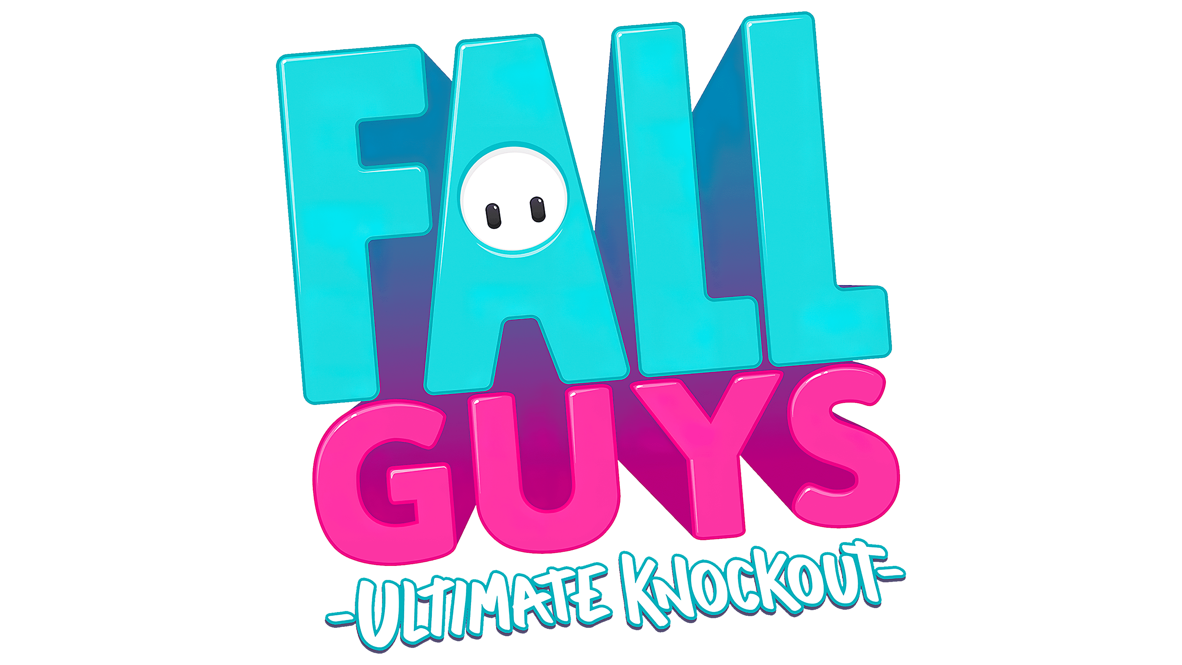
2020 (early)
![]()
After releasing the game Snowman Salvage in 2005, Mediatonic had not had significant success for a long time. Only after joining the Tonic Games Group did they manage to develop a successful first version of Fall Guys: Ultimate Knockout.
The logo is a cartoon version of the game’s name. The first working versions, Fool’s Gauntlet and Stumble Chums, didn’t catch on. Instead, Fall Guys turned out to be an extremely successful choice. Some translators interpret the title as “Autumn Guys,” but a more accurate translation is “Falling Guys.” The name reflects the chaos unfolding on the screen as the tiny bean-shaped minions fall in different directions, overcoming obstacles.
In the emblem, the title is placed on two levels. The large word “Fall” draws attention to the dangers and large barriers. The word “Guys” suggests a small number of competition participants.
The rounded letters and colors of the words convey the smooth lines of the obstacles and shades of the playing field. The eyes that look out of the hole in the letter A resemble a bean in a costume.
Below the title, the phrase “ultimate knockout” is added. It emphasizes that players not only compete with each other but also hinder each other in overcoming obstacles. Those who fail, like a knockout, leave the playing field forever.
2022 (outdated)
![]()
In 2021, the developers’ parent company was acquired by Epic Games, the largest holding company, which reported a profit of $19 billion. Inspired by new prospects, the Mediatonic team decided to add new modes and accounts to the game.
The updated game logo no longer includes the “ultimate knockout” addition. Otherwise, it matches the first version almost entirely.
The color palette became lighter, indicating the ease and humor of battles. The receding letter shadows create the illusion of fast-forward movement, emphasizing the dynamic obstacle course.
The slight tilt of the words demonstrates the absence of a flat plane, constant changes in the scenario, and unpredictability. All of this knocks the ground out from under the players’ feet.
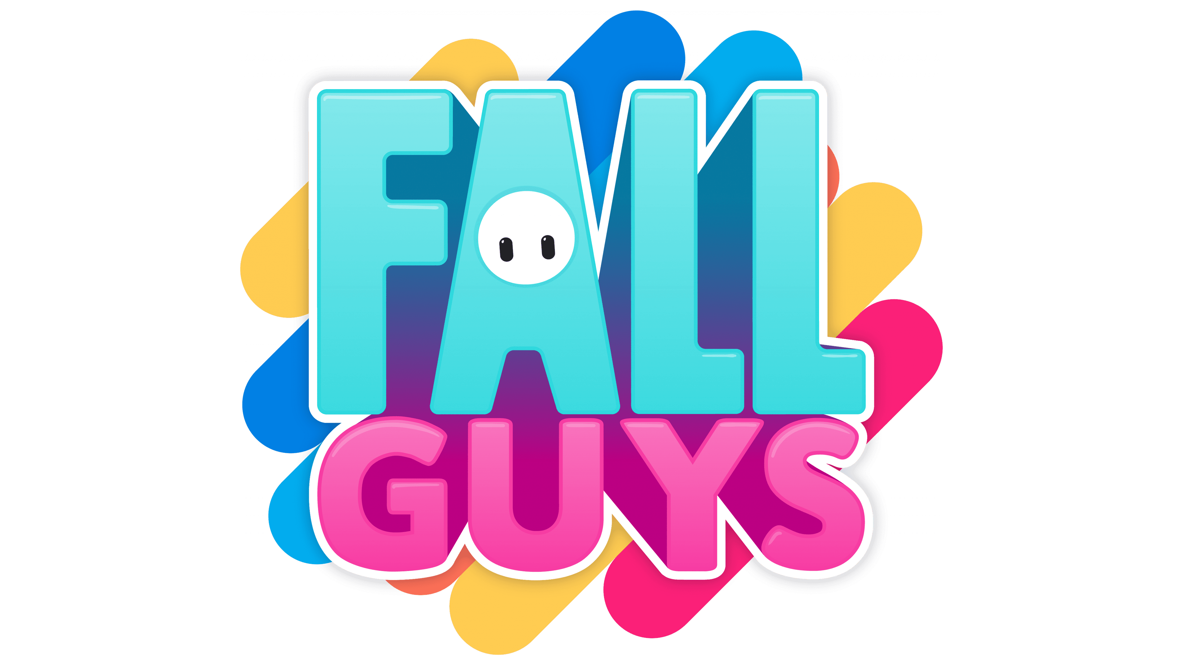
2022 – today
![]()
The modern, updated logo, which has evolved from previous versions as the game improved, includes not only the title but also a background with multicolored stripes (yellow, brown, raspberry, and blue) with rounded ends. This directly points to the game characters and their colors.
The stripes enhance the sense of fun and excellent mood emanating from the logo image.
Font and Colors
Raspberry and blue are the primary logo colors. These shades remind us of sweets, making the game appealing and “childish.” The logo creates an atmosphere of fairy-tale entertainment and fun.
- Pink. At the beginning of the game, all Fall Guys characters are painted raspberry pink. Due to the variety of costumes, this may not be immediately noticeable. Artist Dan Hoang created these images. Later, variations appear as Banana, Silent, and Clovis. Many obstacles also have a raspberry hue.
- Blue. The second primary color for characters is characteristic of the Clovis variety.
The logo font is Metcon Heavy, with added shadows to create a volumetric effect.