


![]() Fallout Logo PNG
Fallout Logo PNG
Sharpness and tension soar in the emblem’s symbols. The Fallout logo showcases the enclosed space, dark designs, and complex challenges that unfold before the player. The main thing is to move forward and not stop.
The Fallout video game series’ plot takes place in a post-apocalyptic world where the protagonist must survive, complete his mission, and thwart the plans of radiation mutants. Interplay Entertainment developed the first part (1997), and Black Isle Studios developed the second (1998). They differed only in the details of the game universe. The new millennium has seen a transition from isometric RPGs to open-world action/RPGs. And all thanks to Bethesda, which bought the Fallout license and created two more parts: the third (2008) and the fourth (2015).
The history of the Fallout series began in 1997, when Interplay Productions, under the direction of Tim Cain, released a role-playing game inspired by their earlier title, Wasteland. Initially intended as a sequel, the project was delayed by legal issues, forcing Interplay to create a new franchise and adopt a unique retro-futuristic aesthetic that juxtaposes 1950s American optimism with post-apocalyptic devastation. The original Fallout introduced the iconic S.P.E.C.I.A.L. character attribute system, nonlinear storytelling, and deep RPG mechanics. A rapid sequel expanded these features, followed by spin-offs exploring tactical and action-oriented gameplay, though financial issues stalled further development.
After Bethesda Softworks acquired the franchise, it revitalized the series with Fallout 3, shifting it to a 3D open-world RPG and significantly expanding its popularity. Bethesda further enriched the universe with Fallout: New Vegas, developed by Obsidian Entertainment and renowned for its narrative depth, and later with Fallout 4, which introduced new crafting and settlement mechanics. Despite initial struggles with the multiplayer-focused Fallout 76, subsequent updates improved player experiences, while spin-offs like the mobile hit Fallout Shelter broadened its appeal. The brand’s expansion continued with a successful television adaptation and the ongoing development of Fallout 5, solidifying its lasting impact on gaming culture.
Meaning and History
![]()
The Fallout was originally planned as a sequel to the post-nuclear RPG Wasteland, but the developers could not obtain permission from the owner. So, they had to develop a plot, name, and emblem for the RPG from scratch, although the new video game series remained Wasteland’s spiritual successor. The dark atmosphere of the post-apocalyptic world is reflected in the logos of all four Fallout games.
What is Fallout?
This is a series of role-playing video games set in a world following a global nuclear catastrophe. The gameplay centers on completing quests, battling enemies, and surviving in a devastated, dangerous environment. The project is known for its retrofuturistic atmosphere, dark humor, and non-linear storytelling.
1997
![]()
The emblem of the first game, released in 1997, contains its full name. The inscription “Fallout A POST NUCLEAR ROLE PLAYING GAME” is depicted on a rectangular plaque, with the first word taking up the main space and the rest at the bottom. The text is supplemented with two pictures: a radiation hazard symbol and a gas mask. They hint that the action occurs in a fictional universe that has survived a nuclear war.
1998
![]()
In 1998, the second part of the series appeared with a new logo. It is similar in shape to the previous one, except that the designers removed the background rectangle and left the inscriptions inside two parallelograms with partially rounded corners. A voluminous purple circle with the number 2 appeared on the right. This emblem, in its design, does not resemble the usual plate; it is a shiny metallic part of the mechanism.
2008
![]()
Fallout 3 was released after Bethesda acquired the license for a series of post-apocalyptic video games. The new developer has changed the design of the fictional universe and the logo. He removed unnecessary details, leaving a single parallelogram with a black border and the words “Fallout 3” on a dappled background.
2015
![]()
The Fallout 4 emblem features a title that doesn’t look 3D at first glance. The lettering is inside a white rectangle with rounded sides. The outer border is outlined with a thin black line.
Each part of Fallout has its distinctive mark. But if the first version was a complex drawing with many colors, details, and inscriptions, by 2015, the design had become much simpler. The developers took a minimalist approach, leaving only the game’s main title and a white-framed background.
Font and Colors
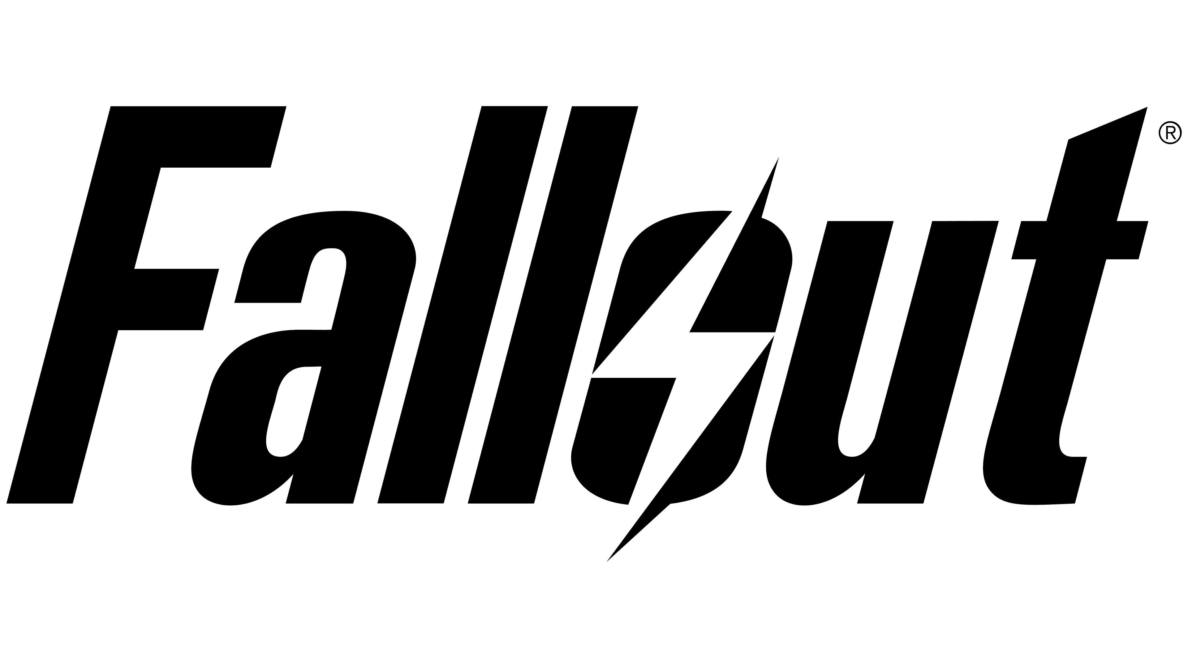
The Fallout logo is set in a slanted sans-serif typeface, with subtle irregularities that enhance the game’s distinctive atmosphere. The letterforms vary in stroke thickness, giving the text a dynamic and slightly unconventional appearance. A small lightning bolt inside the letter “o” references the game’s universe’s energy themes and tone. The top of the letter “t” is shortened, contributing to a sense of ease and casual structure within the design.
The typeface resembles Overseer Oblique, created by designer Neale Davidson and inspired by the original graphics. The lettering appears unified and compact due to tight character spacing. The text remains highly legible, even when scaled down for smaller surfaces.
Early versions of the logo featured muted, cool tones with dark gradients and highlights, including gray, black, and subdued violet. In the fourth installment, the design approach shifted completely: all color elements and gradients were removed, leaving only a stark black-and-white contrast for a cleaner, more iconic presentation.