Caring for the family is the main theme of the emblem. The Family Dollar logo focuses on shoppers needing department store merchandise. The stores have products for all age groups. And the price will pleasantly please and support the family budget.
Family Dollar: Brand overview
| Founded: | November 1959 |
| Founder: | Leon Levine |
| Headquarters: | Virginia, United States |
| Website: | familydollar.com |
Family Dollar National Discount Stores cater to low-income families trying to save on everything from groceries to clothing and home furnishings. Therefore, most of the shelves are filled with American brands worth from $1 to $10. Another budget retailer, Dollar Tree, owns the retail chain. He moved the Family Dollar headquarters to Virginia and created new department store formats to find a better business model.
The Family Dollar retail chain was born thanks to the efforts of Leon Levine, who was inspired by the concept of “everything for the dollar” stores. In 1959, he opened the first outlet and named it after the target audience in honor of financially disadvantaged families. He made the right choice of demographic group: it was not long before sales revenue allowed him to create several more department stores. At the same time, the price threshold was raised because Leon understood that it was not profitable to offer everything for 1-2 dollars.
The network expanded at an accelerated pace: by 1989, it included 1.5 thousand stores. And by 2011, there were more than 7 thousand of them. In 2015, the most significant event in the history of Family Dollar happened: the budget retailer was bought by rival company Dollar Tree. But there was no final merger: both brands operate independently because their business concepts are completely different. They have different supply chains, price ranges, and customer groups.
Meaning and History
The new owner decided to rebrand some Family Dollar outlets, turning them into Dollar Tree. The integration was not complete, as the remaining locations continue to use the old name and logo, which has not changed since 2008.
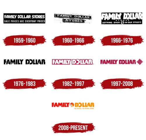
The retail chain has retained its identity to remain recognizable to regular customers. It can be said that throughout the company’s history, its graphic sign has hardly changed because it always contained an inscription made in bold capital letters without serifs. But in fact, there were changes and noticeable ones: after each redesign, the style became more understandable and closer to the original business concept.
What is Family Dollar?
Family Dollar is a chain of outlets with a wide range of general merchandise sold at discounted prices. It includes more than 8 thousand locations (as of 2021) located in most US states. Since 2015, the company has been owned by its main competitor, Dollar Tree, Inc.
1959 – 1960
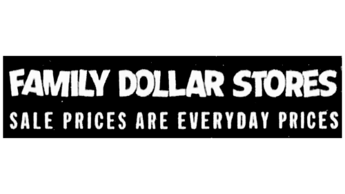
When the Family Dollar network was not yet as popular as it is now, she had to attract customers’ attention through advertising. Therefore, the brand logo has become one of the marketing tools. It contained not only the phrase “FAMILY DOLLAR STORES” but also the phrase “SALE PRICES ARE EVERYDAY PRICES,” which reflected the concept of pricing.
The title occupied the top line and was in jagged font with glyphs overlapping each other. It looked like a stylization of the credits of old cartoons. The company motto was at the bottom and consisted of bold sans-serif letters. Both inscriptions were white and located inside a black rectangle. To justify them in width, the designers had to adjust the size of the glyphs and the letter spacing.
1960 – 1966
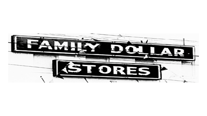
In 1959, young entrepreneur Leon Levine opened his first self-service store and named it Family Dollar. By 1965, the number of outlets had been increased to three. Before becoming a retail giant, the company used a white-printed “FAMILY DOLLAR STORES” logo. It was intended primarily for signage, where the first two words were at the top and the third at the bottom, centered. Both parts were located in separate black rectangles with a white outline. For the text, the designers chose a simple geometric sans-serif typeface.
1966 – 1976
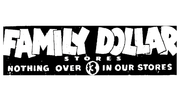
In the mid-1960s, all logo elements ended up in one large black rectangle. Moreover, the brand name was framed in an unusual bold grotesque. The jagged, overlapping letters made the font look cartoonish and reminiscent of the style of the captions in the credits of the first Mickey Mouse cartoons produced by Walt Disney Studios.
At the same time, the word “STORES” has become very small: to make it take up more space, the developers have expanded the letter spacing. At the very bottom was the phrase “NOTHING OVER $3 IN OUR STORES” because, in the 1960s, the price limit was raised to $3. The cost of the goods was placed in a white circle and, accordingly, recolored in black. The logo was stylized as the titles of old Walt Disney animated films because such a design hinted at the family focus of the stores.
1976 – 1983
In the mid-1970s, Family Dollar decided to change its concept. This is how the black logo appeared, consisting only of the brand name. The inscription was designed in an individual font, the main difference of which was the empty spaces in those places where the horizontal bar “A” should be in contact with the left diagonal. The next version presents the same emblem in a different color scheme.
1982 – 1997
In 1974, the chain opened its 200th-anniversary store and a new distribution center. At the same time, her sales began to fall, so she hired a team of marketers who had to change the strategy. Specialists suggested raising the maximum price threshold; as a result, the inscription of about “three dollars” was removed from the logo. Its redesign has become part of global changes.
The creators of the wordmark retained only the name of the company. The phrase “FAMILY DOLLAR” remained white, which is the only thing that connected the new design with the previous one. The font was no longer cartoony, but it still looked non-standard. The developers used bold grotesque with disproportionate glyphs. Inside “A,” “D,” and “R” were slits extending down parallel to the main stroke. At the same time, almost all the letters, as before, crawled on top of each other. A dark crimson outline replaced the black background. At the bottom, it looked like a solid horizontal line, so the inscription seemed stable and monolithic.
1997 – 2008
The original font has been retained, as has the dark crimson color that has become dominant in this emblem version. “L” and “Y” were connected at the top, even though most of the letters had empty separating spaces between them, preventing them from merging. On the left was a unique pattern of four stylized “Fs” stacked in a propeller shape around a black square dot. The ornament looked like a flower or an embroidery element.
2008 – today
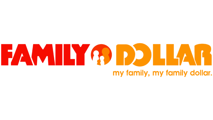
In 2003, the company was inherited by Howard R. Levine. A couple of years later, the logo was changed under his leadership. The designers divided the brand name into two parts, placing a red circle between them with four figurines of white and orange men. The word “FAMILY” became red, and “DOLLAR” was recolored orange. The inscription “my family, my family dollar” appeared on the right side with a dot at the end. Everything after the comma is in bold. The slogan is reduced to such an extent that it fits perfectly under the word “DOLLAR” – from “D” to “R” inclusive. The general background is white; there are no contours around the letters.
At the same time, an alternate logo was used several times on the TV program Save to Win. Its base is a red rectangle. Inside is the same red word “FAMILY” with a white outline, and below it is an orange “DOLLAR” with a dot in the center of the “O.”
Font and Colors
The chain of discount stores, known for its lucrative discounts, targets low-income families. And this is reflected not only in its name but also in the logo. Indeed, in addition to the inscriptions, it contains around icon which depicts a family of four: judging by the size, two adults and two children. This element was added to inspire confidence in the core demographic. The concept did not change even after the Family Dollar Company became the property of Dollar Tree.
Judging by the unusual shape of the letters, the designers used a modified Tabasco Bold font from SoftMaker for the brand name. This is a retro sans serif inspired by the John Schaedler typeface of the same name. It is characterized by a lack of proportionality and a pronounced asymmetry of some letters. The slogan is written in a standard sans-serif font: one half has a normal style, and the other half is bold.
To draw attention to the brand name, its creators combined two bright colors: red (#ef4136) and orange (#f89d33). They are visually balanced because they are complemented by white, which is used not only for the background but also for the icon.
Family Dollar color codes
| Red | Hex color: | #ef4136 |
|---|---|---|
| RGB: | 239 65 54 | |
| CMYK: | 0 73 77 6 | |
| Pantone: | PMS Bright Red C |
| Orange | Hex color: | #f89d33 |
|---|---|---|
| RGB: | 248 157 51 | |
| CMYK: | 0 37 79 3 | |
| Pantone: | PMS 1375 C |
