![]() Family Feud Logo PNG
Family Feud Logo PNG
The extraordinary Family Feud logo looks like the title screen of some Texan Western. Originality and brightness are central to the show’s theme, in which the main goal is to snatch victory from opponents and demonstrate one’s guessing skills. The unique emblem emphasizes this feature and shows readiness to challenge anyone.
Family Feud is an American television show in which two families compete in an intellectual game. Winners receive prizes and money. The idea belongs to producer Mark Leo Goodson, who developed the project’s main concept. The first season began in 1976 on ABC.
Family Feud’s history began on July 12, 1976, when the ABC program aired. Mark Goodson, a well-known American game show producer, created the show.
The show’s concept was inspired by the popular “Audience Match” segment from Match Game, another of Goodson’s productions. The format involved two families competing to guess the most common responses to survey questions posed to a random group of people.
Richard Dawson was the first host. He quickly gained popularity for his charismatic style and habit of kissing female contestants. Dawson hosted the show from 1976 to 1985, often regarded as its peak.
The show became so popular in 1977 that ABC began airing it twice a day, both in the morning and the evening, making it one of the top midday programs in the U.S.
However, the show was canceled in 1985 due to declining ratings. CBS revived it in 1988, with Ray Combs as the new host. This version ran until 1993.
In 1994, Richard Dawson returned to host the show in syndication, but this iteration lasted only one season.
In 1999, the show was revived again, with Louie Anderson as the host. Anderson’s version helped the show regain its popularity.
In 2002, Richard Karn became the host, continuing to refresh the show to attract new audiences.
John O’Hurley took over as host in 2006. Under his leadership, the show remained popular and continued to draw viewers.
A significant change occurred in 2010 when Steve Harvey became the host. Harvey’s unique comedic approach led to a significant increase in viewership.
Under Harvey’s leadership, the show reached new levels of success. In 2013, it became the most-watched syndicated television program in the U.S., surpassing Wheel of Fortune.
2015 Celebrity Family Feud premiered on ABC with Harvey as the host, expanding the show’s reach and audience.
In 2019, an African version of the show, also hosted by Steve Harvey, was launched, highlighting the format’s broad appeal.
Throughout its history, the show has adapted to changing audience tastes while maintaining its core concept. Known for its memorable host interactions and contestant responses, the program has inspired various international versions and remains a significant part of television entertainment.
The show continues to be popular, demonstrating its enduring appeal in the ever-evolving world of TV.
Meaning and History
![]()
The TV show’s name originates from the game concept, in which a “feud” unfolds between families. It is a competition with questions based on intuition, resourcefulness, and the ability to find a way out of unforeseen situations. There are no actual fights, so the word “feud” here is allegorical and somewhat provocative, intended to attract attention and increase viewership.
The Family Feud logo also contains a touch of combativeness: in the early seasons, it was designed as a sign of a Wild West American tavern. This is evidenced by:
- Old English letters;
- A horizontal oval;
- A contrasting frame;
- An imitation of “stars” around the edge.
This style is purely American, as the emblem resembles the classic rondel, the basis for most antique signs. The palette emphasizes this, contrasting the southern sky with dusty sun-scorched earth.
What is Family Feud?
It is a television show that has been broadcast on American TV since 1976. It consists of three seasons. The essence of the show is a spectacular competition between two families. In the end, the winning participants are awarded prizes and receive money. The ideologist of the game is producer Mark Leo Goodson.
1976 – 1985
![]()
The emblem consisted of an ellipse with an inscription at its center. The background inside was yellow, like the warm sun. The name of the TV show, written in an Old English font, stood out clearly. Each letter had expressive spikes that harmoniously blended with the large serifs. They balanced each other as the stems of the glyphs were thin. A strip of white dots ran around the edge of the oval, visually reminiscent of the classic frames with stars found on the seals of American institutions.
1988 – 1994
![]()
The emblem consisted of an oval flattened at the sides, almost like a full circle. However, this impression was deceptive; the logo shape remained oval. A red frame with a series of white dots surrounded it. There was also an inner beige ring with a gradient color transition.
The central part looked like an embroidery canvas stretched on hoops. The designers visually rounded the oval for this purpose. As a result, the family TV show’s emblem accurately conveyed the idea of family. On the squared background, patterns were drawn: flowers, hearts, leaves, and other elements characteristic of embroidery. The most striking detail was the two-level inscription, stylized as a cross-stitch embroidery.
1994 – 1995
![]()
The Family Feud logo was distinctly oval. It had a yellow frame and an inscription that looked pixelated or as if made of Lego pieces. Each letter was accompanied by blurred shadows, making the name appear voluminous. The background was a white-gray ornament. The glyphs had spikes and ornate serifs, resembling the characters of the Old English alphabet.
1996
![]()
The emblem’s pixelated style was preserved, although some details completely changed during the redesign. For example, the color palette shifted to a muted red spectrum: the letters were written in dark maroon, and the background had a carrot hue.
1999 – 2006
![]()
With the arrival of the third season of the TV show, there was a radical change in its visual identity. Designers tilted the oval to the left, lifting the right side, and colored it in azure with a gradient. They added a golden frame around the edges. It had an uneven width, which brought dynamism to the logo. Above it, the show’s name was displayed in a playful style: the word “Family” was italicized and handwritten, while “Feud” was blocky and business-like.
2006 – 2007
![]()
The Family Feud emblem designers settled on a block style. To do this, they made both parts of the title large. Despite their bulk, the inscriptions were perceived easily and dynamically because the letters were of different heights. The designers abandoned the oval and placed the text on a white background, making it appear to float in the air. Black shadows added volume, and a glare in the center brought brightness.
2007 – 2010
![]()
The oval and small dots have returned to the logo, now not on the edge but in the middle, acting as a patterned background. They look like tiny LED lights. The designers made the frame triple: the strip closest to the center is painted white, the middle one is dark sandy with a wood texture, and the farthest one is blue, matching the center. The right and bottom sides of the ellipse are decorated with a smoky shadow, making the geometric figure appear to be hanging in the air.
The TV show’s title is placed on graphic elements. It is much larger than the image, so the side letters protrude beyond its borders. The inscription is a gradient – brick-gold. All glyphs are uppercase except for the lowercase “y,” which is simply enlarged in size.
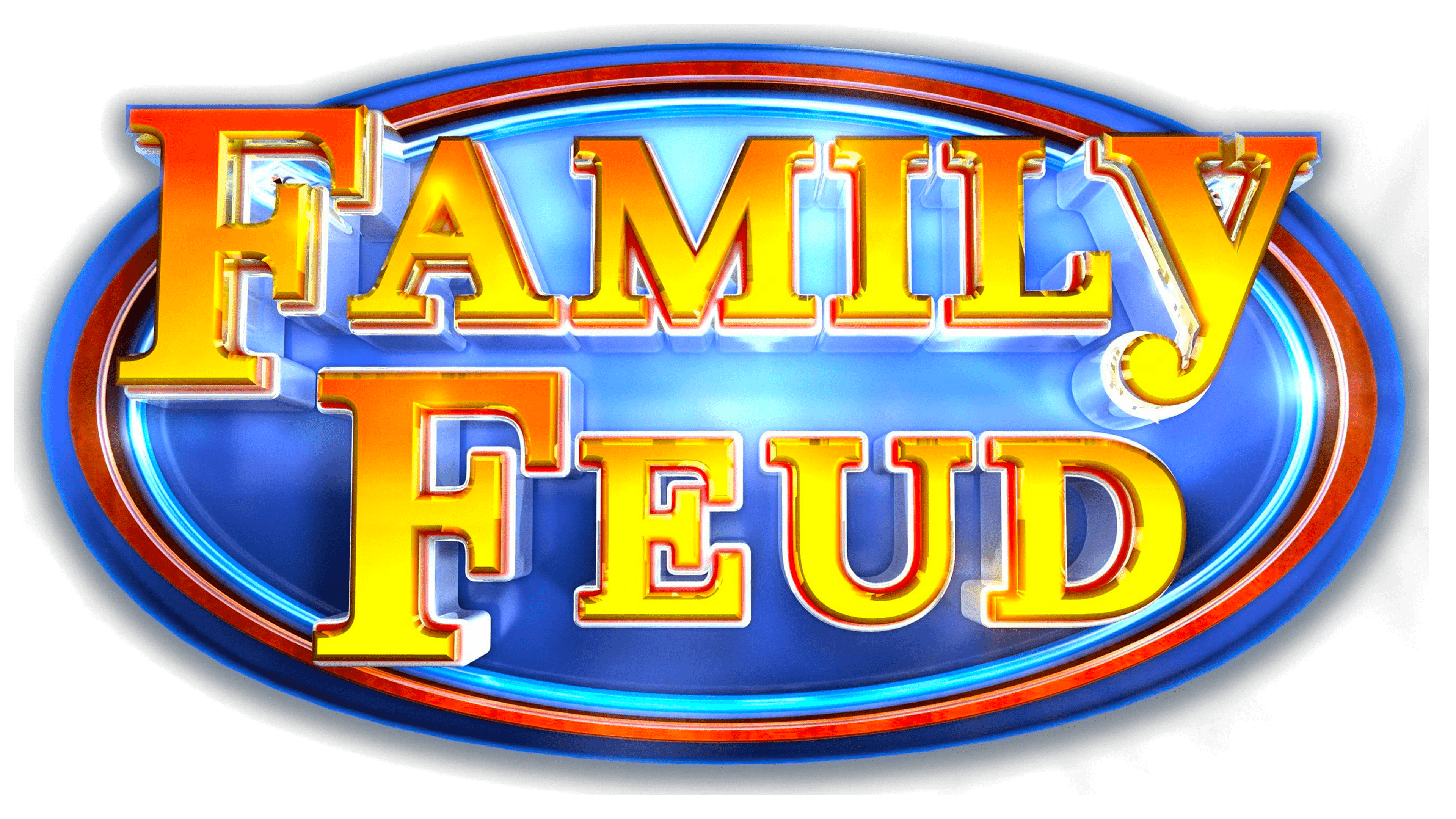
2010 – 2014
![]()
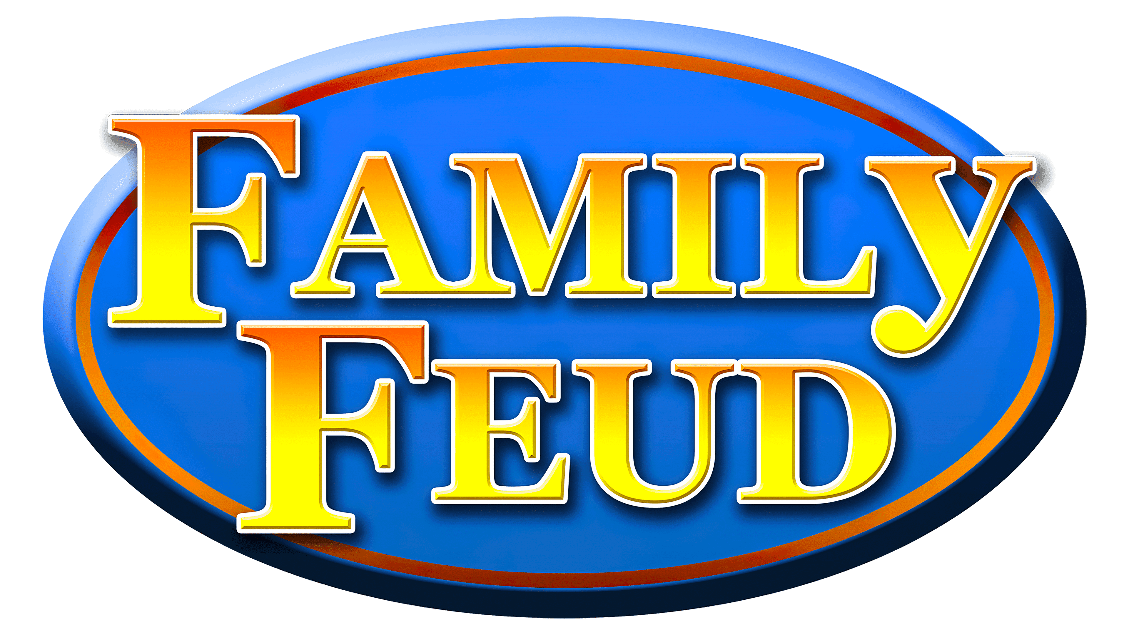
2014 – today
![]()
Font and Colors
The Family Feud logo uses a typeface derived from Clarendon Bold, created in 1953 by Hermann Eidenbenz. The glyphs with serifs resemble Akzidenz-Grotesk ExtraBold.
The emblem’s color palette is diverse. It includes several shades of red, gold, silver, white, blue, and azure. In addition, many gradients convey the sign’s inner energy.