The Family Guy logo is funny and compact. Despite the very “smooth” and approximate name, the inflated letters of the emblem hide sarcasm and black humor, ready to explode at any moment.
Family Guy: Brand overview
| Founded: | January 31, 1999 – present |
| Founder: | Seth MacFarlane, David Zuckerman |
| Headquarters: | United States |
| Website: | fox.com |
Family Guy is an American comedy cartoon about the Griffin family, consisting of a husband, a wife, three children, and a dog. It has been filmed since 1999. It consists of 20 seasons. The idea’s author is Seth MacFarlane, who created the sitcom based on his previous cartoons Life of Larry and Larry & Steve, about a guy and his dog.
Meaning and History
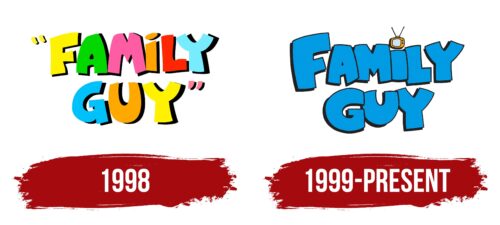
Despite the many years of the series release, the logo for it has never changed. After a trial version, a suitable option was developed, which the creators have adhered to for over 20 years. The emblem encrypts the theme of humor and caricatures and highlights family and television shows.
What is Family Guy?
A media franchise of cartoons, films, and video games based on the adventures of the American Griffin family. The main line is animation, in which about 400 episodes have been released, each 20 minutes long. It belongs to the 20th Television Animation from the third season.
1998
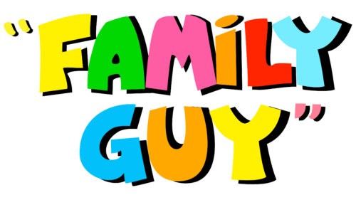
In 1998, a seven-minute pilot episode was released, for which a trial logo was created. It was made with chunky, slightly untidy, multicolored, animated letters.
The “rainbow” in the emblem speaks of the different ages of the characters, diverse emotions, interests, and situations in the cartoon. The series’ participants also wear brightly colored clothes.
The symbols have a black shadow, hinting at the bright sun illuminating the universe of the characters. This technique also points to the black humor hidden in the plots.
The quotation marks in the title demonstrated parody. The sitcom lampoons the shortcomings of American culture and family relationships.
1999 – today
In the original version of the cartoon, launched in 1999, the emblem was slightly modified. The colorful letters in the past sign hinted at young viewers. Despite the animation, the series is targeted at an adult audience. Hence, bright symbols were replaced with a light blue color.
The elements received sharp corners to convey the cartoon plots and sharp humor. The letters are closely placed, overlapping each other, indicating family ties, the unity of characters, and the connection of all episodes.
The volume of the letters represents a “full house,” in which the ideal American family with three children and a dog is realized. Seth MacFarlane, the creator of the sitcom, borrowed the surname of the main characters from his own past. It was the name of a worker in his private school. The choice speaks of an attempt to externally create an idyll and a typical diligent family, which intensifies the contrast against the backdrop of sharp jokes.
The completeness of the symbols also repeats the image of the sitcom’s characters, who are overweight.
The dot of the letter “i” is replaced with a television. The series was created for the Fox television network.
Font and Colors
Blue is the primary color of the logo. The shade speaks of stable family relationships where everything goes according to plan: marriage, work, children, and constant routine. Blue is an intellectual hue. It shows that the series hints at the real oddities and flaws of Americans, and only an intelligent person will understand the full meaning of hyperbole and dialogue.
The font is individual, with cartoonish letters, which have unnaturally full and short glyphs.
Family Guy color codes
| Orange | Hex color: | #ffa400 |
|---|---|---|
| RGB: | 255 164 0 | |
| CMYK: | 0 36 100 0 | |
| Pantone: | PMS 137 C |
| Raisin Black | Hex color: | #231f20 |
|---|---|---|
| RGB: | 35 31 32 | |
| CMYK: | 0 11 9 86 | |
| Pantone: | PMS Neutral Black C |
| Rich Electric Blue | Hex color: | #009be3 |
|---|---|---|
| RGB: | 0 155 227 | |
| CMYK: | 100 32 0 11 | |
| Pantone: | PMS 299 C |


