


![]() Family Guy (sitcom) Logo PNG
Family Guy (sitcom) Logo PNG
The Family Guy logo has become a recognizable symbol of the animated sitcom. Its vibrant design highlights the show’s eccentric nature, known for its offensive humor. Yet, the visual sign itself contains nothing provocative.
Meaning and History
![]()
Although Family Guy is known for its provocative humor, its logo remains relatively neutral. The emblem is used for media and advertising purposes, so the developers decided to make it universal and suitable for a broad audience. At the same time, the visual sign is bright and colorful, conveying the sitcom’s entertaining nature. The creators of the animated series position it as a satirical comedy: viewers are supposed to realize that stereotypical thinking is not glorified but mocked.
What is Family Guy?
Family Guy is a media franchise based on the eponymous animated sitcom. The first season of the animated series debuted in 1999. It was created by Seth MacFarlane, inspired by his old short films Larry & Steve and The Life of Larry. The plot centers around the Griffin family and their anthropomorphic dog. They find themselves in various situations where negative manifestations of American culture are ridiculed. The franchise includes The Cleveland Show, books, special editions, theatrical performances, films, and video games.
1998
![]()
In 1998, MacFarlane presented a demo version of Family Guy, commissioned by Fox Broadcasting Company. The logo of that time featured the name of the animated sitcom, set in quotes and split into two lines, centered. It consisted of multicolored letters: “F” and “Y” were yellow, “A” was green, “M” was pink, “I” and “U” were orange, “L” was red, “Y” was light blue, and “G” was light blue. They also had black shadows, concentrated on the right and bottom. The inscription used a custom-drawn font: bold, massive, unevenly shaped, and leaning in different directions.
1999 – today
![]()
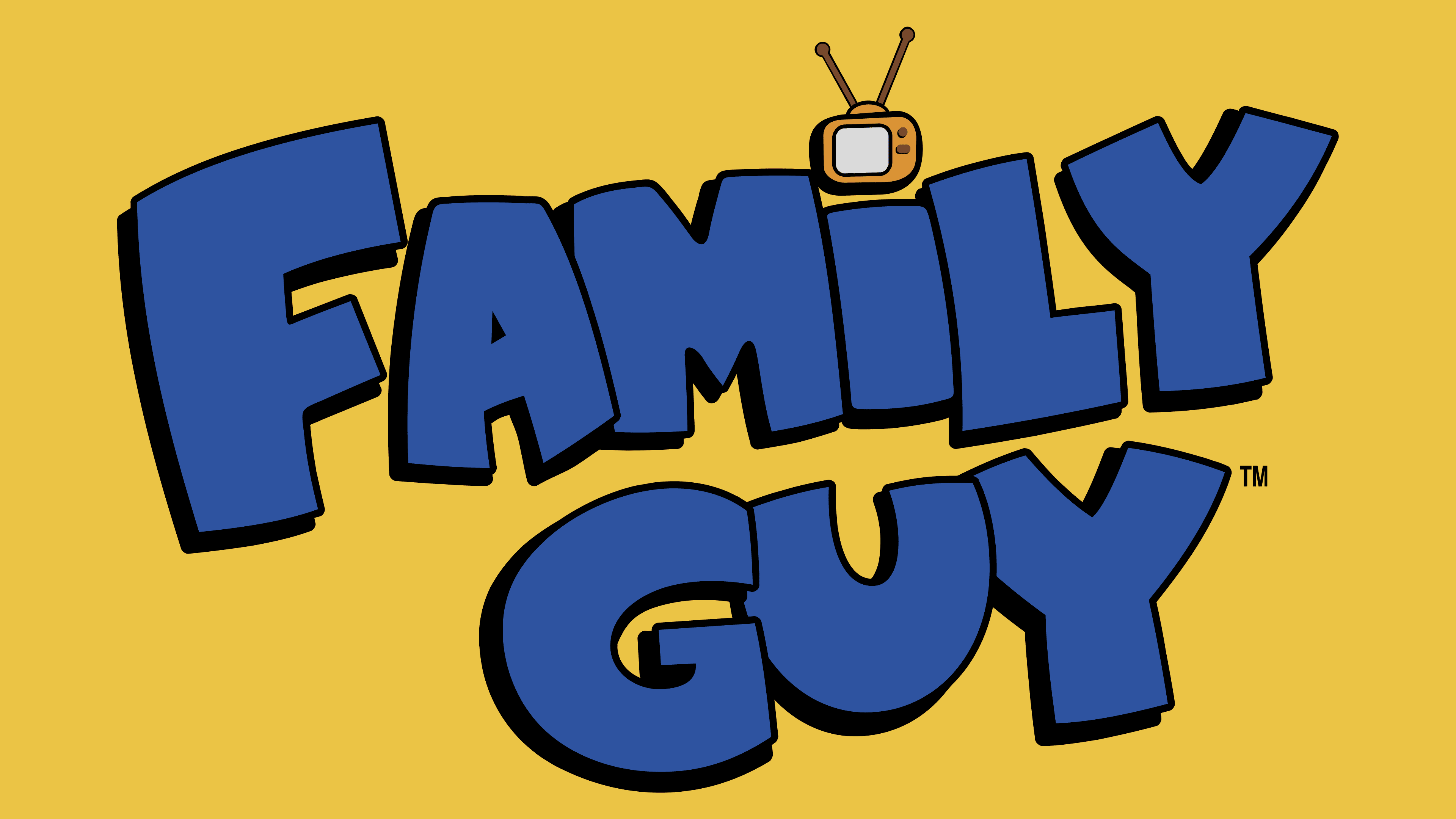
Fox liked the pilot’s 14-minute episode, so they ordered new episodes from MacFarlane. In the final version of the logo, the sitcom’s name is also split into two lines, but now the inscription has no serifs. All glyphs are colored in the same blue and have uneven black shadows, which widen on the left side. The “I” is lower than the other letters, and above it is a small television with two buttons, antennas, and a blue screen. This hints that Family Guy is a popular TV show.
Font and Colors

The animated series’ logo was created from scratch: each letter is meticulously drawn and has an individual shape. Designers made them bold, massive, and uneven, but did not use serifs to keep the inscription legible despite very narrow letter spacing. The glyphs vary in size and thickness. Judging by their bulging sides, it is one of the variations of a bubble font, although there are also sharp angles here.
The emblem predominantly features blue, which is often associated with calmness and reliability. Black is used for contours and some details of the mini-television.