The Fandango logo advises buying a ticket to an entertainment show and enjoying the performance. The emblem indicates ticket distribution through a clear, convenient payment system.
Fandango: Brand overview
Meaning and History
Fandango is headquartered in Beverly Hills. The firm operates primarily online, where customers can freely use its services. Warner Media, LLC, owns 30% of the service. The American multinational conglomerate acquired its stake in 2016 in exchange for Rotten Tomatoes and Flixster. Diversified company NBCUniversal Media, part of Comcast Corporation, owns the remaining 70%.
Fandango is not only a ticket office. On the media service’s website, you can explore movie descriptions, read reviews from other viewers, watch various interviews with actors, watch trailers of new products, and enjoy video clips. At the same time, the online resource differs from its competitors in its original design, built on a single visual identification system. Its important part is the logo – a stylized orange badge with blue lettering.
What is Fandango?
Fandango is an American company that specializes in ticketing. She has her tools of the same name – a website and an application for mobile devices. In addition, it has multimedia resources for television and streaming. It was founded in 2000. The head office is located in the city of Beverly Hills, California.
2000 – 2014
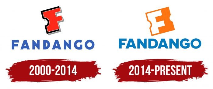
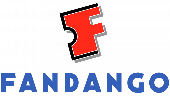
Fandango was founded in 2000 in the state of California. Its first emblem was shaped like a puzzle piece, with a notch on the left and two ridges on the right. It looked like a big F (the first of the word Fandango) and a half-torn movie ticket spine. The element is not one-piece, as indicated by a wide black outline interrupted at the top and bottom. In addition, there was an additional narrow white outline and a gray shadow that created volume. The “F” itself was completely red-orange.
Beneath the emblem was the blue word “Fandango,” written in a disproportionate, upward-looking sans-serif font. It echoed in design with a stylized letter at the top.
2014 – today
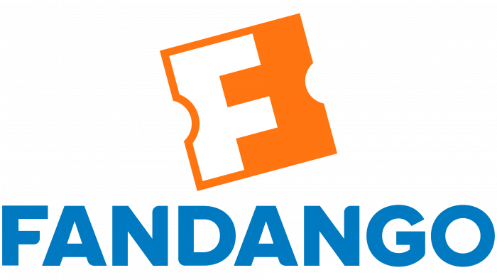
After the 2014 redesign, the graphic no longer looks like a ticket stub. Now, it is just two capital “F,” turned towards each other by the protruding sides and connected like a puzzle. The first “F” is white, and the second is orange, formed by negative space. The black outline was removed because the need for it disappeared—the element is already integral and is not associated with a torn movie ticket.
The inscription has also noticeably changed. Its color has become a little lighter; the letters have acquired a rounded shape and widened. Because the characters have been enlarged, the spacing between them has decreased.
Fandango: Interesting Facts
Fandango, known for changing how people buy movie tickets, started in 2000. It’s grown from a simple ticketing website to a full-blown digital destination for movie reviews, trailers, interviews, and more.
- Start-Up: Fandango started on April 27, 2000, thanks to several major theater chains. It was one of the first to let people buy movie tickets online ahead of time.
- Name: “Fandango” comes from a lively Spanish dance chosen to make getting to the movies fun and easy.
- Innovations: Fandango led the way with mobile tickets, reserved seating, and print-at-home tickets, making movie-going smoother.
- More Than Tickets: Fandango isn’t just for buying tickets anymore. It has movie news, reviews, trailer sneak peeks, and celebrity chats.
- Growing Bigger: By acquiring Rotten Tomatoes and Flixster in 2016, Fandango added movie reviews and streaming.
- Streaming Move: Fandango owns FandangoNOW and Vudu, two digital movie services merging to create a big streaming platform for renting or buying movies and TV shows.
- Loyalty Program: Fandango VIP rewards buyers with points for discounts on tickets and rentals, encouraging repeat customers.
- International Expansion: Fandango has reached beyond the U.S. into Latin America, operating in countries like Mexico, Argentina, and Brazil.
- Content Creation: The company produces “Fandango at the Movies,” offering sneak peeks, exclusive interviews, and behind-the-scenes footage.
- Adapting to Change: The pandemic pushed Fandango to focus more on digital streaming and online content as movie theaters faced closures.
Fandango has successfully moved from just a place to buy tickets to a comprehensive platform for movie fans, demonstrating its ability to adapt and grow in the entertainment world.
Font and Colors
When the emblem lost its classic shape, it took on a new meaning. The two Fs look very simple and balanced at the same time. They balance each other through perfect symmetry. They are connected with the ticket spine only by notches on the side, but there is not enough rectangular shape for complete reliability, unlike a square one. The spirit of the old logo has been preserved, although it is presented in a completely new way.
The wider font and reduced letter spacing make the Fandango text mark better than it was originally. The latest innovations have made it clear, visible, and easy to read. The typeface is Galeb Black by Tour de Force Font Foundry, which is similar in appearance. The logo’s lettering differs from the rounding of some corners.
The graphic symbol, a connected” FF,” uses two colors: bright orange (# F3751E) and white (#FFFFFF). The word “FANDANGO” uses a light but slightly muted shade of blue (# 297ABE).
FAQ
What is Fandango used for?
It is a platform for movie and television lovers that offers various services to enhance their entertainment experience. The brand provides detailed information about movies and TV shows, including synopses, cast and crew details, reviews, ratings, and trivia. Users can buy tickets to more than 31,000 U.S. movie theaters, reserve tickets in advance, select seats, and avoid lines.
The platform provides information on digital downloads, Blu-ray releases, and streaming options, making home entertainment easier. The website and mobile apps are user-friendly, allowing visitors to navigate, find information, and make purchases hassle-free. This digital network for film and television fans provides information, facilitates ticket purchasing, offers engaging videos, and meets the home entertainment needs of more than 45 million monthly visitors.
How do I access Fandango?
Account access and management are straightforward. Here’s how to do it:
Web Access:
- Open your web browser and go to the Fandango homepage. The site is user-friendly, making it easy to find what you need.
- Login:
- Click the “Login” button in the upper right corner of the main page.
- Enter the email address and password associated with your account.
- Click “Login” again to access your account.
Once logged in, click your name or profile icon in the top right corner. Select “My Account” from the drop-down menu to the account management page.
On the account management page, you can:
- Update your profile information, such as your name, email address, and contact information.
- Add or update payment methods.
- View your order history, including ticket bookings and digital downloads.
- Set your notification and newsletter preferences.
- Change your password and manage security settings, such as two-factor authentication.
Mobile Access:
- Download the Fandango app from the App Store for iOS or Google Play for Android.
- Open the application and click “Login.”
- Enter your email address and password, then click “Login.”
- Tap your profile icon to manage your account settings.
Following these steps, you can easily access and manage your account, providing a personalized and secure experience for watching movies and TV shows.
What do the symbols mean on Fandango?
Various symbols on Fandango’s Rotten Tomatoes website indicate the popularity and quality of films and TV shows. These symbols help users quickly understand the general perception of the content they are interested in. Here’s what each symbol means:
- Red Tomato: The red tomato icon means the movie or TV show is critically acclaimed.
- Green Tomato: The green tomato icon indicates a low rating.
- Certified Fresh: The Certified Fresh badge is awarded to highly rated films and TV shows that meet certain criteria for consistency and quality.
Popcorn Icons: These symbols represent audience ratings:
- Bucket Full of Popcorn: The audience rating is positive, with a 60% or higher score, suggesting that most viewers enjoyed the content.
- Spilled Popcorn Bucket: This indicates a negative audience rating with a score of less than 60%, meaning the content was poorly received.
TV Icons: Specific symbols for different seasons of TV shows:
- Fresh Season: Highly rated seasons are marked with a red tomato icon.
- Rotten Season: A season with a low rating is marked with a green tomato icon.
- Certified Fresh Season: This badge is applied to television seasons that meet consistently high ratings and quality criteria.
These symbols help guide users by providing a quick and clear understanding of how critics and audiences receive films and TV shows.
What is the font of the Fandango logo?
The logo uses a classic sans serif font, known for its simplicity and functional design. The letters have straight, clean lines, giving it a balanced and pleasing appearance. Each letter is the same size, increasing readability. A unique feature of this font is the subtle curve at one end of each letter.
The grotesque sans serif font used in the logo works well due to its modern appeal. Clean, straight lines and a minimalist design give the logo a contemporary look that appeals to today’s audiences. The uniform size and proportions of the letters make the logo easy to read at a glance, which is crucial for brand recognition. This versatile font works well in various sizes and formats, whether on a website, mobile app, or printed materials. Its simplicity ensures that it remains clear and legible across different media.
What does the Fandango logo mean?
The logo’s square shape and jagged sides resemble movie tickets, immediately associating it with purchasing them. This visual element shows users that this is a platform for buying movie tickets.
The logo features the letter “F” prominently displayed in white on an orange background. This choice makes the logo stand out and increases brand recognition. Negative space is cleverly used to form an inverted “F” shape, adding depth to the design.
The shape of the movie ticket and the letter “F” blend harmoniously to create a cohesive design. The white “F” stands out against the bright orange background, making the logo recognizable. Orange is associated with energy and excitement, reflecting the enjoyment of watching movies.


