![]() Fashion Nova Logo PNG
Fashion Nova Logo PNG
The Fashion Nova logo originally featured not only the brand name but also a pink silhouette of a woman, located in the middle of the inscription. Recently, the company has been using a concise black wordmark. There are no graphic symbols in it; only strict, clear letters without serifs.
Richard Saghian grew up in California, in a family of Iranian immigrants, and learned retail by helping his father at women’s clothing stores. In 2006, he opened the first Fashion Nova store at Panorama Mall in California. The format focused on affordable clubwear, bold silhouettes, and prices designed for frequent purchases. Over the next few years, the brand expanded into several Los Angeles mall locations.
The turning point came through Instagram. Before launching online sales, Saghian had already built an audience of 60,000 followers on his personal account. In 2013, Fashion Nova opened its online store to support its social media growth. During the first weekend, all products on the website sold out.
Fashion Nova’s model relied on user posts and celebrity exposure rather than glossy advertising. Around 2,000 influencers, including Cardi B, Kylie Jenner, Khloé Kardashian, and Nicki Minaj, produced about 6,000 pieces of brand content each month. WWD reported that a single Kylie Jenner post could generate millions in revenue. Fashion Nova’s social media value exceeded that of H&M and Zara combined, while both competitors still relied on traditional ads and physical retail.
In November 2018, Fashion Nova released a Cardi B collection in Hollywood, and it sold out. That year, it became the most searched fashion brand on Google. Later, the company faced US Department of Labor findings regarding wages at a Los Angeles factory, FTC settlements totaling $9.3 million in 2020 and $4.2 million in 2022, and allegations that it blocked negative reviews. In 2022, Saghian bought The One mansion in Los Angeles for about $141 million, including fees, and later used it for influencer shoots.
Meaning and History
![]()
The founder and leader of Fashion Nova understood that the internet is now a priority and decided to leverage it. Brand representatives follow fashion trends on social media so they can release their product samples literally within a day. Celebrities from Instagram, YouTube, and other online platforms that modern youth love are involved in advertising to win over the audience. This increases sales as online shopping continues to grow.
The promotion of Fashion Nova would also have been impossible without a well-thought-out visual identity. Therefore, the trademark uses a clear, memorable logo in which its name is displayed. As far as it is known, it was previously complemented by a pink female silhouette. But after the redesign, this symbol was removed because the brand’s target audience had expanded to include men.
What is Fashion Nova?
Fashion Nova has been in the retail clothing business since 2006. It has a main office in Los Angeles and five branded stores in Southern California, but the majority of sales are made online. To do this, business owner Richard Saghian uses an e-commerce website launched in 2013, as well as popular social media platforms.
2006 – 2018
![]()
Before creating the men’s clothing collection, Fashion Nova emphasized its focus on women. Its logo contained an abstract pink female silhouette, resembling an elegant mannequin with wide hips and a thin waist. This graphic element was centered, dividing the black brand name into two parts. The inscription was made in a font with narrow angular letters, similar to DecoTech Regular by Justin Callaghan.
2018 – today
![]()
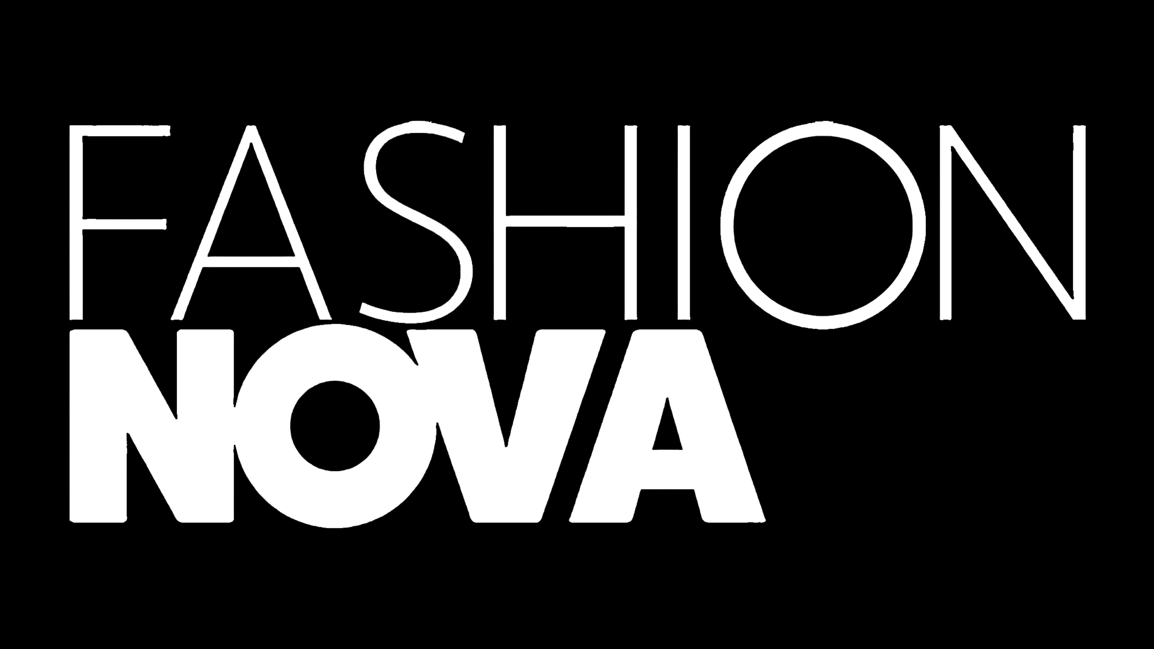
Now, the wordmark contains only a black inscription, with two parts highlighted in different font versions. Notably, the last letter, “N,” in “FASHION” merges with the first letter, “N,” in “NOVA”; a common vertical line connects them. To make this possible, developers converted all glyphs to uppercase.
Absolutely everything in the Fashion Nova brand is designed to attract consumer attention. The fact is that it focuses on online shopping, and online competition is impossible without a recognizable design. At the same time, there are no bright elements in the clothing retailer’s emblem: its creators have limited themselves to a simple black inscription that speaks of seriousness, honesty, and good taste. Since minimalism is fashionable now, this design is highly relevant. But even in a regular wordmark, there is an interesting detail: two “N” letters connected as one.
Font and Colors
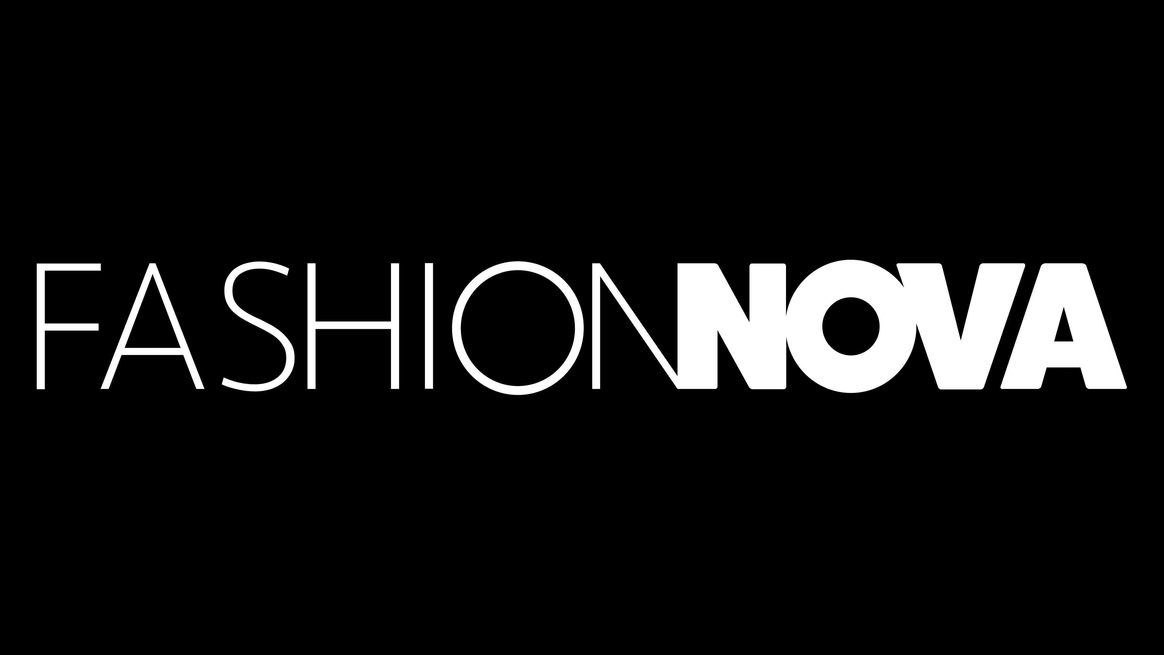
The designers of the Fashion Nova logo used two variations of a geometric sans-serif font: thin and thick lines. All the glyphs on the right side are bold and, as a result, have very narrow intervals. The left side features thin letters, creating a visual contrast. At the same time, both parts of the inscription are presented in black and set against a blank white background. This is another manifestation of minimalism that the designers aimed for.