


 Faze Logo PNG
The FaZe logo’s shape represents team spirit and the unity of players who perform as one. It conveys strength, support, and self-confidence.
FaZe Clan began in May 2010 as a YouTube channel called FaZe Sniping, created by three players known as Housecat, Resistance, and ClipZ. They focused on trick shots in Call of Duty: Modern Warfare 2, building an audience through edited gameplay videos with a strong visual style.
By 2012, new members such as FaZe Rain joined, shifting the project from anonymous content to personality-driven media. The name changed to FaZe Clan as the group expanded internationally.
In 2013, FaZe moved into competitive esports, forming teams in Call of Duty and Counter-Strike: Global Offensive. Its “CS:GO” roster competed at top events alongside organizations such as Natus Vincere and Astralis.
By 2016–2017, FaZe Clan had grown into a major name in esports, with millions of followers and a broad content network. At the same time, it launched merchandise lines, linking the brand to youth culture and gaming.
In 2018, collaborations with brands such as Champion extended its reach beyond esports. Partnerships with technology and consumer companies increased its visibility.
In 2022, FaZe Clan went public on NASDAQ through a SPAC merger, with a valuation of around $725 million. The move exposed financial challenges, including losses and falling share prices.
In 2023, the company faced internal restructuring, layoffs, and criticism from members. In 2024, GameSquare acquired a controlling stake and took over the organization’s management.
Meaning and History
The team’s career began in 2010, when three gamers debuted on YouTube. These were Eric Rivera (nicknamed ClipZ), Jeff Emann (also known as House Cat, who later changed his nickname to Timid), and Ben Christensen (known as Resistance). At that time, they united to post Call of Duty trick shots on a universal internet channel. As a result, a well-recognized emblem emerged, made up of several small elements that form one large sign.
A graphic designer and freelancer known online as Ferox created the original esports logo. His work succeeded because it creates the impression of a random set of stripes of varying lengths while also forming a stable image that fits the team’s concept.
The FaZe logo symbolizes unbreakable unity, integrity, and team spirit; each element is unique, yet together they form a cohesive whole. The designer used slanted stripes of different lengths to emphasize this idea. The sharp ends are directed outward as a protective measure against external factors that may interfere with the group’s actions. The graphic symbol also depicts the team’s abbreviated name: the letters “F” and “Z.”
What is FaZe?
It is the abbreviation for the esports group FaZe Clan. This organization is registered in the USA but is known worldwide. It unites team-based games such as Rocket League, Valorant, FIFA, and Call of Duty.
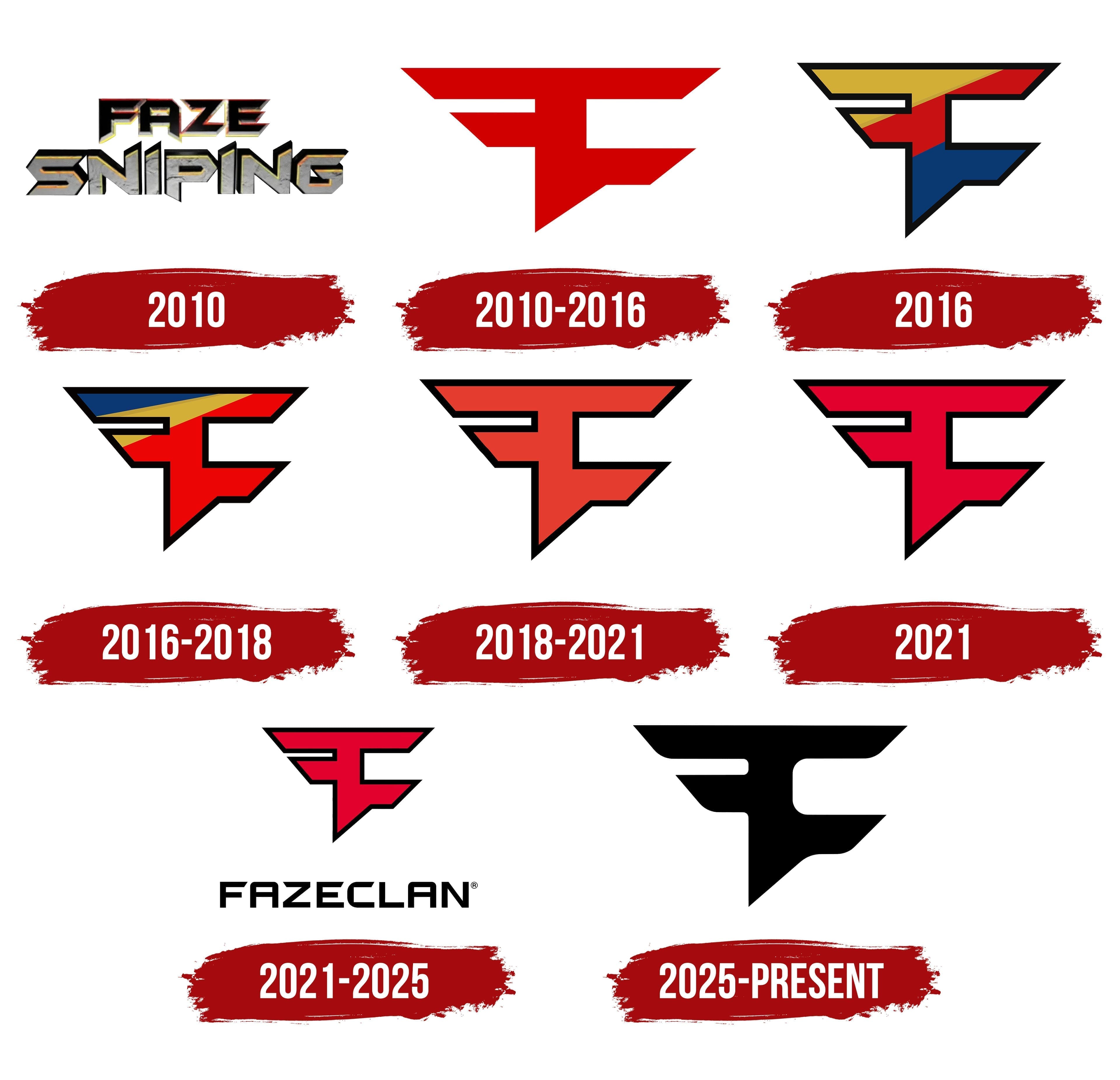
2010

FaZe Sniping emerged as an early direction within FaZe Clan and was tied to sniper-focused Call of Duty content. A separate logo was created for this direction, emphasizing a hard-edged presentation of the name and a gaming-driven tone.
The mark consists of two lines. FAZE appears on the top line, with SNIPING below. Both words use a consistent style, separated by color and letter treatment.
FAZE is rendered in black with a dimensional finish. The typeface is sans-serif with sharp angles. Light highlights along the edges give the lettering a metallic appearance. SNIPING is set in light gray and covered with a rough texture resembling worn metal or stone. The letters show irregularities and darkened areas, with subtle shading along the sides to add depth.
2010 – 2016
FaZe Clan entered the esports scene as a brand in 2010. Early on, the team introduced a simple logo that matched the shooter games of the time.
Designer Joe “Ferox” Ricciuto created the logo. He built the symbol from two letters, F and C, merging them into a single shape. The form is constructed from straight lines and diagonals, with overall symmetry.
The upper section is wider and stretches horizontally, narrowing toward the edges. The letter “F” appears on the left, with the letter “C” on the right as a mirrored response. The color is a single red tone, without shadows or gradients. The look was typical of early-2010s esports and fit well alongside themes from Counter-Strike and Call of Duty. The mark clearly conveyed the team’s image, tied to competitive games and military aesthetics.
2016
The logo shape remained the same, but the colors were updated. A solid black outline separates the mark from the background and defines its boundaries.
Inside, the shape is divided into three diagonal sections. The upper left is yellow gold, the center is bright red, and the lower right uses a dark blue tone close to indigo. The borders between sections run diagonally from the lower-left corner to the upper-right corner.
2016 – 2018
The logo was updated again, this time with a new color palette. The outline and shape remained the same, with changes limited to the placement of the colored sections.
The upper-left area turned dark blue, approaching indigo. Yellow moved to the center as a narrow stripe separating the top and bottom. Red filled the entire lower-right section, making it the largest area and more prominent than in the previous version.
Because the shape did not change, the overall brand image stayed consistent.
2018 – 2021

The symbol returned to its early appearance, used since 2010. The outline of the merged F and C letters remained unchanged, with the same lines, diagonals, and sharp endpoints.
Only the internal color was adjusted. Instead of multiple colors, the mark returned to a single red fill with no transitions. The black outline along the edge was retained, separating the symbol from the background. Red fills the entire interior, making the logo look like the earliest versions.
2021

Another FaZe Clan logo update focused on color. The red deepened and became more saturated, while the merged F and C shape remained the same. The black outline along the edge was also retained, maintaining the mark’s boundaries.
The main difference lies in the new red shade. It appears brighter and stronger in tone, giving the shape a heavier presence within the outline.
2021 – 2025

FaZe Clan added text to the symbol for the first time. Below the merged F and C mark, the word FAZECLAN appeared. The text is set in uppercase letters. The typeface has a technical look, closely resembling Eurostile Extended or Microgramma. The F and C symbols themselves were not changed. The same sharp angles and overall contour were preserved.
2025 – today
The team updated the logo and slightly adjusted the shape. The team dropped the multicolor approach and made the mark monochrome. The surface was completely black.
The main changes affect the lines. Some of the sharp angles from earlier versions were replaced with smoother, rounded corners, giving the outline a calmer feel. The outline was removed, and the mark reads as a single solid form, with the black tone giving the image a strict appearance.
Font and Colors

The emblem’s main element is the letter “F,” uniquely combined with the letter “C.” The symbols connect not as a monogram, as usual, but as a strict geometric figure, with “F” and “C” sharing one adjacent side.
If the original logo was red on a white background, the modern one shifts slightly toward the bright end of the spectrum and adds detail. In 2016, after the redesign, the color palette became multicolored. The iconic figure acquired shades of dark blue, yellow, and black, forming a border.
Since the FaZe logo is a graphic, it does not have its own font. It’s simply an image of letters. Its distinctive features are straight angles, slanted stripes, and a strict geometric texture. The word looks straight and even, as if to emphasize that the owners of such a logo never compromise.
Sometimes, the logo is also accompanied by an inscription. The old label, highlighted in red and white, has a custom font, with each letter developed from scratch. The color palette is variable, as the graphic sign can be painted in the team members’ colors.