


![]() FC Bayern Munchen Logo PNG
FC Bayern Munchen Logo PNG
The color scheme and pattern that distinguish the FC Bayern Munich emblem pay homage to the Wittelsbach dynasty’s coat of arms. The emblem’s symbolism demonstrates the club’s commitment to its history and pride in its national identity. Its simplicity has ensured recognizability.
FC Bayern Munich was founded on February 27, 1900, in Munich by eleven players led by Franz John, following their departure from MTV-1879. For decades, the club remained a regional side until 1932, when it defeated Eintracht Frankfurt 2:0 to win its first German title.
The 1930s disrupted development. President Kurt Landauer was forced into exile, and the club lost key figures. After World War II, he returned and attempted to rebuild the structure.
In 1963, Bayern was excluded from the new Bundesliga, while 1860 Munich was selected instead. Promotion came in 1965 under coach Zlatko Čajkovski, who introduced Franz Beckenbauer, Gerd Müller, and Sepp Maier. The team finished third in its first Bundesliga season and won the German Cup.
In 1967, Bayern won the Cup Winners’ Cup against Rangers FC. By 1969, it secured a domestic double. The early 1970s marked a period of dominance, with three consecutive league titles and three European Cups from 1974 to 1976, including victories over Atlético Madrid, Leeds United, and AS Saint-Étienne.
After the departures of key players, Bayern entered a transitional phase, losing European finals to Aston Villa in 1982 and FC Porto in 1987.
The club returned to European success in 2001, beating Valencia CF on penalties. In 2013, Bayern completed a treble, defeating Borussia Dortmund in the Champions League final.
In 2020, Bayern won six trophies in one year, including a Champions League victory over Paris Saint-Germain, and recorded an 8:2 win against FC Barcelona.
Meaning and History
![]()
Three of the seven Bavarian districts, Upper, Middle, and Lower, belong to Franconia. The red color of the Franconia coat of arms has been used for 109 years; hence, the players’ nickname “red pants.” When they play, the “Allianz Arena” lights up in red, not blue, like at the “Munich 1860” matches.
The diagonal white-and-blue pattern “migrated” from the Wittelsbach dynasty’s coat of arms to Bayern’s logo, which ruled Upper Bavaria from 1240 to 1918. The founder of this line, Otto I, nicknamed the Red, became infamous (in a bad sense) for being excommunicated by the Pope for insulting a bishop.
The logo of the football club Bayern Munich has changed many times. There were emblems, many of which were similar, but others were radically different from the previous ones. Only since 1965 has the Bayern emblem acquired modern features.
There’s a Bundesliga rule: for three championships, one star is added to the club’s emblem; for five, two; for ten, three; for twenty, four. Bayern’s emblem can feature four stars to denote 25 German championships.
What is FC Bayern Munich?
FC Bayern is a prestigious German club that has been delighting fans with its victories for over 120 years. It was founded on February 27, 1900, and has since won numerous national cups and titles. It’s now one of the most successful sports organizations in Germany. In 2014, it ranked fourth in Forbes’ list of the world’s best sports teams.
1900 – 1901
![]()
In 1900, eleven members of the sports association MTV München founded FC Bayern to join the German Football Association. At the same time, they began using the emblem with a flag, which, in vexillology, is called a “swallow’s tail” due to its characteristic triangular shape.
The symbol is adorned with alternating horizontal stripes of white and light blue. In the center of the fluttering banner is a monogram of intertwined letters “FCBM” in a circle. All logo elements are white or light blue, as these are the official colors of the “Freistaat Bavaria.”
1901 – 1906
![]()
Experts studying the history of the football club Bayern have not yet determined the exact year this emblem was used. Some believe it was first used in 1901; others lean towards the club adopting it in the early 1920s following several reorganizations.
In any case, the emblem contains the initials FCBM. Outside is a large, stylized letter “C,” which serves as the basis for the rest of the letters. Above the letter “F” looms the letter “M.” In the bottom right corner is the letter “B,” which is very similar in shape to “R.”
1906 – 1919
![]()
In 1906, the football club Bayern merged with the sports club München to gain greater financial resources and influence. As part of the deal, Bayern had to adopt the colors of its new partners: white and red. However, the club maintained some independence, calling itself F.A. Bayern im Münchner SC (the abbreviation “F.A.” means “Fußballabteilung” or “football department”).
All this was appropriately reflected in the logo, which was no longer light blue. Its base is a large letter “B”. The monogram “MSC” is located in the lower inner letter space.
1919 – 1923
![]()
In 1919, FC Bayern left the MSC because the organization decided to focus on other team sports, such as tennis and field hockey. FC Bayern immediately came under the control of TS Jahn, which, due to the merger, had to be renamed Turn und Sportverein Jahn München.
Judging by the inscription, the logo presented here belongs to the period when the football club was called F.A. Bayern. Its base is a green octagon, outlined with yellow lines. The upper part of the geometric figure is occupied by the yellow word “BAYERN,” which touches the contour. The lower part of the polygon is divided into three fragments. On the sides are the letters “F” and “A,” and in the middle are two white-and-red triangles.
1923 – 1954
![]()
In 1923, the football club Bayern again became independent and restored its original name. However, it did not abandon the red-and-white color scheme adopted by the Munich sports club.
The monogram “FCBM” became more legible: designers corrected its shape to avoid misinterpretations. The light blue letters received thin red outlines to match the new color scheme of the football organization.
1954 – 1961
![]()
This emblem consists of three concentric circles, one white and two red. Their combination looks like a large red circle surrounded by two wide rings. Inside is a white two-level inscription, “F.C. Bayern.” It used a bold sans-serif font. The letters seem blurry due to the rounded corners.
1961 – 1965
![]()
In the first half of the 1960s, a bright red oval logo appeared. Inside it, designers depicted a semi-oval adorned with blue and white diamonds. The Freistaat “Bavaria” diamond flag depicts a similar geometric pattern. Its use as an emblem of the football club manifests patriotism and national pride.
In the upper half of the oval is the yellow word “BAYERN” with unevenly enlarged letters. The same yellow inscription, “MÜNCHEN,” is at the bottom, curved into a reverse arch.
1965 – 1970
![]()
At the end of the 1964-1965 season, the club entered the Bundesliga. The emblem was updated to honor this event, replacing the provocative bright red with a more restrained burgundy brown. The white and blue diamonds have thin black contours, which make the drawing more distinct. The word “MÜNCHEN” disappeared, and “BAYERN” was repainted in white. In addition, the oval has a double white-brown contour in this emblem version.
1970 – 1979
![]()
In 1970, an even more successful era began in the football club’s history, marked by the arrival of the new coach, Udo Lattek. During this period, the sports organization’s emblem turned into a rondel, which can be divided into two parts. Inside is a small circle with a pattern of white diamonds and light blue polygons. It’s surrounded by a wide red ring with the gold inscription “F.C. BAYERN MÜNCHEN E.V.,” where the last two letters mean “eingetragener Verein,” or “registered association.”
1979 – 1996
![]()
After the redesign, all gold elements turned white, and the bright red color took on a raspberry shade. Designers slightly changed the font and enlarged the letters to clarify the inscription. They had to reduce the central circle with the pattern to do this. The blue and white diamonds are now positioned at an angle, making them more similar to the “Freistaat Bavaria” flag.
1996 – 2002
![]()
To attract attention, the logo’s authors further enlarged the inscription and removed the dots in the abbreviations. The pattern also changed slightly: the diamond lines are now shifted slightly lower, obviously for symmetry. The colors became more subdued. At the same time, the rondel acquired a blue contour, which had previously been missing for visual balance.
2002 – 2017
![]()
The club introduced a new emblem in 2002 when it entered two prestigious football tournaments: the Champions League and the Bundesliga. Unlike previous versions, there’s no longer an abbreviation, “E.V.” Removing the two letters allowed the word “MÜNCHEN” to be extended to the length of the upper inscription. The colors became even paler than before.
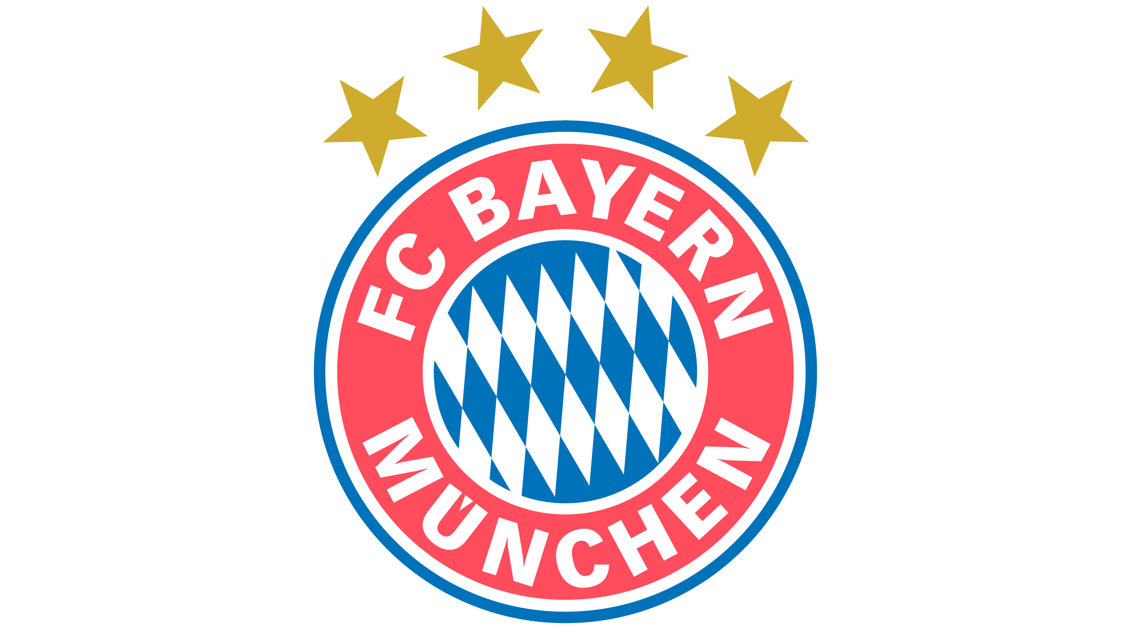
2017 – today
![]()
In the summer of 2017, the football club changed its logo again. This came to light when a Facebook user saw new photos featuring the FC Bayern emblem and noticed a font mismatch. Official representatives of the organization confirmed that the redesign was indeed carried out.
Graphic designer Daniel Nyari provided more detailed information. He reported that, instead of pale red, a warm, dark raspberry color is now used, and instead of blue, dark blue is used. In addition, the diamonds in the central circle changed in orientation, although they still do not fully match the pattern on the flag of the “Freistaat Bavaria.”
Font and Colors
The bold sans-serif font used for the club’s name resembles Vectora Black. This serif-free font was created by Swiss typographer Adrian Frutiger and influenced by fonts such as News Gothic and Franklin Gothic.
The logo’s color palette matches the official color palette of the football club Bayern. Initially, the club was represented only in white and blue. However, after a temporary merger with MSC, it adopted a dark red hue as part of its symbolism.