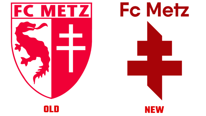
The team decided to get rid of one of their symbols and make the logo more concise.
The team logo consists of the image of the Lorraine cross and the name FC Metz. Before deciding on the innovations, the team surveyed fans and found that 69% chose the cross over the Graoully dragon – another symbol of FC Metz. But the team will not completely abandon the character but use it for visual identity in the future.
The designers retained the corporate garnet color but changed the font for the inscription. The straight lines, lack of serifs, and the unusual combination of the last two letters make the logo even more interesting. The official press release states that the logo was created to reflect the connection with Lorraine and symbolizes the courage, loyalty, and self-sacrifice that characterize FC Metz fans worldwide.
Interesting fact! FC Metz is the only club that can use the Cross of Lorraine. This fact makes the logo even more interesting and unique.


