


 Fight Club Logo PNG
The Fight Club logo embodies an unreal world in which the brain fills in the missing parts. At some point, at the peak of emotion, it becomes difficult to distinguish between truth and falsehood. The emblem keeps the viewer in suspense, just as the movie’s plot does.
Fight Club began with Chuck Palahniuk’s camping trip in the early 1990s. At the time, he worked in Portland as a journalist and at the Freightliner Trucks assembly plant. After a quarrel over a loud radio, camp neighbors beat him. Back at work, with visible injuries, no colleague asked anything. That silence became the starting point for the book.
Palahniuk was then attending Tom Spanbauer’s Portland writing group, centered on “dangerous writing,” a method that uses minimalist prose and painful personal material. In 1995, his seven-page story “Fight Club” appeared in Pursuit of Happiness. He later expanded it into a novel, with the original story becoming chapter six. W.W. Norton & Company published the book in August 1996. Fewer than 5,000 copies sold in its first year.
20th Century Fox optioned the film rights in 1996. Jim Uhls wrote the script, and David Fincher, coming off Seven, was hired to direct. Brad Pitt played Tyler Durden, Edward Norton played the unnamed Narrator, and Helena Bonham Carter played Marla Singer. Fincher kept the voice-over narration despite pressure from one producer to remove it.
The film premiered at the Venice Film Festival on September 10, 1999, and opened in the United States on October 15. With a $ 63- 65 million budget, it earned about $100 million. It was judged a box-office failure, competing with DreamWorks’ American Beauty and Warner Bros.’ The Matrix. DVD changed its fate in 2000, turning it into a cult title. Palahniuk later continued the story with Dark Horse Comics’ Fight Club 2 in 2015 and Fight Club 3 in 2019.
Meaning and History
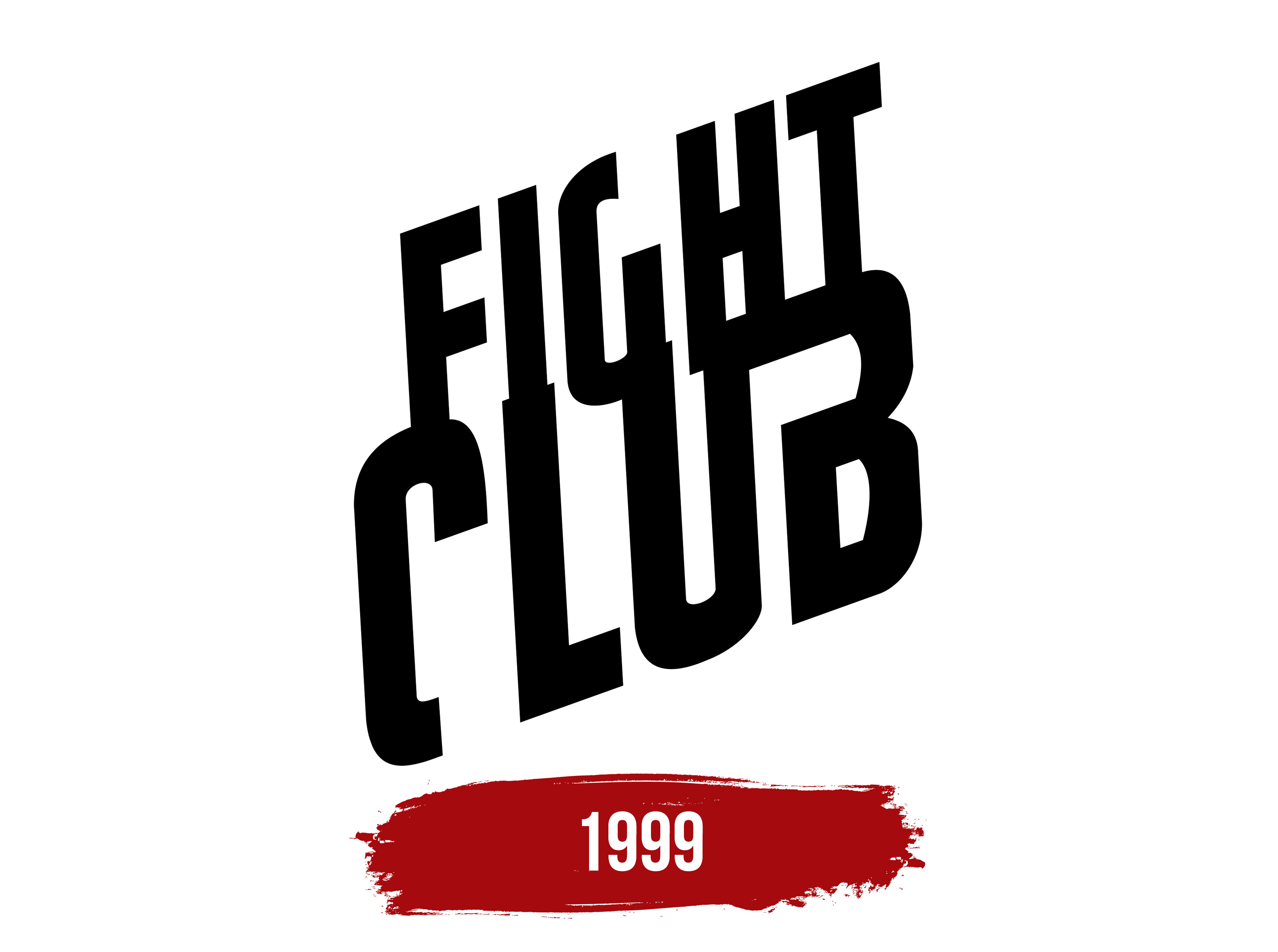
The existing film logo didn’t come together all at once. Fox Searchlight Pictures had difficulties developing a visual identity. Thus, they brought in the independent marketing agency Wieden+Kennedy, which suggested a logo in the form of an inscription on pink soap, aiming to attract not only a male audience. The owners perceived the proposal as a mockery and ultimately kept only the inscription. However, pink soap was used as part of the identity in many posters and played an essential role.
What is Fight Club?
A 1999 movie directed by David Fincher. The story revolves around a man who travels a lot for work and resolves contentious issues. As a result of stress, he develops insomnia. The protagonist finds an outlet in fist fights, opening a fight club with a new friend. However, the movement morphs into an anti-government organization, Project Mayhem. In the end, the narrator discovers that his friend is his alter ego and that he has gone insane.
1999
The emblem consists of the title placed on two levels. The upper part overlaps the lower one, conveying the theme of contact combat, the close intertwining of bodies in a duel.
The two-tier emblem hints at a skyscraper, which the main character’s friend eventually plans to blow up. The number 2 also points to the narrator’s dual personality.
The inscription is positioned with a significant tilt, a tactic that speaks to radical measures. Palahniuk’s works are written in the transgressive fiction tradition, in which societal prejudices and demands constrain the protagonist’s life. A non-standard and often illegal solution becomes the way out of the situation.
In Fight Club, organizing fights became an aggressive way to treat insomnia, which the doctor refused to help with. The steep upward tilt of the emblem’s text underscores the protagonist’s active involvement in his problem and a very unusual, radical solution.
The tilted inscription also speaks to extremism since Fight Club morphs into a dangerous organization that engages in acts of vandalism and plans to destroy consumer civilization.
The intertwining elements, the lack of distinct details, and the overlay of inscriptions in the logo convey the hero’s confusion, and the sign’s position in space indicates abrupt, impulsive decisions.
Font and Colors
The logo’s color is black, symbolizing the world’s fundamental nature. The gaps symbolize the destruction of reality. The shade personifies the night and the theme of sleep, around which the plot revolves. Black also refers to battles, conveying masculine energy and strength. Dark shades point to dirty thoughts, law violations, and crimes that the hero’s decisions lead to. His dangerous black alter ego.
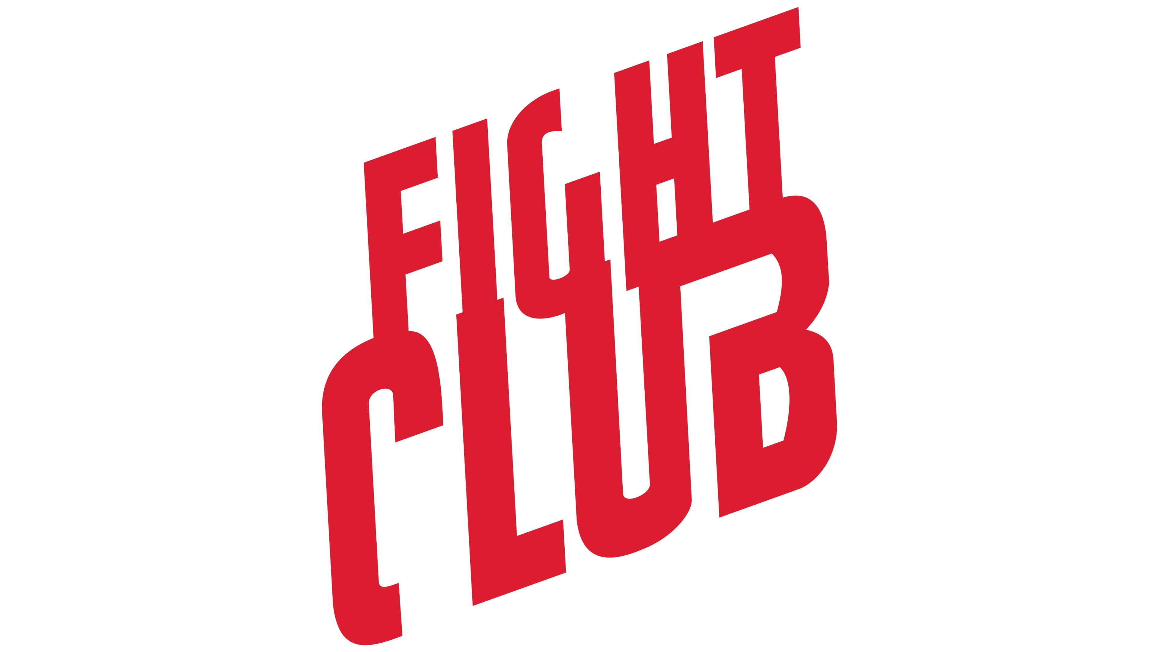
In some interpretations, the emblem is rendered in red to convey the hero’s energy, risk, and inflamed mind.
The inscription’s font is unique because it lacks distinct letter elements. This technique shows the gaps in the character’s memory, who, as it turns out, leads a double life. His other self, Tyler Durden, comes to light when he thinks he is asleep. The intermittent font embodies insanity, the loss of parts of reality, and a distorted perception of the world due to lack of sleep. The merging of U and B forms a fist or a gun. The first indicates underground fights, and the second is the plot’s outcome, in which the hero shoots himself to stop his alter ego.