Fiji Airways’s logo is a powerful symbol of the airline’s deep cultural ties and pride in its heritage. It showcases Fiji’s beauty and uniqueness, incorporating natural wonders and traditional art elements. This emblem invites travelers to explore this picturesque part of the world, offering an experience that immerses them in Fiji’s culture and hospitality.
Fiji Airways: Brand overview
The airline’s history started on September 1, 1947, when Australian entrepreneur Harold Gatty and British airline Qantas established Katafaga Estates to transport sugarcane between the Fijian islands using a small De Havilland Dragon DH.84 aircraft. In 1951, Katafaga Estates was renamed Fiji Airways and began using second-hand De Havilland aircraft for passenger and cargo transport within Fiji and neighboring countries like Tonga and Samoa. The fleet grew with new aircraft types, including the De Havilland Heron and De Havilland DHA-3 Drover.
By 1958, the Fijian government became a shareholder in the company, gradually increasing its stake until the airline became fully state-owned in the 1970s, attracting investments for development and fleet modernization.
In the 1960s, the airline expanded its route network to cities like Auckland, Honolulu, and Port Vila, adding jet aircraft like the BAC 1-11 and Douglas DC-9. Renamed Air Pacific in 1970, the airline continued expanding with flights to Australia, Hong Kong, and Japan, introducing the McDonnell Douglas DC-10 for long-haul routes in 1973. Facing financial challenges in the 1980s, the airline optimized routes and reduced its fleet but continued operating key routes to Australia, New Zealand, and the USA. In the 1990s, the airline started recovering and modernizing with new Boeing aircraft and loyalty programs, forming partnerships with carriers like Qantas and American Airlines.
In the 2000s, the airline updated its fleet with modern aircraft like the Boeing 737NG and Airbus A330, expanding its network to Hong Kong and Tokyo, promoting Fiji as a tourist destination. After a rebranding in 2013, reverting to the name Fiji Airways, the airline refreshed its identity with traditional “masi” patterns on aircraft liveries, updated crew uniforms, and improved in-flight services. From 2013 to 2019, the company focused on fleet renewal, network expansion, and service quality improvement, introducing Airbus A330s for long-haul routes and Boeing 737 MAX aircraft for regional flights in 2014. However, after the 737 MAX crashed in 2019, the airline, like others worldwide, had to suspend flights of this aircraft type.
2015-2016, the airline expanded its route network by launching new flights from Nadi to Singapore and San Francisco. This move strengthened the airline’s position as a major carrier connecting the South Pacific with Southeast Asia and North America.
2017, the company celebrated its 65th anniversary, operating flights to over 20 destinations in 13 countries, including Australia, New Zealand, the USA, Japan, Hong Kong, Singapore, and various Pacific island nations. At that time, the fleet consisted of 11 aircraft: five Airbus A330s, four Boeing 737NGs, and two Boeing 737 MAX (before the suspension of flights).
In 2018, the airline was honored as the best airline in Australia and the Pacific region by the prestigious Skytrax World Airline Awards. This recognition was a testament to the high-quality service and positive feedback from passengers. That same year, the airline upgraded the interiors of its Airbus A330 cabins by installing new seats and entertainment systems.
In 2019, the company continued to strengthen its partnerships with other airlines. A codeshare agreement was signed with British Airways, allowing passengers to travel more conveniently between the United Kingdom and Fiji through Singapore and Hong Kong. Additionally, the airline expanded its collaboration with Qantas and American Airlines on key routes connecting Australia, the USA, and Fiji.
Meaning and History
What is Fiji Airways?
It is the national airline of Fiji, based in Nadi. It operates international and domestic flights connecting Fiji to the Pacific, North America, Asia, and Australia destinations. Known for its warm Fijian hospitality, it offers a wide range of services in economy and business class, aiming to provide a comfortable and enjoyable travel experience. The brand’s fleet includes modern Airbus and Boeing aircraft.
1951 – 1961
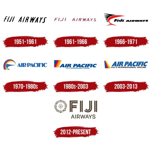
Fiji Airways, a well-known airline, was founded in 1951 by pilot Harold Gatty. At that time, the company’s logo was a simple black inscription in uppercase letters. This succinct design was deliberately chosen. It emphasized a businesslike style and reliability appropriate for an airline operating small commercial flights between islands. Such a logo reflected the company’s straightforward and practical approach to air transportation, undoubtedly meeting the needs and expectations of customers at the time. Harold Gatty, drawing on his experience and knowledge in aviation, aimed to create a reliable and efficient service for passengers traveling short distances between various islands.
1961 – 1966
The company’s new owners, airline Qantas, took decisive steps to further develop and expand Fiji Airways. They made a strategic move by inviting the small island nations of Oceania and Polynesia to participate in the company’s management, strengthening its regional presence and involvement in the aviation business.
These changes in ownership structure played a key role in the company’s development, making it more extensive and influential in the market. A visual reflection of these changes is the updated logo. The letters in the name changed to bright red, signaling new energy and the company’s ambition for growth. The increasing spacing between characters in the logo emphasized the idea of expansion and openness, symbolizing the company’s readiness to embrace new challenges and opportunities.
1966 – 1971
In 1966, Fiji Airways strengthened its position as a regional airline, actively operating routes between the islands of Oceania. During this period, the company’s leadership updated the logo to reflect its identity and close connection with the oceanic states. The logo design was inspired by the image of the mahi-mahi fish—a popular target for sport fishing among tourists visiting Fiji. This choice was deliberate: mahi-mahi translates to “very strong,” symbolizing the airline’s leadership ambitions and stability.
The stylization of the logo as a mahi-mahi fish emphasized the region’s uniqueness and cultural attachment and reflected the company’s key characteristics. The mahi-mahi is known for its bright coloring, which makes it stand out among others. This element was transformed into the corporate style, where the use of bright red and black colors in the logo symbolized beauty, strength, and speed. The detail of water droplets on the dots above the letters “i” in the name added a special touch, highlighting the airline’s connection with the element of water and its ability to navigate the skies as confidently as a fish swims in water.
1970 – 1980s
After the Fijian government acquired shares in the local airline, significant changes were made to expand the carrier’s international operations. The company began developing routes connecting Fiji with various parts of the world. As part of a global rebranding, the airline was renamed Air Pacific, a change reflected in the design of a new logo.
The logo features a predominance of blue shades, symbolically indicating the scope of international flights over oceans and seas. The visual design includes large capital letters that emphasize the global scale and ambition of the company and inspire respect and trust. An interesting detail is the dots on the ends of the glyphs, representing the cities now connected by Air Pacific.
One of the most memorable elements of the logo is the dynamic depiction of the mahi-mahi fish as if it is leaping through a rainbow. This logo element is particularly meaningful as it highlights Fiji’s liberation from its colonial past under British rule and symbolizes a new era of prosperity for the country and the airline. The rainbow in the logo is rendered in specially chosen colors, each with its significance and connection to Fijian culture:
- The raspberry color symbolizes Fiji’s tropical fruits and flowers, conveying a sense of passion and energy. This color choice reflects the company’s drive for dynamic development and expansion.
- The orange color is associated with the sun and warmth of the tropics, emphasizing the friendliness and hospitality that are important parts of the airline’s image.
- The yellow adds bright joy and optimism, describing the company’s overall perception as vibrant and positive.
The Air Pacific logo is bright and appealing, reflecting the spirit of the tropical zone and the company’s aspiration to new heights in the aviation industry.
1980s – 2003
The airline’s emblem, symbolizing technical excellence, underwent a significant redesign. In the new design, images were replaced with geometric figures made up of multicolored stripes resembling the keel of an airplane. This change highlights the brand’s active development and commitment to modernizing its fleet. The new emblem looks progressive while maintaining brightness and colorfulness, reflecting the island’s life-affirming atmosphere and the region’s cultural heritage.
The tilt and color change of the geometric figure capture the dynamics of flight, adding visual movement and emphasizing the company’s speed and agility. This image symbolizes the ease and efficiency of modern aviation and the airline’s ability to adapt quickly to changes in the industry.
The company’s airplanes, as flagship transportation, play a key role in supporting the tourist flow to Fiji. The image in the emblem creates associations with relaxation and entertainment, strengthening Fiji’s image as an attractive destination for international tourism.
2003 – 2013
In 2003, the company’s designers decided to refine the emblem’s symbolism further to accurately reflect key aspects of its identity. The multicolored stripes were meticulously reworked and arranged to form a perfect likeness of an airplane’s keel, emphasizing the brand’s technical sophistication and aviation focus.
In the new logo, the text was organized on two levels and elevated so that, together with the design, it creates a unified whole, enhancing the perception of the logo as a complete composition. Using blue for the company name’s letters was intentional, as blue is traditionally associated with reliability, professionalism, and harmony. The letters became taller and larger, visually emphasizing the company’s confidence and dominant position in air and sea transport.
This change symbolizes the company’s power and stability, highlighting its ability to confidently dominate the air and sea, a key message for potential clients and partners.
2012 – today
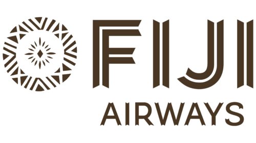
The Fiji Airways logo features an intricate design that reflects the airline’s cultural heritage. The left side displays a Teteva Masi pattern, a circle made of stripes and triangles. This design includes cross-shaped elements symbolizing the connections Fiji Airways creates between the islands of Fiji and international destinations. The center of the emblem has 16 petals around a diamond, representing teamwork. The empty ring formed by the negative space symbolizes mutual care among people. Makereta Matemosi designed this emblem to reflect deep cultural values and community spirit.
The Fiji Airways logo blends cultural significance with corporate identity by incorporating traditional Fijian designs and universal symbols of connection and cooperation. The use of specific colors reflects Fiji’s natural beauty, while the geometric shapes, such as triangles and stripes, draw from traditional Fijian art. The detailed patterns on the text and emblem highlight the airline’s commitment to preserving and promoting its cultural heritage.
The Teteva Masi pattern is more than a decorative element; it embodies Fijian art and storytelling. The circle of stripes and triangles represents unity and continuity, while the cross-shaped elements symbolize the airline’s role in connecting destinations. The central diamond surrounded by 16 petals illustrates teamwork and collaboration, key values in Fijian culture and the airline industry.
The negative space forming an empty ring signifies mutual care and support among people, a core aspect of Fijian community values. This design by Makereta Matemosi honors traditional Fijian motifs and meets modern branding needs, creating a logo that resonates worldwide while staying true to its roots.
