The Finish Line logo is a visual reflection of a line of clothing and footwear made in the same vein. Its main difference is premium quality and compliance with modern fashion. The emblem shows style, neatness, and convenience.
Finish Line: Brand overview
| Founded: | 1976 |
| Founder: | Alan Cohen, David Klapper |
| Headquarters: | Indianapolis, Indiana, U.S. |
| Website: | finishline.com |
Meaning and History
The actual history of Finish Line began in 1981 when David Klapper and Alan Cohen registered the brand under that name. Before that, they owned the franchise of the manufacturer of sneakers Athlete’s Foot. They opened their first shoe store in 1976, followed by several more locations in different cities. When the friends started Finish Line (as a subsidiary of Athlete’s Foot), they already had ten outlets. The franchise expired in 1986, so all stores were renamed. This laid the foundation for the modern retailer, which in 2002 became the second-highest-grossing sporting goods retailer in the United States.
The company’s success is due to its wide range and the rapid expansion of the trading network. Visual identification plays an equally important role because the brand’s uniqueness depends on it. And even though the famous runner logo has been replaced with a simple wordmark, the Finish Line symbol remains recognizable thanks to the typeface and black and blue palette.
What is Finish Line?
Finish Line is a sportswear retailer that has recently become part of JD Sports Fashion’s British organization. Their merger was completed in 2018. Before that, the chain of stores had the status of a public company; that is, its shares were divided among market participants. Now she owns more than 600 outlets in the United States.
1976 – 2016
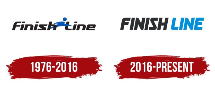
The first Finish Line logo did not appear until 1981 because before 1981, this company did not exist: David Klapper and Alan Cohen only had Athlete’s Foot franchise stores. When two comrades registered their trademark, they needed an easily identifiable sign to promote the brand in the sporting goods market. This is how the black inscription “Finish Line” was created, separated by a blue figure of a running man. The silhouette consisted of a circle and two connected lines that were shaped like a Nike Swoosh. The little man did not just run but crossed an imaginary finish line: judging by his position, he managed to step over it with one foot.
The name of the company was written in bold italic sans-serif. The first letters in words were uppercase, and the rest were lowercase. Above the “i” were dots in the form of parallelograms. The “s” was the most unusual: it looked like a short zigzag. The “F” looked exactly like an inverted “L” with an extra horizontal stroke.
2016 – today
In 2016, two significant events took place in the history of the Finish Line at once. First, Sam Sato became the chief executive officer of the company. Secondly, the designers developed a new logo for the chain of stores, from which the silhouette of the runner disappeared. As a result of the changes made, the inscription became two-color: only the first word remained black, and the second is now completely blue. All letters are converted to uppercase – accordingly, the characteristic quadrangular dots above the “i” have disappeared. But the zigzag shape of the “S” was preserved.
Font and Colors
The 2016 redesign sparked widespread outrage among Finish Line customers, who are used to seeing the silhouette of a running man in its logo. And no wonder, because this character embodied all the retailer’s values: love for sports, passion, desire to win. And he clearly illustrated the name of the brand. After the disappearance of the figurine, one inscription remained without additional elements. But it is worth recognizing that it does an excellent job with its main task – identifying the company.
The bold sans-serif used in the Finish Line logo is associated with confidence, strength, and resilience. A slight tilt to the right creates a sense of movement. All letters are capital; many have rounded corners, including “F,” “N,” “S,” and “L.” At the same time, the “S” is shaped like an inverted “Z.”
The black and blue color scheme were used initially, but the shades became slightly lighter after a redesign in 2016. In the current version, black is closer to graphite (#272b2b), and blue is closer to azure (#0090dc).
Finish Line color codes
| Azure | Hex color: | #0090dc |
|---|---|---|
| RGB: | 0 144 220 | |
| CMYK: | 100 35 0 14 | |
| Pantone: | PMS Medium Blue C |
| Graphite | Hex color: | #272b2b |
|---|---|---|
| RGB: | 39 43 43 | |
| CMYK: | 9 0 0 83 | |
| Pantone: | PMS 426 C |


