The FINNAIR logo is a visual symbol of the brand’s uniqueness and importance in the world of air travel. The text “FINNAIR” in large bold italics draws attention and emphasizes dynamism and modernity. The cut edges of the letters “F,” “N,” “A,” and “R” symbolize the speed and ease of flight and convey the feeling of takeoff and landing. The dark blue color of the logo has its symbolism: it is associated with reliability, stability, and professionalism, which reflects the importance of safety in the aviation industry.
FINNAIR’s tradition includes customer focus, innovation, and sustainability. The brand is committed to providing the best flight experience for its passengers, constantly looking for new ways to improve its services. It is actively working to reduce its carbon footprint and improve its environmental responsibility, highlighting its importance and role in today’s world.
The FINNAIR emblem generally reflects the company’s values and commitment to innovation and quality in passenger service while maintaining its recognition and leadership in the global air transportation market.
Finnair: Brand overview
| Founded: | 1 November 1923 |
| Founder: | Finnair Group |
| Headquarters: | Helsinki Airport Vantaa, Finland |
| Website: | finnair.com |
Finnair is the official airline of Finland, with a net profit of around 170 million euros and more than 5 thousand employees. Its air fleet includes 80 vessels flying to 130 destinations across two continents. It’s part of the Oneworld alliance.
Finnair’s history traces back to November 1, 1923, when Consul Bruno Lucander established Aero O/Y (Aero Ltd), one of the world’s earliest commercial airlines. The company’s inaugural flight occurred on March 20, 1924, flying from Helsinki to Tallinn on a Junkers F.13 seaplane leased from Junkers Flugzeugwerke AG in Germany. Initially, Aero O/Y mainly transported mail and operated limited passenger flights within Finland, Estonia, and Sweden. Over time, the fleet expanded to include newer aircraft like the Junkers G.24 and Junkers Ju 52/3m.
In the 1930s, the company expanded its route network significantly, introducing regular flights to major European cities like Stockholm, Copenhagen, Amsterdam, and London. American aircraft like the Douglas DC-2 and DC-3 were incorporated into the fleet. During World War II, the airline faced restrictions, with some planes requisitioned for military use and certain routes closed. However, flights to neutral countries like Sweden and Switzerland continued. After the war, the company resumed its growth, making its first transatlantic flight to New York in 1947.
In the early 1950s, the airline established regular routes to Asian destinations like Bombay (now Mumbai), Bangkok, and Tokyo, with new aircraft like the Convair 340 and Douglas DC-6. In 1953, Aero O/Y rebranded as Finnair.
In the 1960s, the airline entered the jet age, adding aircraft like the Sud Aviation Caravelle and Douglas DC-8 to its fleet, expanding its network to various cities in Europe, Asia, and North America. In 1969, it became the first European carrier to operate the McDonnell Douglas DC-10 wide-body aircraft. The following decades saw further growth by adding new long-haul routes to destinations such as Beijing, Tokyo, Osaka, and Singapore. The fleet was modernized with aircraft like the McDonnell Douglas MD-80, DC-10, and Boeing 757, while partnerships with other airlines were developed through code-sharing agreements.
In the 1990s, the company ventured into the Russian market after the Soviet Union’s collapse, launching flights to major cities like Moscow and St. Petersburg. The 2000s saw the airline continue to update its fleet with Airbus A330 and A340 aircraft, opening new routes to China, India, and South Korea to strengthen its presence in Asia. Joining the Oneworld alliance in 1999 was a significant milestone, allowing the company to expand its international network and enhance service quality through partnerships with global carriers like American Airlines, British Airways, and Cathay Pacific.
In the 2010s, the airline implemented a growth strategy focused on enhancing transit traffic between Europe and Asia through its hub at Helsinki-Vantaa Airport. The airline expanded its fleet with new long-haul Airbus A350 XWB aircraft, enabling more frequent flights and the addition of new destinations in China, Japan, and Vietnam. It improved digital services such as online check-in, a mobile app, and in-flight Wi-Fi.
Despite challenges like the closure of Russian airspace in 2022, which led to route adjustments and longer flight durations to Asia, the company maintained financial stability and operational continuity through effective crisis management, government assistance, and customer loyalty.
Meaning and History
The company was founded in the early 20th century, in 1923, but the first known Finnair logo appeared in 1968. Initially, the company was called Aero Osake-yhtiö. Only after the war, in 1946, the state bought a large portion of the company’s shares, beginning to influence its development. As it grew, the idea arose to change the name to something more scalable, suitable for a national carrier.
The company unofficially used the name Finnair in 1953 but registered it in 1968. That’s when the first corresponding logo appeared. By then, the company had already owned a fleet of jet vessels for long-haul flights. Therefore, it chose the ambitious theme of intercontinental flights worldwide for its identity. However, it failed to meet the goal fully, and in subsequent years the sign was changed to a wordmark without images.
What is Finnair?
Finnair is a Finnish state airline with an extensive network of flights within the country and international flights to Asia, Europe, and North America. The company’s fleet is comprised of Airbus planes. Around 12 million people use the carrier’s services each year, although this number dropped to 3 million in 2022 due to the pandemic.
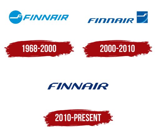
1968 – 2000
The first logo consisted of a blue circle, symbolizing the globe. The choice indicated the aspiration to establish flights worldwide. The color corresponded to the sky, the airy atmosphere in which the airliners fly, and the image of the planet when viewed from above, from space.
Against the backdrop of the globe was a stylized white airplane in the shape of the letter F – the first letter in the company’s name. When looking at the logo, it seems as if the airliner proudly glides around the planet.
The company name in large, blue capital letters followed the image. The company’s name is compound, comprising two words – Finland and air or airlines. A slight inclination gave the impression that the inscription, like a ribbon, was flying across the sky, carried by the plane.
2000 – 2010
In 1999, Finnair joined Oneworld, the third-largest airline alliance. The participation allowed it to expand and create a subsidiary company in Estonia – Aero Airlines. To reflect this expansion, the carrier’s logo was revised.
A darker shade of blue in the letters indicated increased experience and capabilities, conveying more confident market positions. A similar effect was brought by the change from a circle to a square. The precision and logic can be read in straight lines. The four sides of the figure are like the four points of the compass where the company aims to expand.
Inside the square is a part of the globe, against which a white company airplane is flying.
The new emblem was developed by the company SEK & Grey.
2010 – today
In the most recent emblem and aircraft livery updates, the company SEK& Grey also participated. The logo was chosen word-based with dark blue ribbon letters with rounded edges. The logo reflects harmony and the desire to please passengers. Encoded in its soft lines are light, safe flights.
The airplane symbol from the stylized F also changed to a dark blue but is now used separately from the main logo.
Font and Colors
The company did not randomly choose blue for the logo. It expresses the technical perfection of the airliners and the professionalism of pilots and flight attendants. It’s no wonder Finnair is considered very punctual.
The color inspires passengers’ trust. It hints at a sober mind and precise following of instructions, which gives confidence in a calm flight. And this corresponds completely to reality. The company ranks 6th in the ranking of the safest. Over the past 50 years, it has had no crashes or emergencies.
The cool color palette is associated with the coolness of Finland and its blue lakes. The blue shades are connected with the sky, conquered by the carrier’s airplanes.
The font is unique. The letters seem laid out from ribbons, resonating with lightness and airiness. The slight forward tilt indicates movement.
Finnair color codes
| Dark Sapphire | Hex color: | #0a2d72 |
|---|---|---|
| RGB: | 10 45 114 | |
| CMYK: | 91 61 0 55 | |
| Pantone: | PMS 288 C |


