


![]() Five Nights at Freddy’s Logo PNG
Five Nights at Freddy’s Logo PNG
A video game that instills horror and pumps adrenaline through the blood: this is how the Five Nights at Freddy’s logo can be described. It conveys an atmosphere of tension, the height of emotion, and a desire to find a way out of what seems like a hopeless situation under cover of night. Tension and dynamics are also clearly manifested.
Five Nights at Freddy’s grew out of Scott Cawthon’s earlier work as an independent developer. Before the series, he released Chipper & Sons Lumber Co., a children’s game whose character animation was often described by players as unsettling. Cawthon turned that criticism into the basis for a horror game built around animatronic figures.
The first Five Nights at Freddy’s was released on August 8, 2014, first on Desura and later on Steam. The story followed a night guard at Freddy Fazbear’s Pizza, where animatronics, including Freddy Fazbear, became hostile after dark. The game used a simple yet tense structure, with security cameras, limited resources, and a survival-until-morning objective.
The series spread quickly through YouTube, especially through Let’s Play videos by Markiplier and PewDiePie. Cawthon then released sequels at a rapid pace: Five Nights at Freddy’s 2 in November 2014, the third game in March 2015, and the fourth in July 2015. Later entries included Sister Location in 2016, FNaF World in 2016, Freddy Fazbear’s Pizzeria Simulator in 2017, and Ultimate Custom Night in 2018.
The franchise also expanded into novels written with Kira Breed-Wrisley and published by Scholastic. In 2021, Cawthon stepped back from public leadership, while Steel Wool Studios continued the series with projects such as Security Breach. In October 2023, Blumhouse Productions and Universal Pictures released the film adaptation directed by Emma Tammi. In the indie horror market, Five Nights at Freddy’s was often compared with Bendy and the Ink Machine and Poppy Playtime.
Meaning and History
![]()
After its 2014 release, the video game became a sensation; before this, Scott Cawthon had produced Christian-themed games, which had one complaint: boredom. The developer gave gamers what they desired: adrenaline-fueled horror. Video bloggers immediately began spreading the word about his new product, marveling at the bone-chilling events unfolding at night in an ordinary pizzeria. Thus, a separate universe was created, ruled by an animatronic toy, the bear Freddy Fazbear.
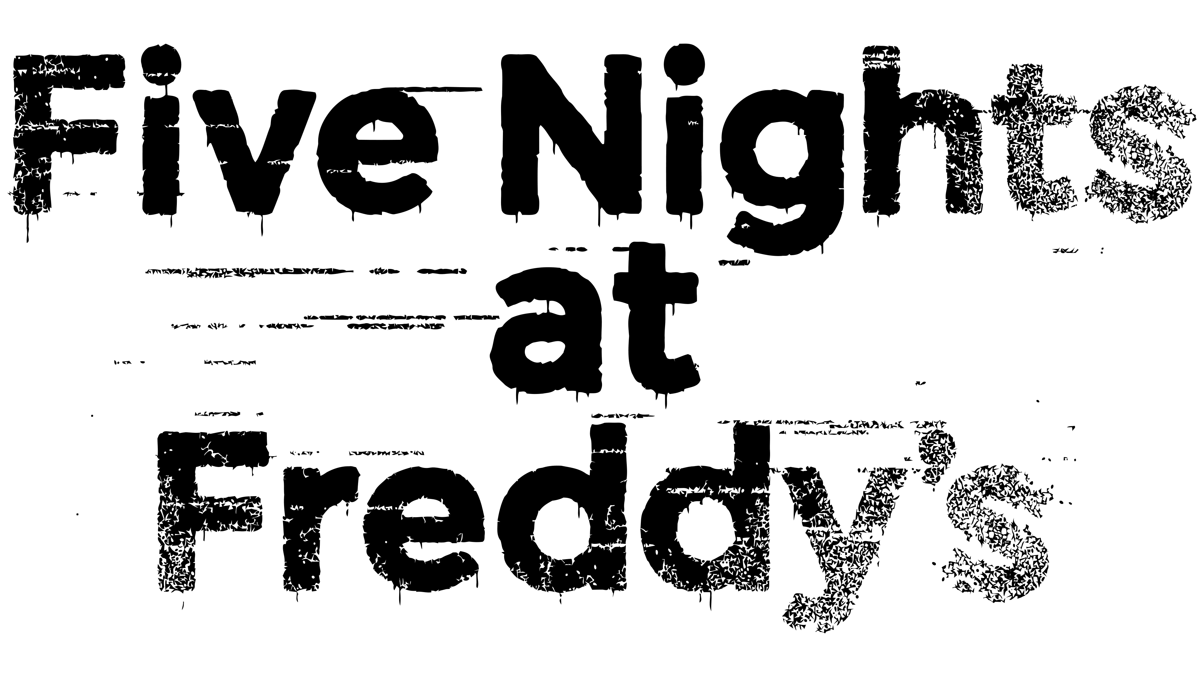
He also became the basis for the video game’s name and logo. His name laid the foundation for everything related to this intriguing character. The tense atmosphere is conveyed by the bloody inscription, with traces of “dirt,” as if it were a print left by an injured participant. In some places, the text is clear; in others, foggy, blurry, almost invisible. This style immediately sets gamers up for horrors with bloody carnage.
What is Five Nights at Freddy’s?
Five Nights at Freddy’s (FNaF) is a video game set in a pizzeria at night. Its main character is the cafe’s mascot, an animatronic toy of the bear Freddy Fazbear. After its 2014 release, the game gained significant popularity and continued to grow, gradually becoming a major media franchise. Its creator is Scott Cawthon.
2014 – today
![]()
The Five Nights at Freddy’s logo features a three-level inscription centered. All words are typed in the same font, a lowercase slab serif. Only the first letters are uppercase. Thin streams flow down from each glyph. According to the developers’ idea, this is blood. Red streaks on a white background tickle the nerves and evoke the atmosphere of horror films about Freddy Krueger, since the main character bears an almost identical name.
The letters are wide, bold, and similar to prints. In some places, they are indistinct, especially at the end of the first and third lines. As a result, it creates the impression that the character does not have enough blood for the inscription, so he will soon go after the next victim to finish the start line. There are also horizontal, long, dash-like traces, no less chilling.
Font and Colors
The Five Nights at Freddy’s emblem is word-based, so great attention is paid to the inscription, as it performs three functions:
- indicates the name of the media franchise;
- conveys the atmosphere of the video game;
- reflects its style and genre (horror).
A stylized slab-serif font, Montserrat Bold, was chosen for the text, which shares similarities with Avenir Next. In this case, the apostrophe is a comma raised upward. Moreover, the capital letters “F” in “Five” and “Freddy’s,” as well as the “N” in “Nights,” are aligned in height with the lowercase “i.”
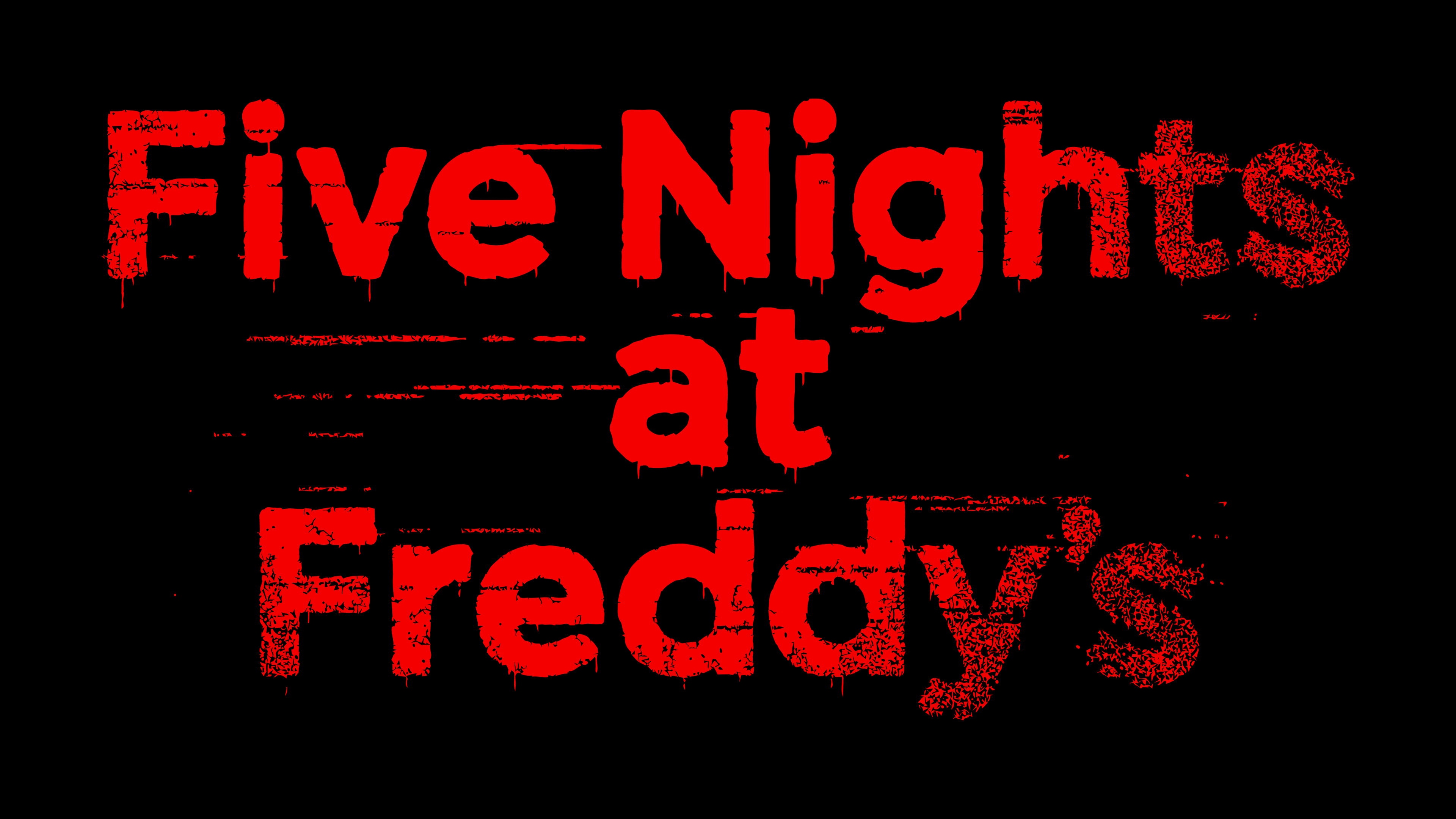
The color palette is predictable and monotonous, blood-red, reminiscent of blood. This choice is dictated by the video game genre and the desire to accurately convey the atmosphere of horror.
fnaf logo