


 Fjallraven Logo PNG
The Fjällräven logo is one of the most memorable. It looks like a bright, colorful image, almost as if taken from a cartoon, and it sticks in the memory for a long time. The Scandinavian company achieved an impressive result by featuring its mascot in the first version of its brand identity. The brand quickly gained customers’ trust by using this image and offering high-quality outdoor products. The original logo was key to establishing the company’s strong, positive image.
It is often said that the fox, so brightly and carefully depicted on the logo, became a symbol of the brand’s success. However, there were many other reasons to praise Fjällräven. The modern logo fully affirms the brand’s reliability, remaining vibrant, original, and strikingly beautiful. But if we look back at previous versions, we can see that the current logo is a refined, more thoughtfully designed version of its predecessor. It avoids excess, with each element conveying important information and highlighting the company’s balanced, well-considered approach to its identity.
Fjällräven began in 1960 in Örnsköldsvik, Sweden, when 23-year-old Åke Nordin started making backpacks in his family’s basement. He sold packs to small retailers. His first design came from an aluminum-frame pack built at age 14 and refined during military service. The name means “arctic fox” in Swedish. A lighter thermal tent brought early sales in 1964, followed by the Greenland Jacket in 1968, made from G-1000 fabric.
During the 1970s, the company added tents, sleeping bags, clothing, and other outdoor equipment. In 1978, it introduced Kånken as a school backpack for Swedish children, later adopted by adults. International expansion began in the 1980s through Germany and other Nordic markets. In comparison, the 1990s brought wider clothing lines and offices in the United States and other countries.
Fenix Outdoor AB acquired Fjällräven in 2001 and supplied resources for further growth. Fjällräven Classic launched in Swedish Lapland in 2005 and later expanded abroad. Eco-Shell clothing appeared in 2008, followed by Fjällräven Polar in 2013, a 55th-anniversary collection in 2015, and the Bergtagen mountaineering line in 2018.
Online sales expanded during 2020 as buying habits changed. Tree-Kånken, made from a wood-pulp-based material, launched in 2021. A special Kånken collection followed in 2022. By 2023, the company continued international expansion through e-commerce and new offices, while its range covered backpacks, clothing, tents, sleeping bags, and technical outdoor gear.
Meaning and History
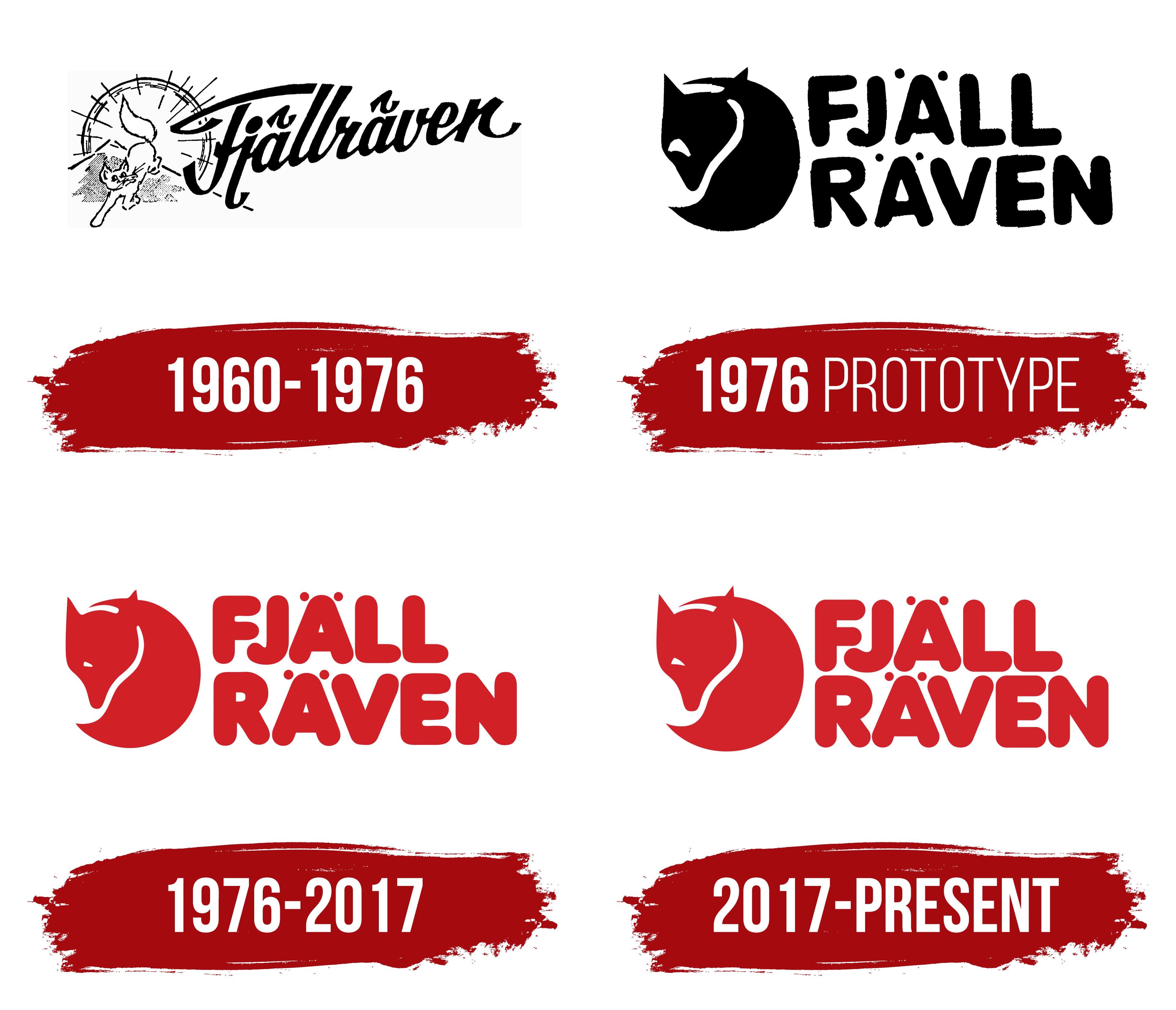
What is Fjallraven?
This Swedish outdoor gear manufacturer gained worldwide recognition for its adventure products and urban clothing. The brand, with its recognizable Arctic fox emblem, combines durability and performance with the elegance of Scandinavian design. The Kanken backpack, created as a school bag, has become a global fashion statement. The product range includes durable clothing, accessories, tents, and sleeping bags designed to withstand the harsh conditions of the northern climate while remaining stylish. The brand has earned a loyal following among environmentally conscious consumers due to its use of sustainable materials and ethical production methods.
1960 – 1976

Against the backdrop of its successors, the first logo stood out for its uniqueness and original appearance. It combined image and text into a single concept, making it difficult to determine which element held the primary position in the identity.
The image was placed on the left and rendered black on a white background. This graphic element consisted of three parts. In the foreground was a cat whose outline closely resembled that of a fox. It was depicted in motion, giving the logo a sense of liveliness and dynamism. In the background were two landscape scenes: mountains and a rising sun. These symbols represented the brand’s ascent to the peak of popularity. The three graphic elements blended so harmoniously that they were often perceived as a whole.
The brand name, placed to the right of the image, also added dynamism to the logo. A special italic font was chosen to emphasize the company’s growth, offering backpacks and a wide range of outdoor products. The text was arranged diagonally, starting in the lower-left corner and rising upward, symbolizing the brand’s growth, unity, and reliability. Notably, the letters were connected rather than separated, adding extra expressiveness to the logo. Two small elements above the letters “a” resembled birds soaring in the sky, evoking a sense of lightness and freedom.
1976 (prototype)
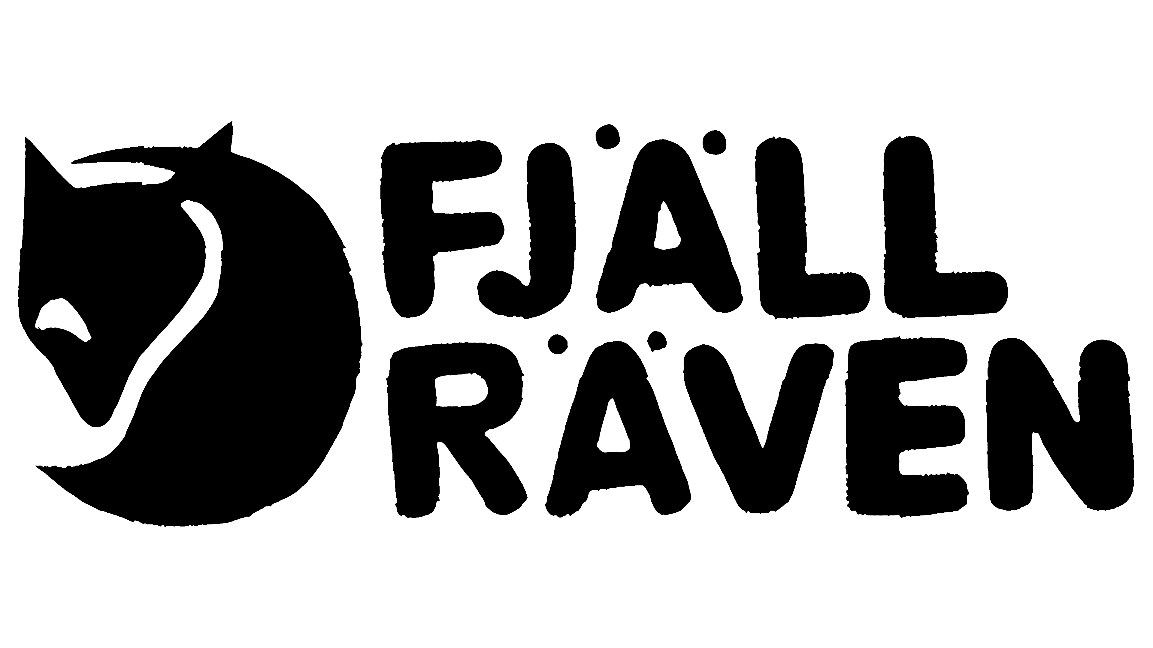
In 1976, a logo was introduced that lasted for nearly half a century, serving as the foundation for all subsequent versions. Although it would change over time, adjusting colors and certain details, it would forever retain its key elements: the company’s values and reliability. The mascot, a carefully drawn fox, seemed to guard the logo and accompany the brand on its path to success.
This logo stands out because the graphic and text are balanced, playing equal roles. The color scheme remains classic: black illustration and text stand out against a white background, creating a clean and formal composition. The height of the drawing and the letters, now arranged in two rows, is almost identical. The brand name is split into two words for the first time, marking a departure from tradition and introducing new elements into the company’s identity, founded in 1969.
As the brand’s mascot, the fox is depicted in a calm, peaceful state. It is motionless, curled up, as if observing everything around it. The illustration is soft, but the sharp angles give the image clarity and structure. One key element that makes the logo unique is the fox’s slightly open eye, which creates a friendly impression and sparks curiosity in the audience.
The text block has become more expressive. The bold font gives each letter stability and confidence. Above the “A” vowels, the so-called “attention magnets,” four bold dots, highlight the logo’s uniqueness and draw attention to its details.
1976 – 2017
In 1976, the Fjällräven brand also introduced its logo in a new color variation. Despite the apparent consistency of all elements, the drawing and text, now rendered in red, stood out vividly against the white background. Some details gained a distinct individuality. For example, the animal’s eye became slightly smaller, adding more playfulness and mystery to the image.
Some consonant letters were slightly thicker and wider while maintaining clarity and proportion. The red dots above the vowels retained their original size, remaining an important logo element.
The change in color palette was a significant step for the brand. Red is traditionally associated with love, but in the brand’s interpretation, it symbolizes originality and a passion for outdoor activities. The red letters and fox appeared bold yet elegant, enhancing the visual impact. This color scheme significantly increased the brand’s recognizability, helping the logo stick in the minds of a broader audience and strengthening its connection to the brand’s values.
2017 – today
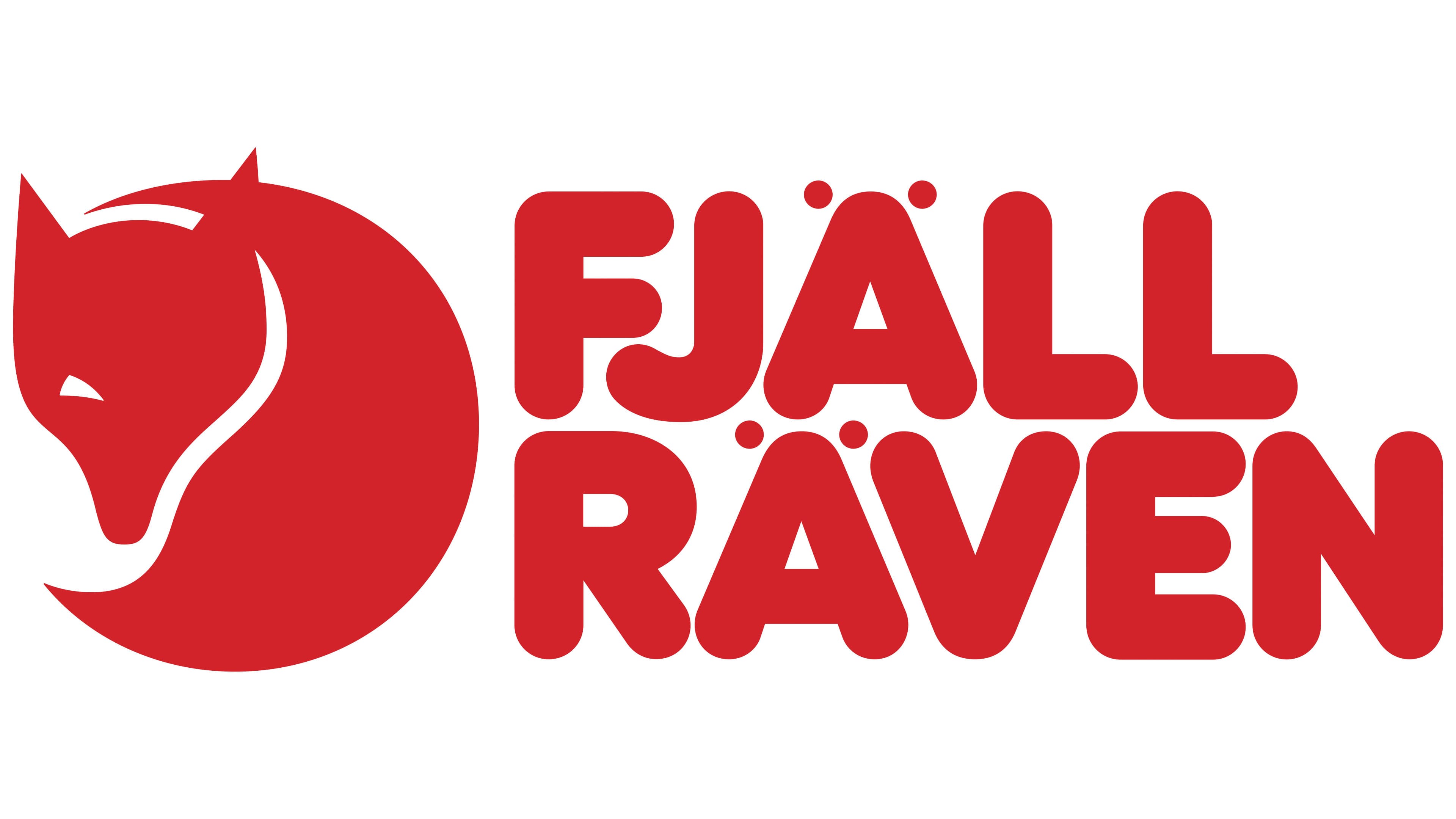
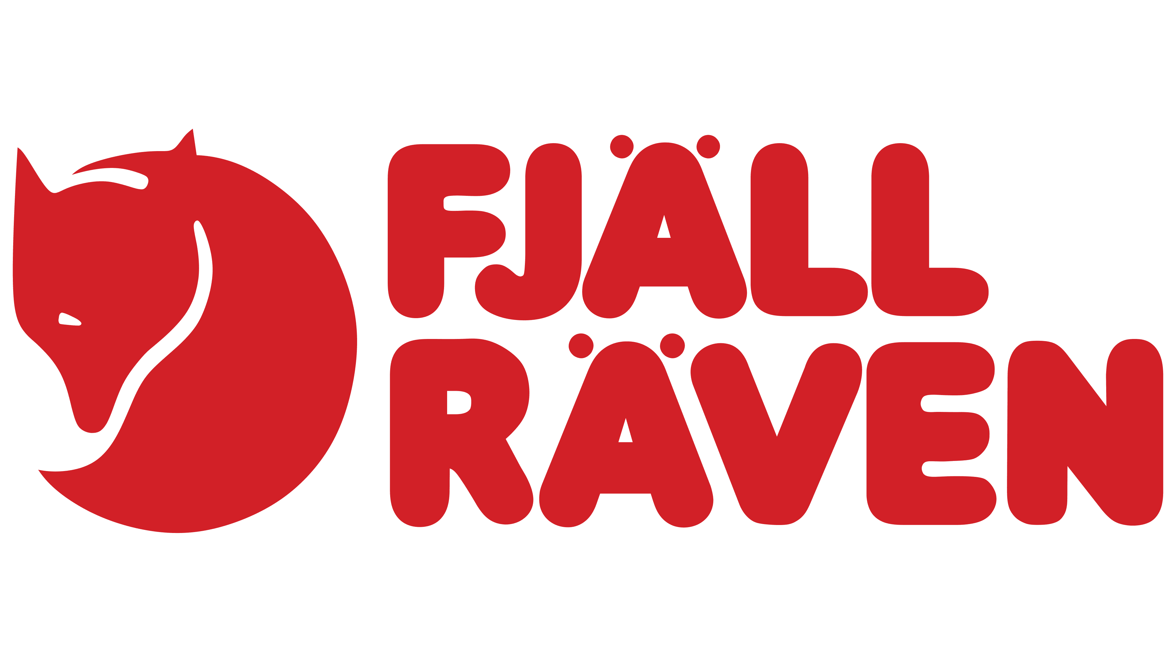
Another version of the logo was introduced in 2017. The brand’s identity remained vibrant and appealing, and it is now perfectly aligned with modern trends.
The logo underwent several changes, enhancing its individuality and emphasizing its contemporary look. The white background and red color used to fill the letters and drawing remained, but the image became more graphically refined and elegant.
Two key changes stand out. First, the fox’s eye became noticeably larger, with a more defined triangle-like shape. This shape was also applied to the ears and the outer parts of the animal’s body, giving the fox a sharper, more dynamic appearance. Second, the gap between the fox’s head and body increased, adding lightness and space to the logo.
The text also saw changes. The letter widths in the two words increased, giving the logo greater stability and prominence. The letter “J” had a distinctive appearance: its lower part became elongated and rounded, adding a unique look.
Today, the logo remains unchanged and is the brand’s signature, associated with high-quality outdoor products. Fjällräven has proven its reliability over the years, gaining worldwide popularity and solidifying its reputation as a manufacturer of premium-quality goods.