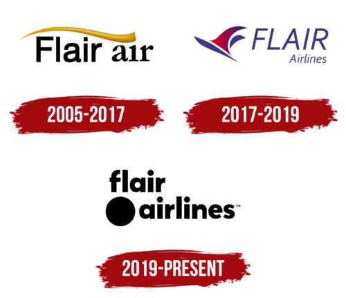
The Flair Airlines logo symbolizes the airline’s commitment to making air travel accessible and affordable. It draws on the rich heritage of Canadian exploration and the pioneering spirit, representing the connection of varied regions across the country. The emblem highlights the airline’s role in facilitating connections that unite people, focusing on community and shared experiences.
Flair Airlines: Brand overview
Flair Airlines, headquartered in Edmonton, Alberta, has transformed the Canadian airline industry since its inception. Operating a fleet of Boeing 737 aircraft, Flair Airlines offers Canadians affordable and convenient travel options across the country.
Founded in 2005, Flair Airlines was a budget option for travel packages. However, in 2017, the airline became an ultra-low-cost carrier, expanding its reach with more affordable fares and improving accessibility to destinations in Canada and the United States.
As Canada’s first and only independent ULCC, Flair Airlines is a true pioneer in the country’s aviation industry.
Flair Airlines prioritizes the safety and comfort of its passengers, which is why it operates a modern fleet of reliable and comfortable Boeing 737 aircraft.
By expanding its route network and increasing the number of customers, Flair Airlines continues to grow rapidly and strengthen its position as a prominent player in the Canadian aviation industry.
Meaning and History
What is Flair Airlines?
It is a Canadian budget airline based in Edmonton, Alberta. It operates a network of domestic and international flights and provides affordable air travel options across Canada and selected destinations in the United States and Mexico. Known for its budget fares, it strives to make air travel affordable by offering a no-frills service with additional options for a personalized travel experience. The airline’s fleet consists mainly of Boeing 737 aircraft.
2005 – 2017
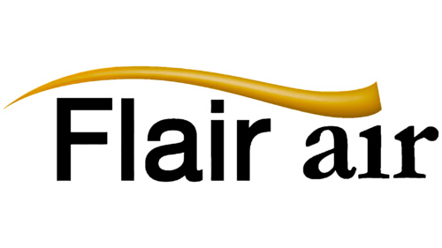
The first logo of Flair Airlines, created in 2005, reflected the company’s aspirations in tourism. The golden arch positioned above the name symbolized the tourist routes the airline offered to its passengers. Initially, Flair Airlines was closely linked to travel packages, providing flights to the most beautiful and memorable places. This arch is reminiscent of the trail left by a taking-off airplane, symbolizing the company’s dynamism, speed, and commitment to continuous forward movement.
The choice of gold for the arch was deliberate. It highlights the high quality of service that Flair Airlines provides to its passengers onboard. The smooth line of the arch adds a sense of warmth and joy, emphasizing comfort and the pleasant emotions associated with traveling with the company.
The brand name in the first logo, Flair Air, is presented in black and divided into two parts using different fonts. This design visually separates the company name from its area of activity, focusing on the brand’s uniqueness and specialization.
2017 – 2019
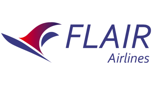
The emblem of Flair Airlines features a stylized image of an airplane tail, the central element of the design. Rendered in purple and lilac tones with a gradient effect, these smooth and graceful lines evoke a nearly magical sensation, adding a touch of romance and inspiration to the company’s image. The choice of colors and style reflects the company’s goal to refresh its image, positioning itself as a carrier of dreams and offering comfortable flights at affordable rates.
The elegance and delicacy of the lines used in the logo for the company name emphasize the simplicity and accessibility of Flair Airlines’ services. This visual strategy conveys that traveling with Flair Airlines is easy and convenient. The emblem’s design aims to attract a broad audience of travelers looking for economical flying options without compromising quality or comfort.
2019 – today
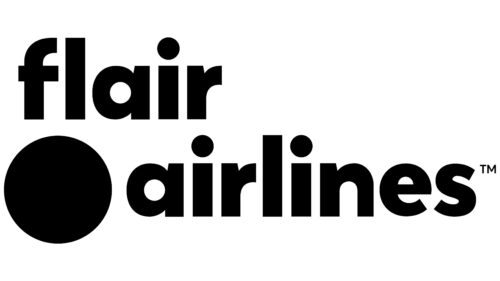
The Flair Airlines logo is unique in its minimalist design, avoiding typical airline imagery like the sky, birds, and airplanes. The main feature is a large black circle in the lower left corner, balanced by the brand name in two lines, using a modified Rozanova family font.
This minimalist approach makes the Flair Airlines logo memorable and distinct in the airline industry. The large black circle and the sleek font convey modernity and efficiency. Flair Airlines presents itself as a forward-thinking brand by avoiding traditional elements like wings or globes. This simplicity emphasizes essential and streamlined service, aligning with the airline’s ethos.
The large black circle in the logo speaks to a clean and contemporary aesthetic, reflecting a modern sensibility and suggesting that Flair Airlines values simplicity. Placing the dot and the brand name creates a balanced composition, enhancing visual appeal and brand recognition.
The modified Rozanova font for the brand name adds a unique touch, ensuring the text is legible and stylish. Splitting the name into two lines enhances clarity and visual impact, making the logo easy to read and remember.


