Digital marketing platform Flodesk, co-founded by Martha Bitar, Trong Dong, and Rebecca Shostak in 2019, has recently undergone a transformative rebranding. Known for its comprehensive suite of tools, Flodesk has made waves since it came out of its beta phase in 2021. With an offering that includes email design, custom sales pages, online payment processing, and audience list growth, the platform is celebrated for its simplified pricing model with no limitations on sends or subscribers.
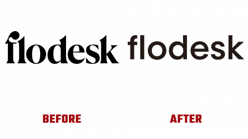
The new Flodesk logo, skillfully redesigned by the company’s in-house design team in collaboration with DIA, is taking center stage in the rebranding. While the previous logo’s high-contrast, bold serif style was impactful, it was considered too specialized for a brand aiming to attract a diverse clientele. In contrast, the new logo offers a neutral, sans-serif look, perfectly conveying the company’s aim for efficiency and seriousness—attributes its core user base of business owners and content creators highly value.
The rebrand doesn’t stop at the logo. Unique typefaces crafted by Optimo lend a classical vibe that avoids the eccentricities usually associated with custom fonts. The carefully orchestrated contrast between serif and sans-serif styles in these typefaces achieves an equilibrium between the contemporary and the timeless. A nuanced animation that toggles between these styles adds a layer of visual finesse.
But it’s not just about aesthetics; it’s about function, too. Flodesk has integrated dynamic elements that contribute to an engaging and fluid brand experience, courtesy of DIA’s expertise. The animation utilizes basic geometric shapes, like squares and circles, enhancing the user interface without causing distractions. This dynamic styling offers the flexibility to showcase a wide range of photography that reflects Flodesk’s varied customer base.
Even the brand’s merchandise isn’t left untouched. The minimalist tone-on-tone embroidery on t-shirts is done so tastefully that it stands out without seeming ostentatious.
As for the typography, Flodesk opts for unconventional yet harmonious alignments that maintain visual appeal while ensuring readability. The net result is a brand identity that perfectly aligns with Flodesk’s mission—to be a design-focused, user-friendly digital marketing platform.
The revamped identity underscores Flodesk’s commitment to offering a visually appealing, user-centric experience, attracting a discerning audience keen on sophisticated marketing tools. In sum, the new Flodesk brand identity captures the essence of the platform’s vision for a modern, versatile, and elegant digital marketing future.


