The football team prepares to play for the first time in 2022, but designer Christopher Payne has already created a laconic logo.
Rochester in New York State has always been considered the premier football city in the United States. Rochester Rhinos was one of the main soccer clubs in the city. But since 2017, the team has been on sabbatical and has not returned to the field. Several enthusiasts Dave Weaver, Mark Washo, and Todd Harrison, decided to renew the city’s former glory and create their club.
The name Flower City Union is closely related to the history of the city itself. Rochester is often referred to as the “Flower City” because of the large company specializing in the production of Ellwanger & Barry Nursery flower seeds. The city’s logo also uses a floral pattern, and the most famous event in Rochester is the annual Lilac Festival at Highland Park. The beautiful name is reflected in the name of the football team.
Designer Christopher Payne talked to the city’s residents and learned that, for example, they don’t like winter very much and are happy when the first lilacs bloom. Football clubs also depend on their fans, which is why the designer turned to them during the development of the logo. It became clear that in the center of the whole image, there would be a lilac flower.
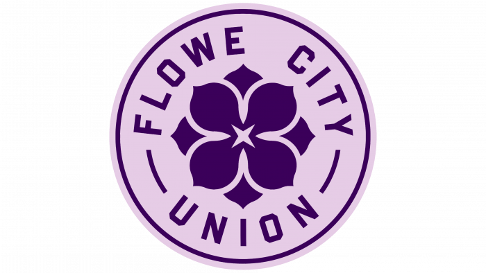
At the center of the entire design is the 4-petal lilac during flowering. The color palette consists of different shades of lilac. The name of the team is located around the flower. Inside the logo is a four-pointed shape that symbolizes the flash from the camera – a tribute to the Rochester-based Kodak company.
Fans of the club have already reacted positively to the modifications. You can also buy a variety of merchandise with a new symbol. The visual identity turned out to be bright, colorful, and familiar to many fans. The design combines modernity with an interesting history that draws a parallel not just with the team but with the whole city and all its inhabitants.


