The Food Lion logo symbolizes the supermarket chain’s dedication to providing value and quality in the grocery sector. The lion in the logo represents strength and leadership, reflecting the company’s goal to be a leading grocery provider. It also embodies the firm’s commitment to community involvement and customer satisfaction, striving to be a dependable and caring neighborhood grocery store. The emblem highlights Food Lion’s promise to offer a wide selection of quality products at competitive prices, simplifying daily shopping for its customers.
Food Lion: Brand overview
Back in 1957, in Salisbury, North Carolina, Ralph Ketner, Brown Ketner, and Wilson Smith started a grocery store called Food Town. They wanted to sell good food at great prices, a promise to their community. They made their stores simple and chose their products wisely to reduce costs. This way, they could make things cheaper for their customers. This idea worked well, and soon, Food Town became a favorite in the Southeast.
As years passed, Food Town grew quickly. In the 1970s, they changed their name to Food Lion, marking the start of a new chapter. The 1980s were big for Food Lion. They kept prices low, ran their stores efficiently, and chose smart locations for new stores. By the end of the 1980s, they had over 800 stores.
The 1990s brought new challenges. Despite facing more competition from Walmart, Food Lion expanded into Florida and Texas. Their low prices were still a priority. However, they also faced a scandal in 1992 when a news report questioned their food-handling practices. Food Lion defended itself against these accusations, but their reputation took a hit.
Still, Food Lion kept growing and improving. They invested in improving their stores, introduced new technology, and offered a wider variety of foods. They also started focusing more on fresh and healthy options. In response to people’s desire for convenience, Food Lion improved its online delivery and pickup services.
Today, Food Lion has more than 1,000 stores in 10 states. It’s known for its good value, quality food, and convenience. Despite ups and downs, it’s a big employer and a key shopping spot in the region.
Food Lion’s story shows how the grocery business can have good and tough times. They’ve always focused on being affordable, efficient, and convenient. As shopping habits change and new stores come into play, Food Lion knows it needs to keep up with what customers want. Looking ahead, Food Lion is ready to face new challenges, ensuring it stays a go-to grocery store for many people.
Meaning and History
What is Food Lion?
Founded in 1957 in Salisbury, North Carolina, Food Lion is an American supermarket chain with over 1000 stores across ten Southeast and Mid-Atlantic states. The chain offers an extensive selection of groceries, including fresh produce, meats, dairy, pantry staples, and household and health products, all at competitive prices. Food Lion emphasizes customer service with regular sales, a loyalty program, and a focus on customer satisfaction.
1957 – 1983
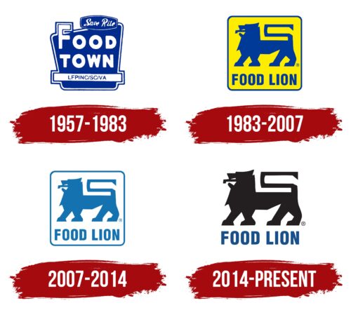
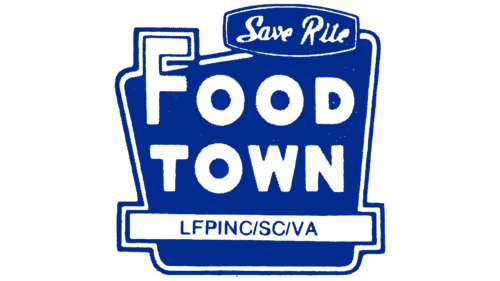
From 1957 to 1983, Food Lion introduced its first emblem, featuring a stylized image of a building that likely represented a supermarket. The emblem was blue, chosen for its associations with wisdom, thoughtfulness, and professionalism. These qualities reflected the company’s strategic approach to keeping product prices low for customers.
The store’s name appeared white and extended beyond the main image, symbolizing novelty, freshness, and easy product access. This design emphasized Food Lion’s dedication to offering quality, fresh goods at competitive prices.
In the top right corner, “save rite” highlighted the company’s commitment to budget-friendly shopping, stressing affordability and easy access to products as core aspects of its mission.
The lower part of the emblem displayed “LFPINC/SC,” with “LFPINC” standing for “Lowest Food Prices in North Carolina,” emphasizing the company’s goal to provide the lowest prices in the state. “SC” referred to Salisbury City, the first store’s location, reminding people of the company’s origins and commitment to affordable food in North Carolina and beyond.
1983 – 2007
When Delhaize Group acquired the chain, it completely revamped the supermarket’s name and visual identity. They introduced a new logo with a square with softly rounded corners, suggesting a safe or enclosed space. This design symbolizes the store as a special place that offers customers a unique shopping experience with benefits and comfort.
The logo’s yellow background was chosen to make the shopping experience at Food Lion seem easy and enjoyable, emphasizing affordability. The bright and sunny color evokes joy and satisfaction, conveying a promise of budget savings. This visual feature represents the company’s strategy to create a positive client experience.
The central feature of the new emblem, a blue lion, might initially seem unusual for a grocery supermarket. Yet, this symbol is significant, representing the store’s leading position in the market and its ambition to be the top competitor. The lion’s blue color conveys trust, stability, and professionalism, reinforcing Food Lion’s reputation as a reliable and quality shopping destination.
2007 – 2014
In 2007, Food Lion launched a loyalty program and started focusing on selling healthy products to attract new customers and respond to the increasing demand for nutritious foods. This is aligned with global health trends.
To reflect this strategic focus in its visual identity, Food Lion updated its logo. The lion, symbolizing strength and leadership, remained but was redesigned in white and light blue. This new color scheme represents the lightness of low-calorie foods and the brand’s commitment to promoting healthy lifestyles.
The white and light blue colors also suggest a connection to cloud technology, highlighting Food Lion’s dedication to innovation. This includes making online ordering easier, reflecting the company’s efforts to use modern technology to simplify shopping and make product selection and purchase more convenient for customers.
2014 – today
The modern emblem of Food Lion conveys messages of freedom, confidence, strength, and pride, which are central to its corporate identity. These qualities showcase the company’s spirit and help maintain its strong market position. Thanks to strategic management and its dedication to quality service and products, Food Lion continues to grow and thrive in the competitive retail sector.
The emblem features a black lion, a strong symbol of victory and dominance over competitors. Black is chosen for its associations with elegance, power, and authority. The lion represents leadership and majesty, underscoring Food Lion’s aim to lead the industry and offer the best shopping experience.
Beneath the lion, a blue inscription enhances the emblem’s regal look. Blue represents trust, reliability, and calm, reinforcing the brand’s image as a dependable shopping destination. Combining the black lion and blue text creates a visually striking and balanced image.
The inscription is in uppercase letters, adding to the emblem’s impact. This choice enhances readability and lends a sense of stability and authority, reflecting Food Lion’s long-standing experience and commitment to high-quality services.
Font and Colors
The Food Lion logo features a bold sans-serif font that communicates strength and reliability. The “FOOD LION” text is in all caps, which conveys a sense of stability and authority. The font’s straightforward style without embellishments enhances readability and clear brand name communication.
The logo’s strong visual impact is due to the colors used—black for the lion symbol and dark blue for the brand name. Black is associated with sophistication and power, while dark blue signifies reliability and safety. This combination engenders confidence in the brand, suggesting quality and dependability.
The logo’s simple font and color scheme make it memorable and easily recognizable, which is vital for maintaining the brand’s presence in a competitive market. The design’s simplicity allows for scalability to various sizes without losing clarity, from store signs to product packaging.
FAQ
What is the name of the Food Lion mascot?
Food Lion’s mascot, Leo the Food Lion, was introduced on January 17, 1997. Leo has become a friendly face for the brand, helping to make the stores feel welcoming. Choosing a lion was to show strength and commitment to great service and products.
The mascot appeared long after Food Lion changed its name from Food Town in 1983. This change helped the company grow since “Food Town” was a name already used by other stores in some places. With a new name, Food Lion could expand without any confusion.
Leo the Food Lion plays a big part in the company’s image and helps maintain a strong bond with the communities where It operates. The company, now part of Ahold Delhaize, has grown significantly. Despite all these changes, Leo stays a constant symbol of Food Lion’s focus on quality, value, and making customers happy.
When did Food Lion change their name?
In 1983, the grocery store known as Food Town changed its name to Food Lion. This change happened because they discovered another store already using “Food Town” in some areas. To avoid any mix-ups or legal problems, they decided to pick a new name that stood out. They chose “Food Lion,” a name inspired by their parent company, Delhaize Group from Belgium, which bought the chain in the 1970s. Delhaize also had a lion in its logo, so the new name fit well with the overall brand. This name change was a big deal for the company, helping it grow and succeed in a market full of competition.
What is the meaning of Food Lion?
Food Lion is a big name in American grocery stores, starting in 1957. It was first called “Food Town” in Salisbury, North Carolina. The store focused on affordability, offering good quality, and making shopping easy for everyone. Over the years, it grew a lot and now has more than a thousand stores all over the US. This shows how much it cares about making customers happy and meeting their wants.
In 1983, the store changed its name from “Food Town” to “Food Lion.” This was because as it grew, it found other stores with the same name, which could confuse people and cause legal issues. “Food Lion” was picked for its strong and memorable qualities, showing the company’s goal to lead in grocery shopping. This new name helped it grow even more across the US without the trouble of having a similar name to others.
After changing its name, Food Lion kept improving, improving shopping for its customers by updating its stores, adding new products, and improving service. It also started using more technology and focusing on being eco-friendly. This helped the store move from just one in North Carolina to a big chain nationwide. Food Lion’s story shows how it can change and succeed in the busy world of retail.
What are the colors of the Food Lion?
The Food Lion brand uses blue and black colors to make its logo easy to spot and remember. They chose these colors because they’re clear and stand out well. The main blue they use is called Pantone 647. It’s a special kind of blue that looks professional and nice. They also put this logo on a white background, which helps the blue and black colors pop even more. This color choice makes the Food Lion logo easy to see. It gives off a vibe of reliability and professionalism, which is important for a grocery store trying to stand out.
Who owns Food Lion?
Food Lion is a popular grocery store chain in the U.S., and Ahold Delhaize owns it. This company is a big deal in the food retail, with its main office in the Netherlands. It was created in 2016 when two big companies, Ahold from the U.S. and Europe and Delhaize Group from Belgium, decided to join forces. Both were known for their great grocery stores and service.
Food Lion started in 1957 in Salisbury, North Carolina. Since then, it has grown significantly and now has over a thousand stores, mainly in the Southeastern and Mid-Atlantic regions of the U.S. Being part of Ahold Delhaize has helped Food Lion grow even more by giving it access to more resources and expertise in retail.
Being owned by Ahold Delhaize means Food Lion is part of a bigger family of brands that all focus on providing good quality, value, and service. This connection helps Food Lion offer better choices to its customers and stay strong in a very competitive market.
What is Food Lion’s mascot?
Food Lion, a well-known grocery store chain in the U.S., has had a mascot named Leo the Food Lion since January 17, 1997. Leo was introduced to help make the brand more likable and friendly, especially to families and kids. The mascot came into play years after Food Lion changed its name from Food Town in 1983. This name change was needed so the company could grow in new areas without confusion with other stores called Food Town.
Being a lion, Leo matches the store’s name and makes the brand stand out. He’s part of Food Lion’s ads, grand openings, and community events, showing the store’s commitment to good service and values. Even though Food Lion has grown a lot and joined the Ahold Delhaize group, a big global food retailer, Leo remains a key part of the brand. He helps Food Lion stay connected with shoppers and keep the stores welcoming.
Who designed the Food Lion logo?
The Minale Design Group made the Food Lion logo in Paris. They worked closely with Food Lion people from Salisbury, North Carolina, to ensure the logo looked good and fit what Food Lion stands for. This teamwork was key because it ensured the logo showed Food Lion’s true spirit, focusing on being a store that cares about quality, low prices, and helping customers.
Minale Design Group is pretty good at making brands look great. They know how to capture what a brand is all about and turn that into a logo. Thanks to their skills and working together with Food Lion, they created a logo that people now easily recognize. Its logo has lasted over time and shows what Food Lion is all about to everyone who shops there.
