The Food Network logo is a symbol of taste. Its brightness is directly related to food, as the chosen color stimulates the appetite, encouraging viewers to watch culinary shows to perfect their cooking skills or indulge in culinary topics. The soft contours and smooth lines indicate safety for those who decide to use the suggested recipes.
Food Network: Brand overview
| Founded: | November 23, 1993 |
| Founder: | Warner Bros. Discovery, Nexstar Media Group |
| Headquarters: | New York City, New York, United States |
| Website: | foodnetwork.com |
Meaning and History
To increase its popularity, Providence Journal owner Trygve Myhren came up with the idea of creating a culinary channel. In 1990, he sought help from Reese Schonfeld, Joe Langhan, and Jack Clifford. As a result, in 1993, a specialized channel dedicated entirely to food appeared on television. Its working title was The Cooking Channel, which was changed to TV Food Network upon launch and later to Food Network.
The logo emerged immediately, as the network needed a visual identity to represent it at all levels. Of course, a thematic design was chosen, directly indicating that the channel was related to culinary arts. Subsequently, each logo change brought certain modifications, but they still conveyed the general brand concept – directly or indirectly (through symbolism).
What is Food Network?
Food Network is a thematic channel on American television. It features culinary shows, talks about food preparation, and hosts cooking shows. It first appeared in 1993. Founders include Trygve Myhren from Providence Journal (initiator), Reese Schonfeld, Joe Langhan, and Jack Clifford. Currently, the network is owned by Warner Bros. Discovery Networks (69%) and Nexstar Media Group (31%), but in reality, only the former manages it. The brand’s head office is in New York, with additional offices in eight US cities.
1993 – 1997
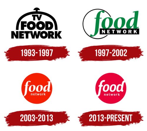
The logo consisted of an imaginary dish covered with a culinary hat. The word “Network” served as the plate, enlarged and stretched horizontally so that the end letters went beyond the edges of the hat. The edges of the hat rested on the columnar legs of “N” and “K.” The designers made the phrase “TV Food” the “food” and placed it inside, reducing the size of the first part.
1997 – 2002
After rebranding, the channel management approved a new name and a modernized emblem. Its author was Pittard Sullivan. He completely redrew the logo, changing both the concept and the layout:
- removed the chef’s hat and the imagined “plate”;
- added a thin circle to the left, surrounding the letter “f”;
- changed the font of the word “food” to lowercase and italicized it;
- placed the “Network” text inside a horizontal rectangle;
- visually separated the two parts of the text, styling them differently;
- used a combination of black, white, and green.
The logo became light, airy, and unobtrusive, but it was hardly related to the culinary theme, except for the channel’s name. The emblem became two-tiered since the abbreviation “TV” was removed.
2003 – 2013
Troika Design Group worked on the next version of the Food Network logo. They focused on the color scheme and abandoned the black rectangle, placing “Network” in the center of a red circle under the italicized “food” text. The first part of the name was larger, while the second part was smaller, filling the space between “f” and “d.” All the letters in both words were lowercase.
2013 – today
The modernization of the TV channel’s emblem was entrusted to graphic agencies Sibling Rivalry Studio and Superestudio. The result was a red-raspberry-colored logo with a different text style. The two-tiered arrangement was preserved, as was the ratio of the glyph sizes, but the words became more graphic, especially the first:
- letters have uniform width and equal line thickness;
- the lower part of the “f” tail and the upper end of the “d” leg now reach the edge and seem to penetrate outward, emphasizing the openness and accessibility of the programs to viewers of all age groups;
- the top line no longer has serifs, and the lower glyphs are shorter than before.
Fonts and Colors
Different types of fonts prevailed in the Food Network logo at different times: bold, italic, geometric, slab, and antique. Mainly, Futura Extra Bold, Gilroy, a customized variation of DIN, and Lorimer No 2 Semibold were used. The signature color palette consists of black, white, calm green, and two shades of red – scarlet and raspberry.
Food Network color codes
| Red | Hex color: | #e70037 |
|---|---|---|
| RGB: | 231 0 55 | |
| CMYK: | 0 100 76 9 | |
| Pantone: | PMS 185 C |
